Digital display
Universal principles
The guidelines on this page form the foundation of all digital display content. While specific use cases make exceptions to these rules, they should be treated as the default for all compositions.
Brandmark & tagline
Size & boundaries
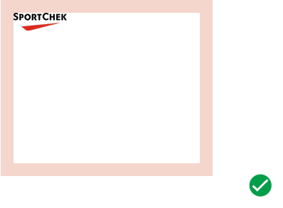
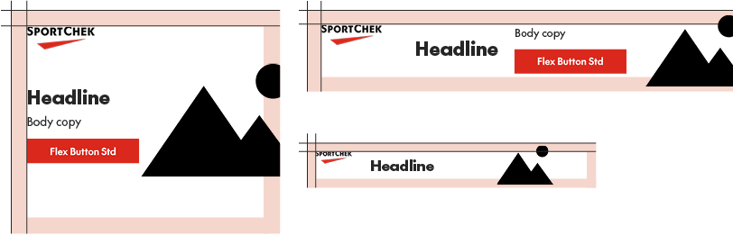
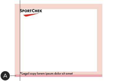
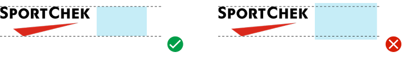
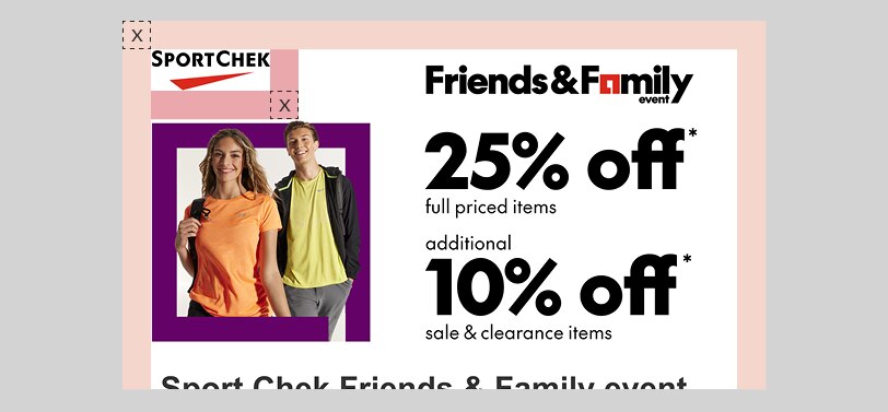
The Brandmark is the key to display advertising layout: the Brandmark and its clear space define major elements such as margins and padding (see the Layout section for more details). Brandmark dimensions are optimized for every common banner size—it is a fixed dimension component: do not adjust its size.
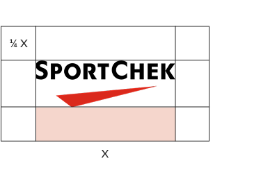
The Brandmark should always use the standard clear space
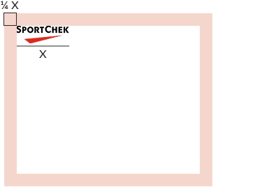
The Brandmark's clear space defines the banner’s margins
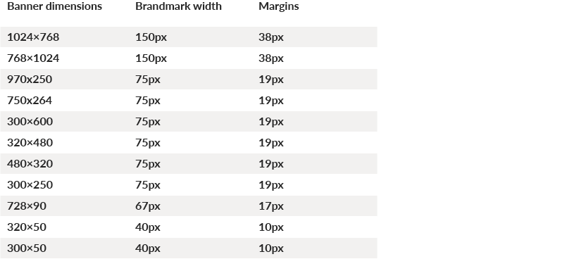
Common banner dimensions with Brandmark height and margins:
Position
For IAB/network banner units, the Brandmark must always appear in the top-left position.
In all instances, the Brandmark must sit in the top-left position
Do not place the Brandmark in any position other than top-left
Tagline
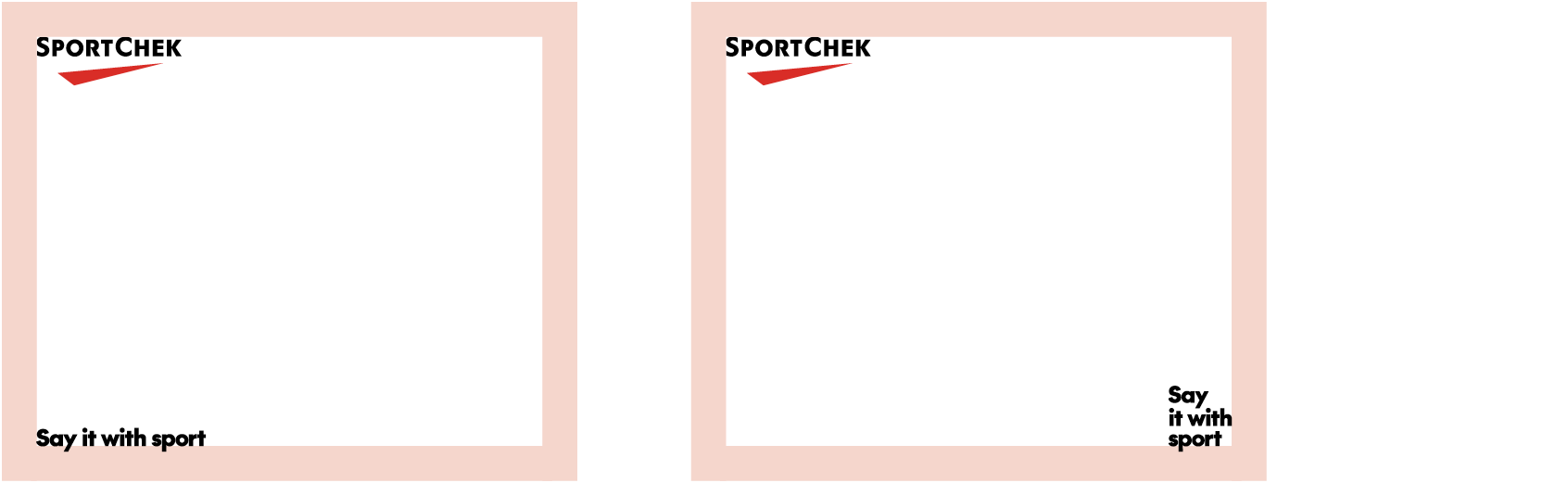
The tagline is an optional element that can be included in brand-focused ad creative. The tagline may be placed in either of the bottom corners of the layout and must sit against the margins (details below). You may use any of the variations.
Always place the tagline using the sizing system described here:
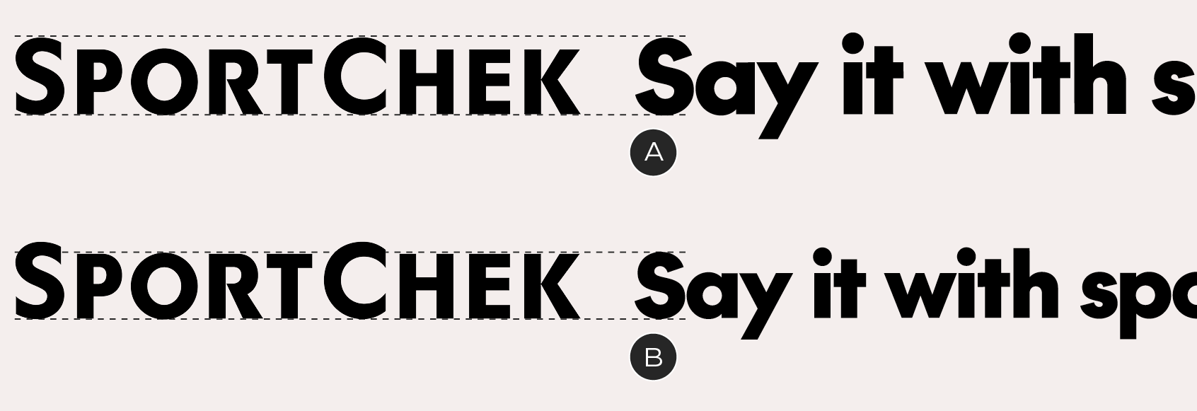
A – Banners above 300×250 in size: the height of the capital F matches the large cap height in the wordmark
B – Banners 300×250 and below: the height of the capital F matches the small cap height in the wordmark
Taglines must sit in either of the bottom corners, aligned to the margins – align the baseline of the tagline to the bottom margin, so that the descender of the Y sits outside the safe area
Layout
Margins
Margins are defined on a unit-by-unit basis, optimized for every common size of banner and based on the Brandmark's clear space. They are a fixed dimension component: do not alter the margin sizes. If you encounter a banner size that is not documented, match the specs with the nearest documented size. See the Brandmark section for a table of common sizes. The Brandmark, tagline and copy block must sit within the boundaries of the margins.
Examples of margins – note that images are not constrained by them
Padding
Banners should be laid out with internal padding – a minimum distance between copy blocks, hard-edged graphics and the Brandmark. Padding is equal to the margins.
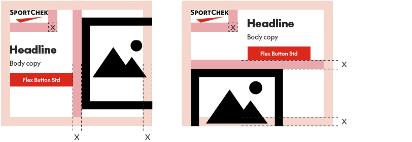
Examples of padding between objects. Don't forget that the Brandmark's clear space (equal to the rest of the padding) extends all the way around it
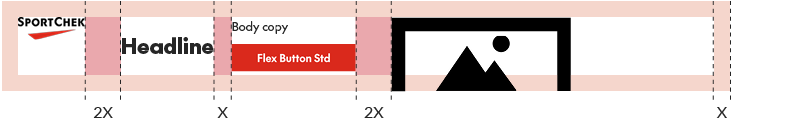
In narrow horizontal banners (eg. 728×90, 320×50), the padding is increased to two margin widths, with one exception: within copy blocks, elements are separated by a single margin width – eg. headlines and copy/buttons
Typography
Font sizes
Type size in banners is flexible – make sure you balance readability with the bold attitude we're looking for in our visual identity. As a general rule, copy should be set at 12px or higher to ensure it is readable by all viewers.
Copy blocks
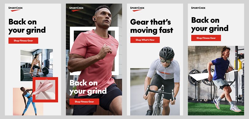
Headlines, body copy and buttons are treated as single units, referred to as copy blocks. For promo events, a graphical lockup replaces the headline and may be scaled to any size.
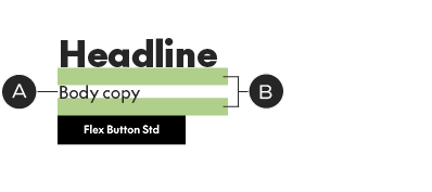
There are two scenarios for vertical spacing in copy blocks, depending on whether or not there is body copy present.
If there is body copy, the font size of the body copy determines the vertical space between elements, from baseline to cap height or baseline to top of button:
With text-based headline
A – Body copy: 16px
B – Space above body copy and button: 16px.
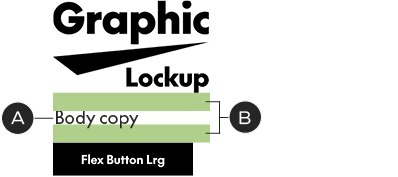
With promo lockup
A – Body copy: 18px
B – Space above body copy and button: 18px. Disregard type baselines in the lockup – measure from the bottom of the graphics.
If there is no body copy, place 15px of vertical space between the button and whatever comes above it, no matter the size.
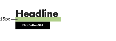
With text-based headline
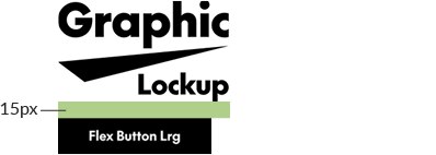
With promo lockup
Legal
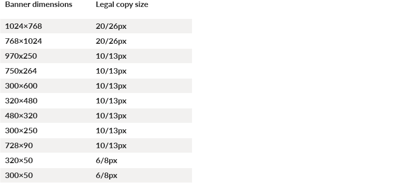
Always set legal copy in SC The Future Medium. Legal should typically be set at 10/13px, with the exception of tablet-sized and mobile banners, when it's adjusted to 20/26px and 6/8px, respectively. Use the following table as a quick reference:
Legal copy may be placed in one of two positions in your layout:
A – Against the left margin and 10% of the logo width from the bottom of the layout
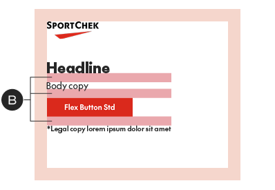
B – At the bottom of the copy block, using the same vertical spacing (see above for details on defining vertical spacing)

Buttons
The display advertising system uses a flexible-width button. There are three sizes of Flex Buttons, each designated for specific banner sizes to work with the allotted space and stay in scale with the typography. Don’t alter them in any way other than updating the copy or colour. The Flex Button, available below for download, will automatically scale to the width of your CTA.
In display advertising work, we typically use the primary (solid) button style, for maximum impact. It may be applied in one of three basic colour combinations, depending on the design:

SC Red with white text
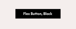
Black with white text
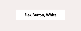
White with black text
Common banner dimensions with Brandmark height and margins:
Borders
IAB/network banners should always include a 1px border in Pale Grey, regardless of size or background colour.
Graphic elements
Be sure to consider using the graphic elements from our visual identity for a branded look.
From left to right: triptych, Chek Box Frame, Implied Chek Box, Chek supergraphic
Animation
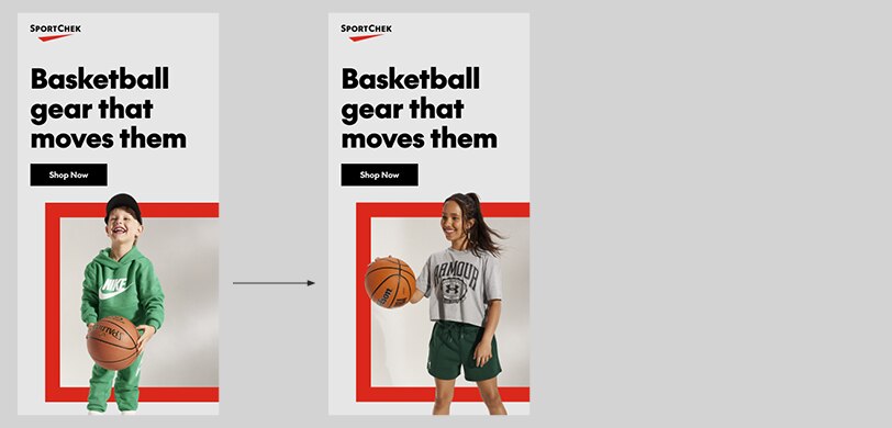
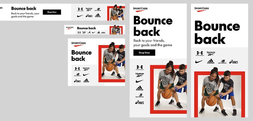
There are many cases for animation in banners; the recommendation here is using it to keep multi-image layouts clear and focused, by splitting them up into separate frames.
Single partnership layouts
Ads with single brand partnerships should follow the same layout conventions as other banners – but they typically must include a co-branded lockup. To properly do this, apply the Sport Chek Brandmark at the same size as in standard banner units (see guidelines above), then match the co-branded lockup to the original Brandmark's size.
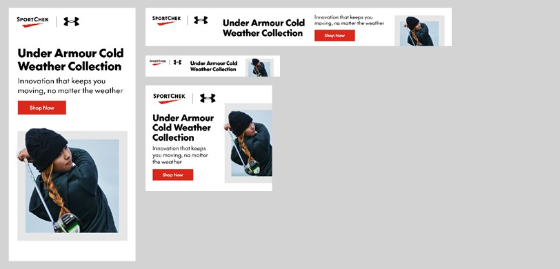
Single partnership ads with a co-branded lockup
Multi-vendor layouts
Multivendor ads typically contain a list of third party logos, which should be applied using the sizing and spacing system shown here. The logos can be contained within an optional background box, which creates better hierarchy and adds visual interest.
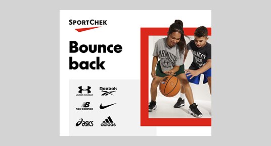
Example multivendor ad with background box
Logo sizing & arrangement
Multi-vendor ads offer three tiers of vendors: the top-tier vendors should always appear first, from top to bottom and left to right. The arrangement within a given banner unit is up to the designer. The following are options for a one or two-tier layout:
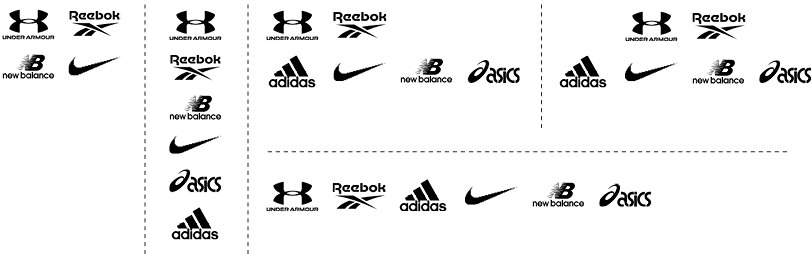
We recommend placing each tier on a different line, although the layout or banner size may not always allow for it.
How to size vendor logos:
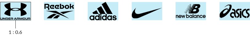
Place each logo inside a box with an aspect ratio of 1:0.6 – all boxes should be the same size. Scale the logo to fill the box, without distorting it.
The box height should never exceed the height of the Sport Chek Brandmark in each layout.
How to space vendor logos:
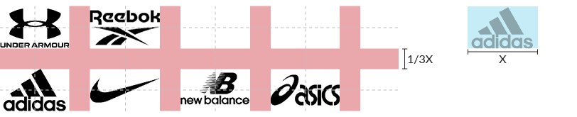
Space your logos using the equivalent of 1/3 of the width of your sizing box. Ignore the box boundaries when you space the logos – use the edges of the logos themselves. At times, you may need to optically adjust the spacing by a pixel or two to make it look better.
Background box
The background box is an optional element that is designed to keep logo-heavy layouts from being floaty or disorganized, while adding visual interest. It can be positioned almost anywhere on the layout and is most successful when it creates a sense of layering with other foreground elements, like photos or shapes. It must be set in Faint Grey and have at least one edge that bleeds off the layout.
Examples of the background box in layout. Although the Faint Grey works against all background colours, it is optional and may be forgone if it doesn't serve the composition
Mobile banner exceptions
Spacing exceptions can be made for mobile banner units, as space is so limited. Vendor logos may sit outside the margins; the background box may be placed closer to text than the banner's padding would normally allow. All elements must still respect the Brandmark's clear space.

A mobile banner layout with the vendor logos running into the margin space and the background box closer than normal to the type (layout enlarged to show detail).
Google Responsive, Local, and Discovery ads
These types of ads are component based and should not be designed in the same way as typical banner units. The primary challenge is designing for extremely limited spaces, in banners that will run on both desktop and mobile devices.
Use simplified lockups in small-size units – consider removing the date and/or discount information to ensure nothing becomes so small that it’s illegible. Always follow Google's recommendations for layout and content, especially when to submit the Brandmark as a separate file, rather than a part of the layout.
These guidelines apply equally to AI-driven/responsive ad units on other platforms.
Layout
Layouts that include the Brandmark and/or text and lockups must follow the same guidelines for Brandmark size, clear space, margins, and padding as other types of banners.
Brandmark size, clear space, margins and padding must be the same as in any other type of banner