
Save Stories
Overview
Our Save Stories should be treated the same way across all events and promotions to maintain consistency. There are two ways to treat Save Stories detailed on this page.
Standard Save Stories
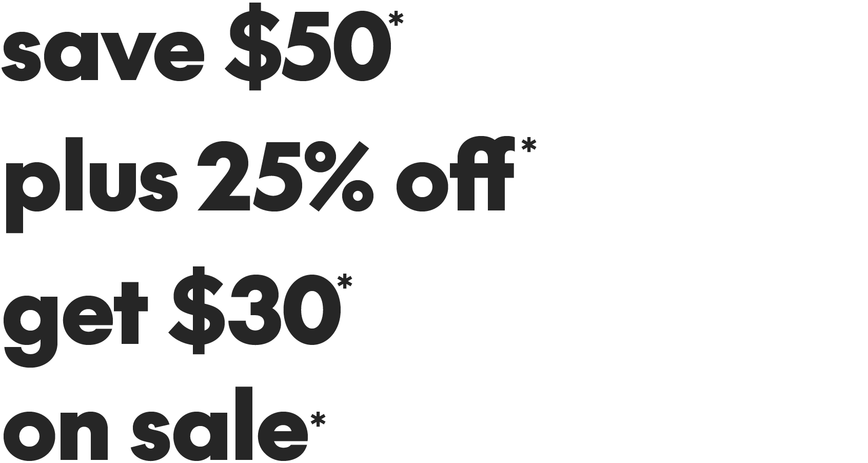
Save Stories should be set in SC The Future Black, in a single font size and weight. They may be set on one line or broken on two lines to accommodate different layouts. Always use lowercase for Save Stories.
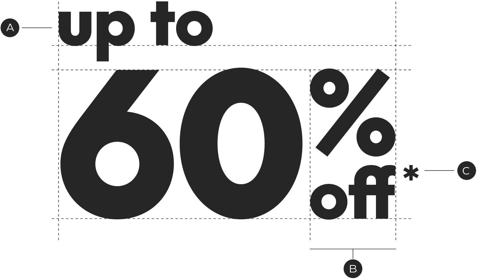
Standard Save Story construction

A – Horizontal
B – Stacked
C – Always use the ff ligature glyph available in our SC The Future font
Standard Save Story examples
Condensed save stories
When space is limited use a condensed Save Story treatment. This treatment puts focus on the discount and allows the type to be set in multiple sizes. These should only be used when a standard treatment is not possible due to legibility issues.
A – Lead-in text is set smaller and left aligned above the discount
B – The percentage glyph and off are stacked at a shared width
C – Place the asterix hanging off of the "f"
Condensed Save Story examples

ff ligature
Always use the alternate ff ligature when typesetting "off" in Save Stories. All promo templates will be set with the ligature, but if you are typing out the Save Story you will need to replace the characters using the Glyphs panel.
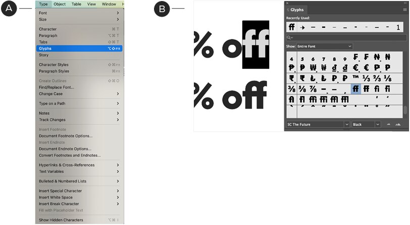
A – Navigate to the type panel and locate Glyphs. Click to open the panel.
B – With the Glyphs panel open, select the ff characters. Locate the ff ligature in the Glyphs panel and double click. After the first instance, the ff ligature will appear in the recently used area of the Glyphs panel for easy access.
Save Story violations

Don't capitalize "Up"

Don't use the non-ligature ff

Don't randomly mix type sizes

Don't mix font weights