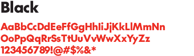
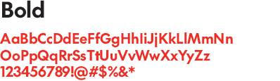
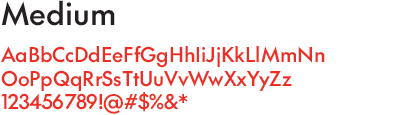
Typography
Our brand typeface

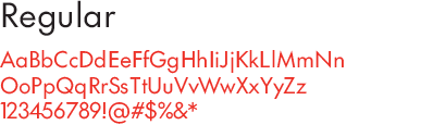
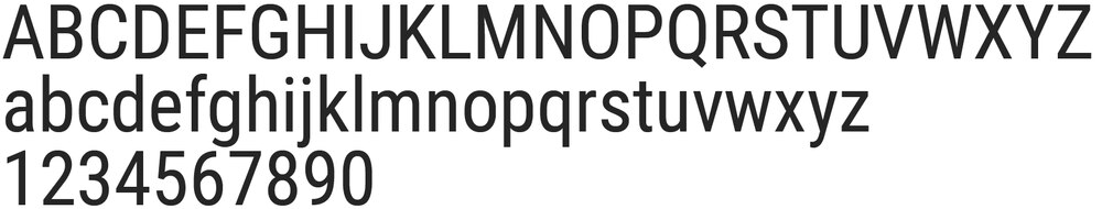
SC The Future is a sans serif typeface with geometric architecture and avant-garde alternates. This is the default typeface for all Sport Chek applications.
Weights
SC The Future can be set in one of four standard weights:

NEVER add effects

NEVER scale Brandmark elements

NEVER use the Wordmark without the Chek if the Chek doesn’t appear anywhere else in the lauyout

NEVER place on a busy background
Typographic principles
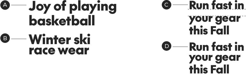
All headlines use SC The Future, in the Black weight.
The Bold weight is for sub-text. The Medium and Regular weights are for body copy, and the Regular weight is good for small type or legal.
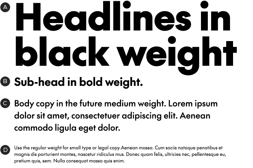
A – Black weight
B – Bold weight
C – Medium weight
D – Regular weight
Typography dos and don'ts
· Left-align all text except for cases where it doesn't work – like in end slates.
· Sentence case is used for both headlines and copy.
· Do not use italics.
Do set copy left-aligned, in sentence case

Don't use italics
Leading
Maintaining consistent leading ensures that our headlines stay tight and impactful and our general type settings are always legible and comfortable for readability. The following are general rules for leading settings in our different type styles.
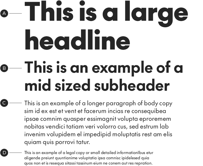
A – Headline with leading set to 115%
B – Subheader with leading set to 120%
C – Body copy with leading set to 130%
D – Legal/detail copy with leading set to 130%
Headline leading
Our headlines should be set with tight leading, however we do not want our ascenders or descenders crashing. For headlines with ascenders/descenders use a general rule of 115% leading. For headlines with no ascenders/descenders the leading can be closed down to 80%. Leading can be adjusted up or down to accommodate difficult situations but should stay close to the above values.
A – Headline with ascenders/descenders set to 115%
B – Headline with no ascenders/descenders in leading area, set to 80%
C – Example of a headline with poor visual spacing
D – Example of adjusted leading to make optimal spacing
Alternate glyphs
SC The Future has an alternate dash set, which sits slightly higher than the default set:
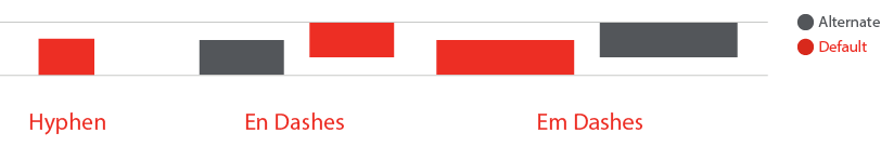
SC The Future has adjusted the en dash to make the higher position the default as we set a lot of numbers. You can access the lower position in the glyph panel if required for use with lower-case text. Hyphens and Em dashes remain in the original lower position by default.

Correct use of higher-position en-dash

Incorrect use of low-position en-dash
Languages

Need something translated? SC The Future supports over 200 languages. Unfortunately, Asian languages aren’t supported with SC The Future.
Legal copy overview
Legal copy has two type treatments depending on the placement and copy length. Generally we use SC The Future Regular for legal copy placed within creative layouts. When we place large blocks of legal copy we use Roboto Condensed Regular.
Legal copy within layouts
When legal copy is placed within creative layouts use SC The Future Regular in sentence case. When placed on a light background the text colour should be SC Mid Grey. The type size should be significantly smaller than body copy, but still legible.

Examples of legal copy within creative layouts.
Large legal copy blocks
Large blocks of legal copy should be set in Roboto Condensed Regular at the smallest legible size possible. The text should be sentence case in black or white.
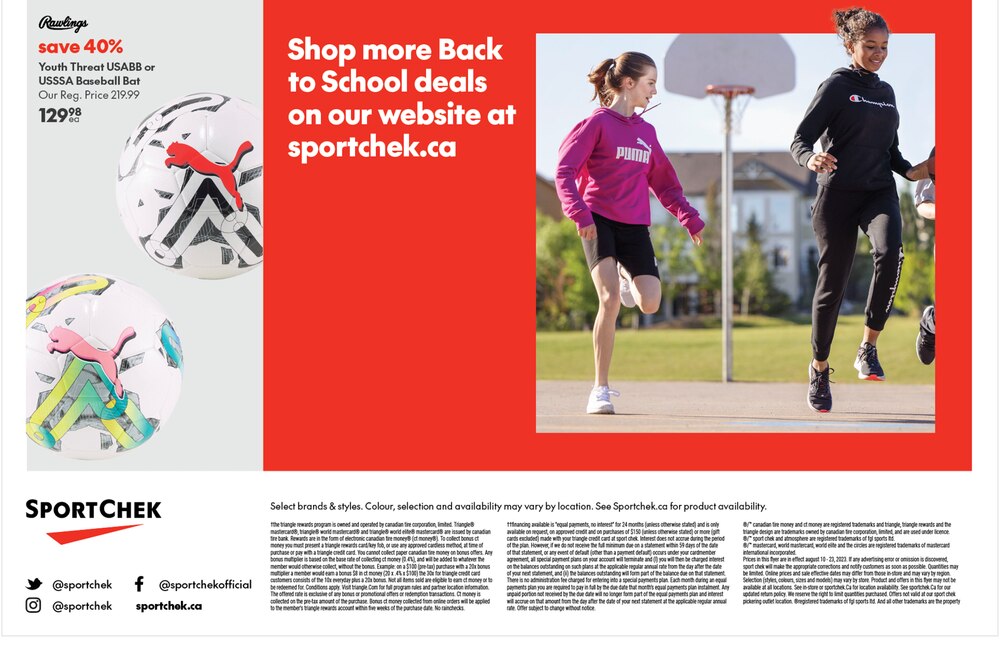
Example of a block of legal on print flyer.
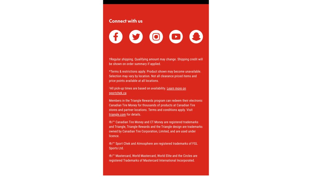
Example of a block of legal on emailer.
Roboto Condensed Regular