
Flyer
Introduction
Our print flyer needs to convey a large amount of information while also visually remaining clear in understanding the hierarchy between offers. Our grid and typographic system are designed to help achieve this while remaining cohesive with the other print applications.
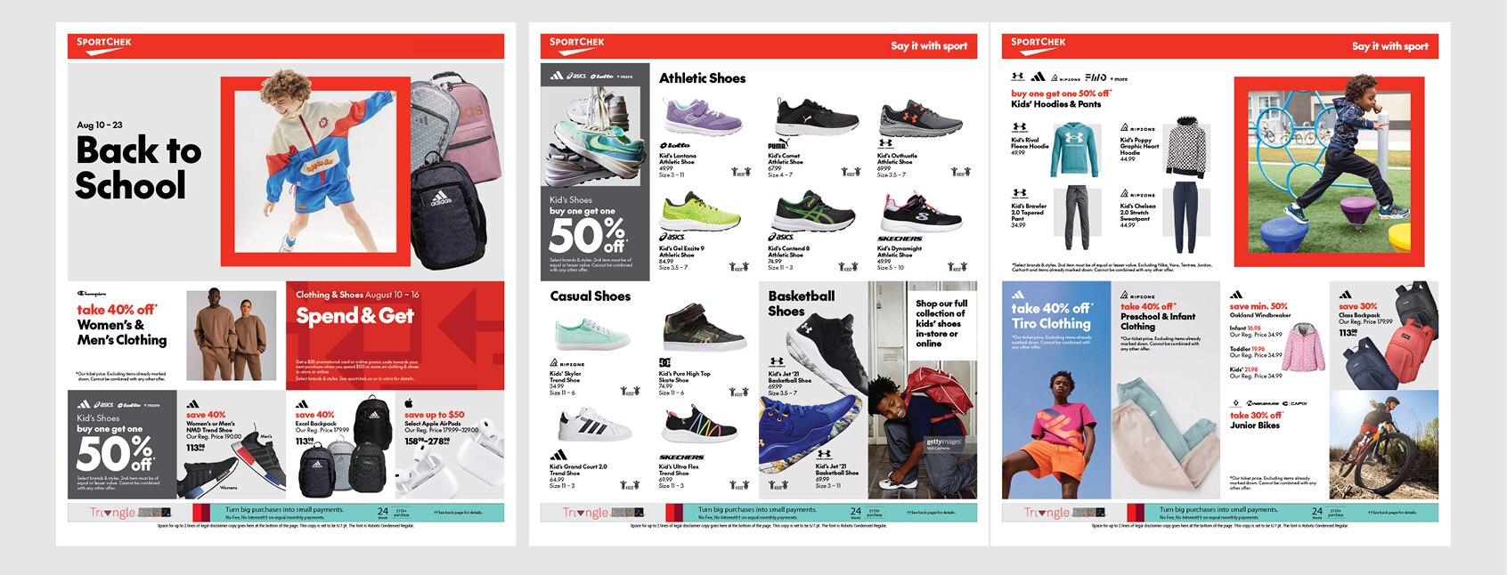
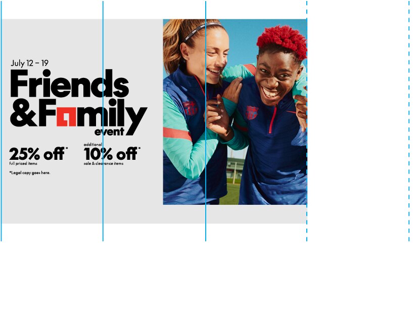
Example of creative
Grid
The square tab flyer grid is structured in a 4x4 module layout, facilitating seamless adaptation to digital formats. These modules are intentionally designed as perfect squares to integrate with our visual language and ensure effortless utilization of our graphic elements.
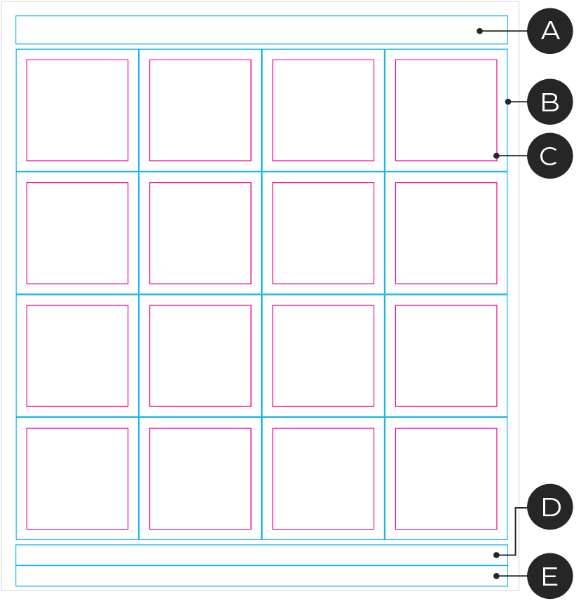
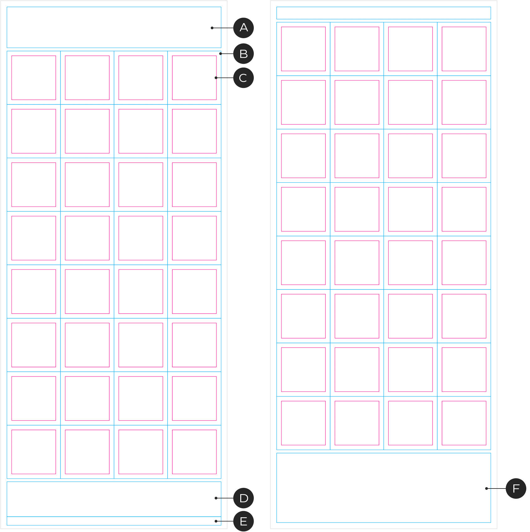
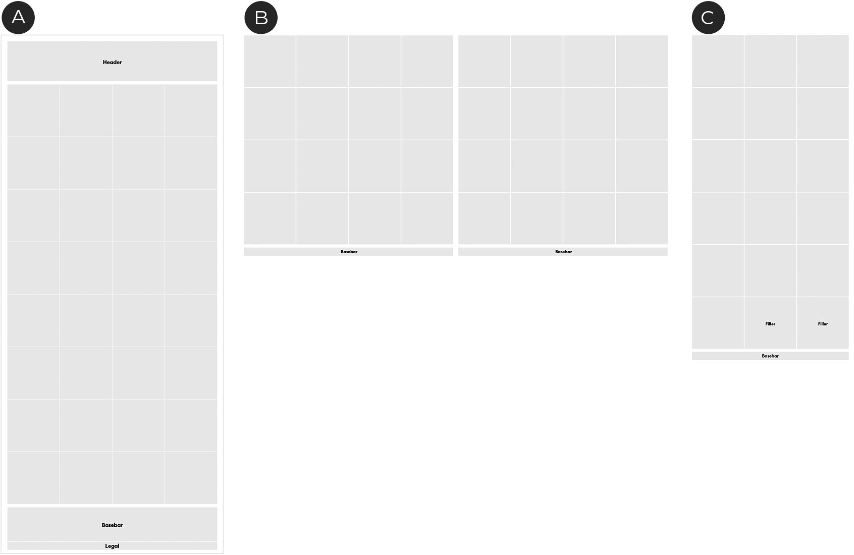
Front/Inside page grid
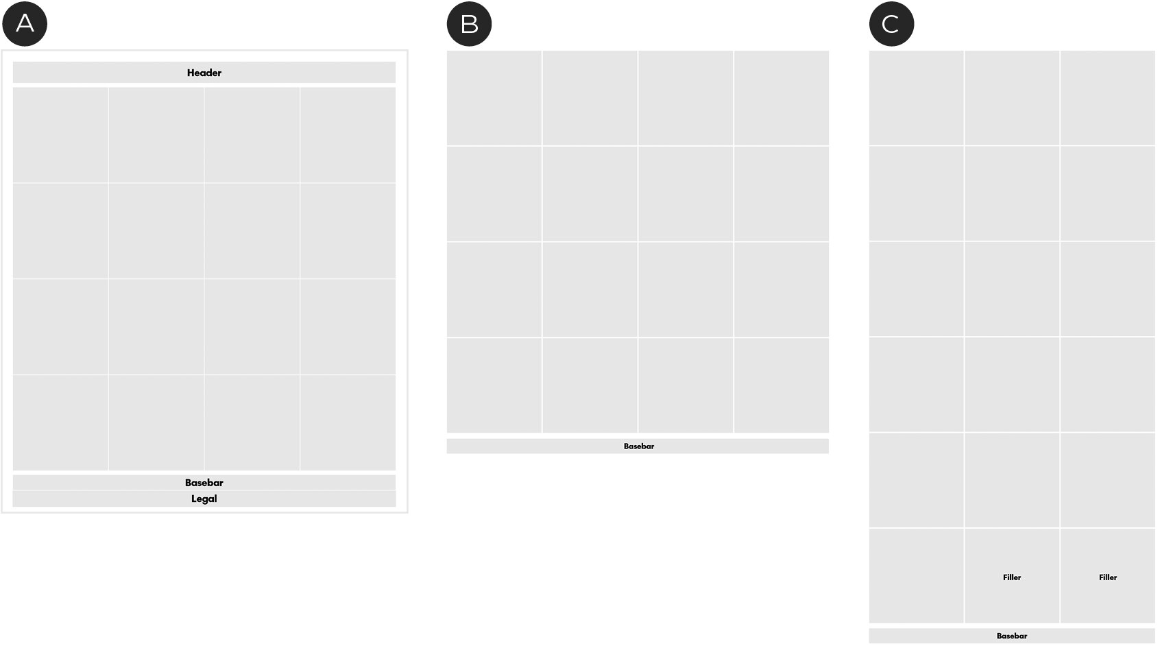
A – Header
B – Module boundary
C – Inset grid
D – Basebar
E – Legal copy
F – Footer/Legal copy
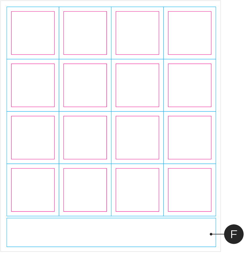
Back page grid
Examples
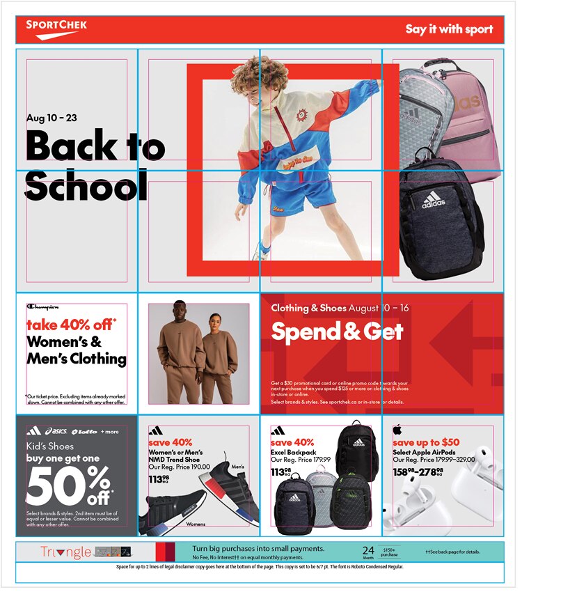
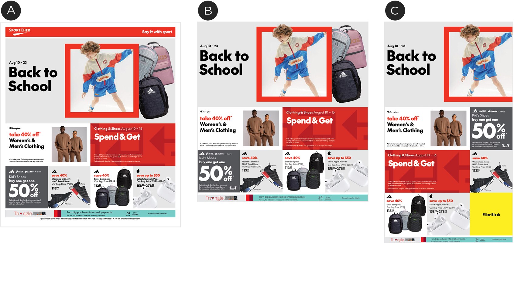
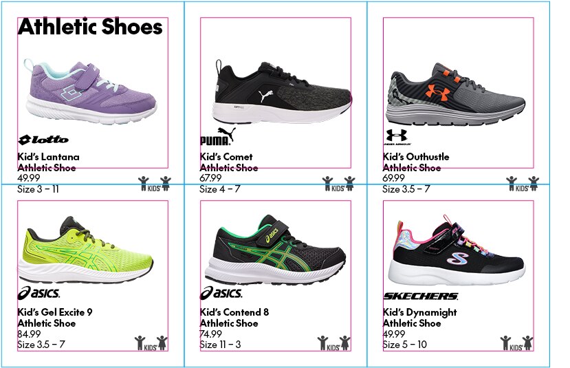
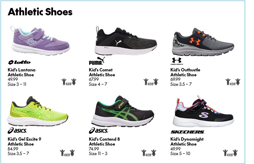
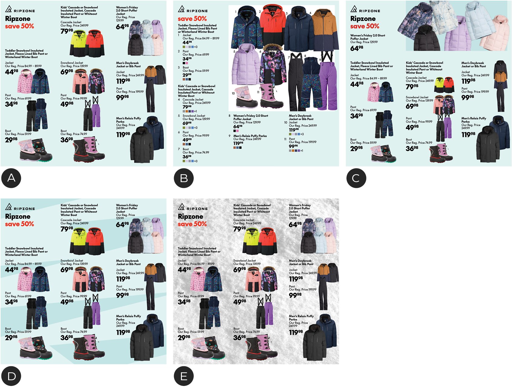
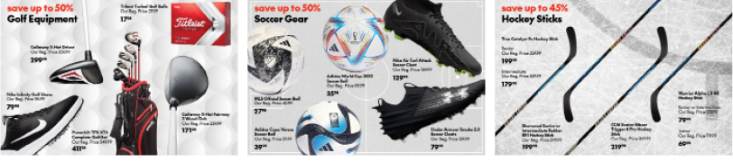
Front/Inside page layout example
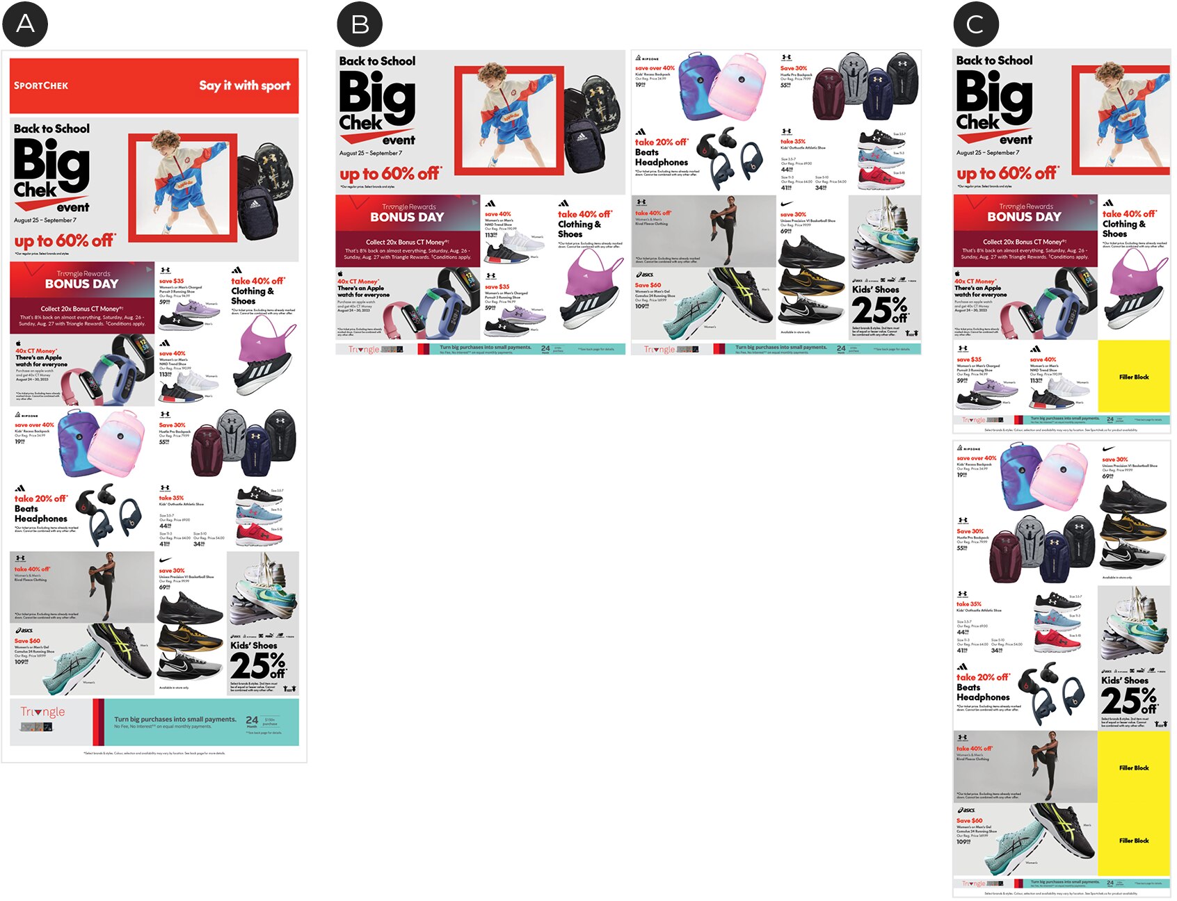
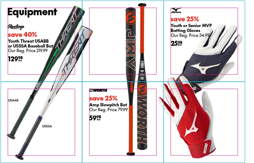
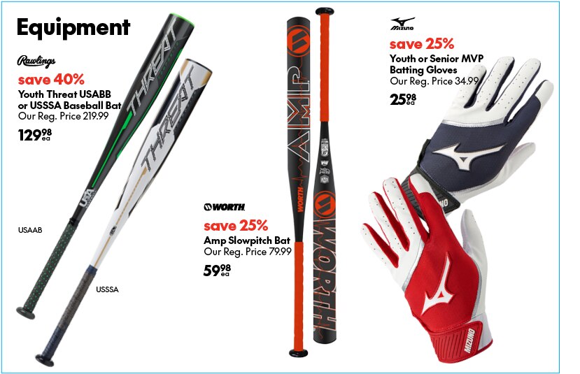
Back page layout example
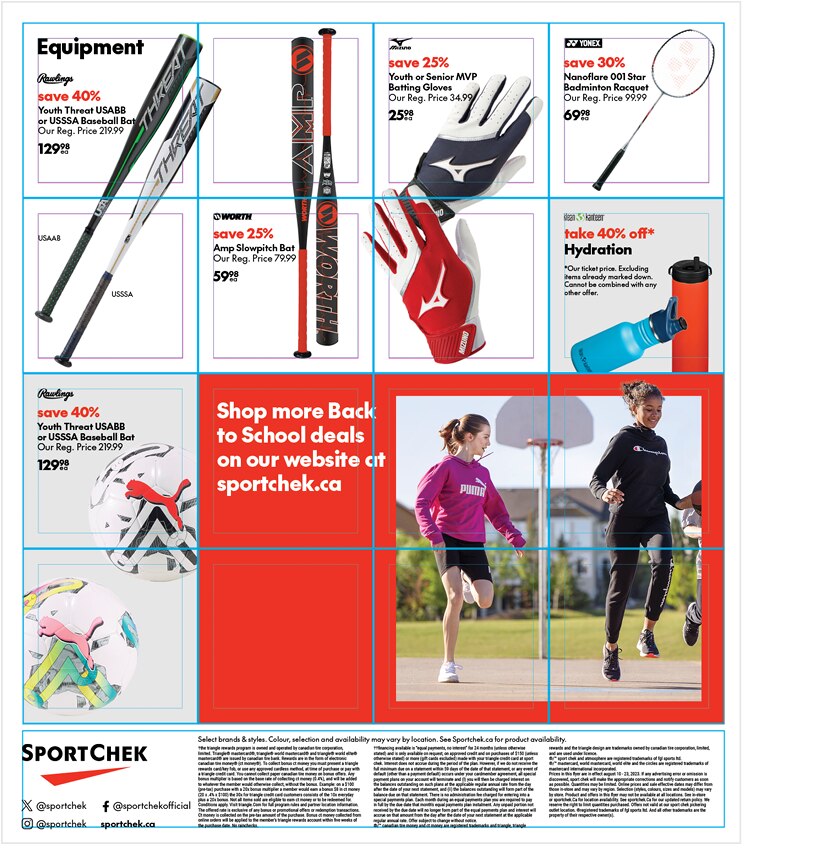
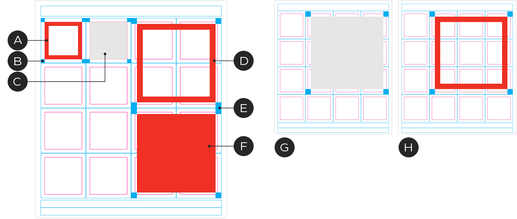
Modules within the grid can be combined to create larger units. Module combinations can only be a maximum of 3 units wide because of limitations converting to digital applications.
Square Modules
The grid is intentionally designed to have square modules to accommodate our square graphic elements and for creating crops consistent with our visual language. It also allows us to create perfect square modules of varying sizes when combining modules.
Inset Grid
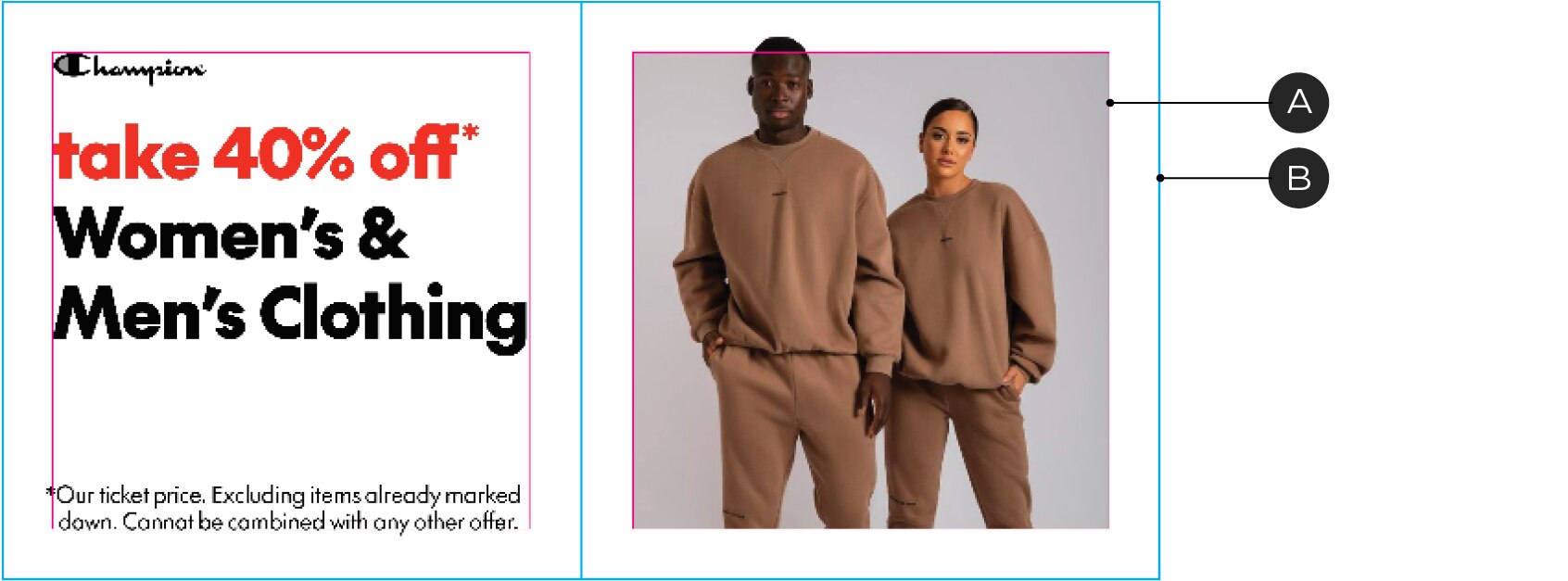
A – Inset grid
B – Module boundary
The inset grid is the boundary for graphics and copy within a module. When placed in a single module, the margin is designed according to the correct padding for our Chek Box Frame or the Implied Chek Box Frame. For larger Chek Box Frames, adjustments are necessary.
Broadsheet
A – Header
B – Module boundary
C – Inset grid
D – Basebar
E – Footer & Legal copy
F – Extended legal copy area
The broadsheet shares the same 4x4 grid specs as the square tab but doubles in height to make a 8x4 grid with larger headers and basebars. It is neccessary to treat each 4x4 grid as an individual piece because they will be split and set side by side in the desktop digital adaptation.
Graphic elements
We use our core graphic elements to emphasize key items or save stories. In order to maintain the effectiveness of these elements we need to restrict their use.
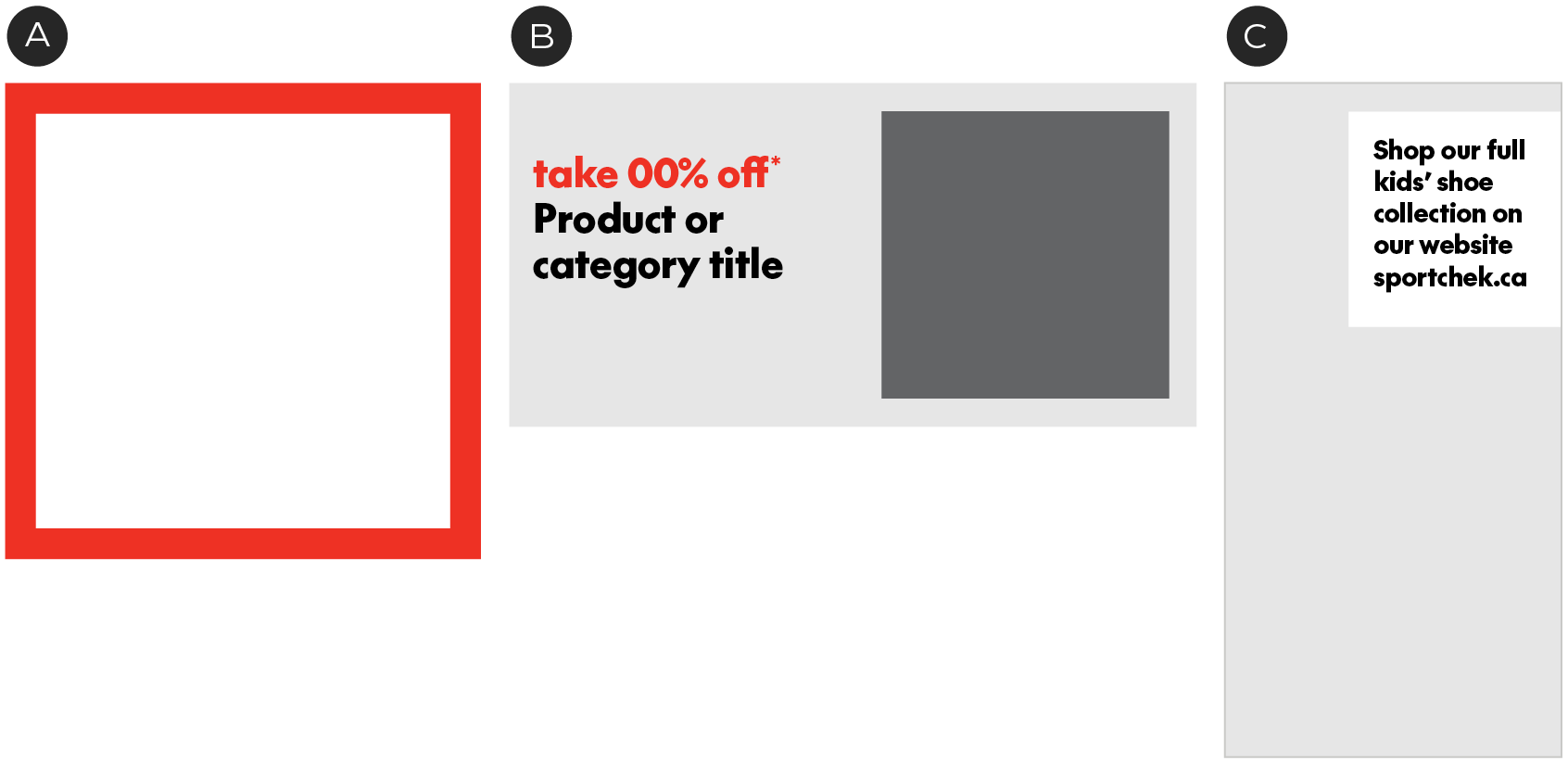
A – The Chek Box Frame can be used to emphasize a product or an image, but should only be used max. once per spread.
B – Implied Chek Box Frames can be used to hold an image within a module
C – The square tag can be used for a callout on top of an image.
Frame spacing
A – 1x1 Chek Box Frame
B – 1x1 Chek Box Frame clearspace
C – 1x1 Implied Chek Box Frame
D – 2x2 Chek Box Frame
E – 2x2 Chek Box Frame Clearspace
F – 2x2 Implied Chek Box Frame
G – 3x3 Implied Chek Box Frame
H – 3x3 Chek Box Frame
The grid is designed to allow our square elements proper spacing in a variety of sizes and uses. For more information on the sizing and use of these elements see the Chek Box Frames guidelines.
Typography
Type sizes and spacing should stay consistent throughout the flyer. In order to create hierarchy between offers we recommend using larger headline sizes with limited use.
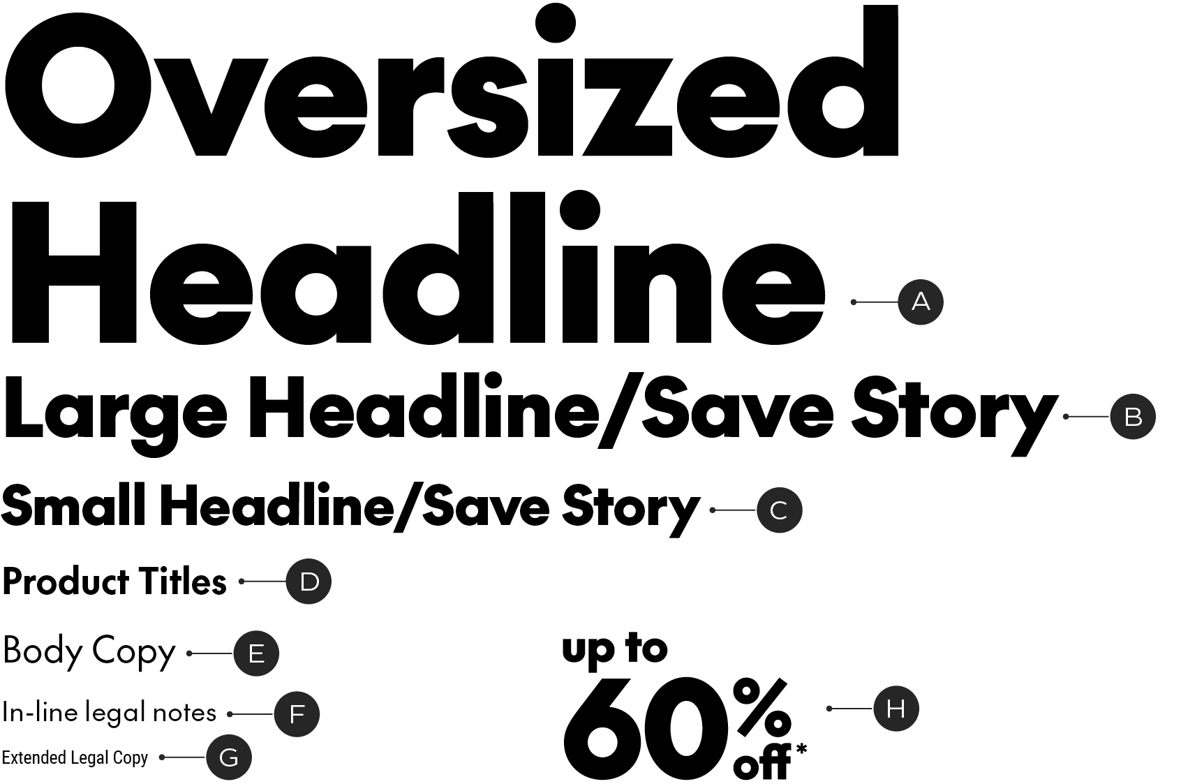
A – SC The Future Black, 35-50pt (Used max. once per flyer)
B – SC The Future Black, 18/21pt (Used max. once per page)
C – SC The Future Black, 12/14pt
D – SC The Future Bold, 8/9pt
E – SC The Future Regular, 8/9pt
F – SC The Future Regular, 6/7pt
G – Roboto Condensed Regular, 4/4.5pt
H – Condensed Save Story
Digital conversion
When converting the print flyer into its digital versions there are a number of considerations needed in order to make the transition seamless. See below.
Square Tab Grid
The 4x4 grid remains consistent and adapts easily to the 4x4 desktop digital grid. Modules are rearranged to flow into the 3x6 mobile grid. Filler blocks will be needed for the mobile layouts.
A – Print Flyer
B – Digital Desktop
When converting to the digital desktop flyer, the layout stays intact but loses its outside margins. The basebar remains, while the header is removed and replaced with a fixed header. Flow is from left to right.
C – Mobile
When converting to the digital mobile flyer, the layout changes from a 4 column grid to a 3 column grid. Layouts need to shuffle slightly to accommodate and filler blocks will be added to leftover modules.
Broadsheet Grid
The 4x8 grid of the broadsheet flyer is divided in to two 4x4 grids for the adaptation to the digital formats. The larger header and basebar revert back to the standard size.
A – Print Broadsheet Flyer
B – Digital Desktop
When converting to the digital desktop flyer, the 4x8 grid is divided in to two 4x4 grids. Each 4x4 grid becomes it's own page. The basebar remains, while the header is removed and replaced with a fixed header. Flow is from left to right.
C – Mobile
When converting to the digital mobile flyer, the layout changes from a 4 column grid to a 3 column grid. Layouts need to shuffle slightly to accommodate and filler blocks will be added to leftover modules.
A-Spot
The A-Spot should span the width of the flyer in all formats to have the most impact. This means the A-Spot needs an alternate layout to adapt from a 4x2 module to a 3x2 module space in the mobile flyer.
To make this adaptation, we hide the 4th column on the right side for a cropping effect. This means content must be carefully considered to work in 3 and 4-column formats. All vital information or images must be contained in the first 3 columns.
A – 4th column representing the expendable area to be hidden for mobile
Examples
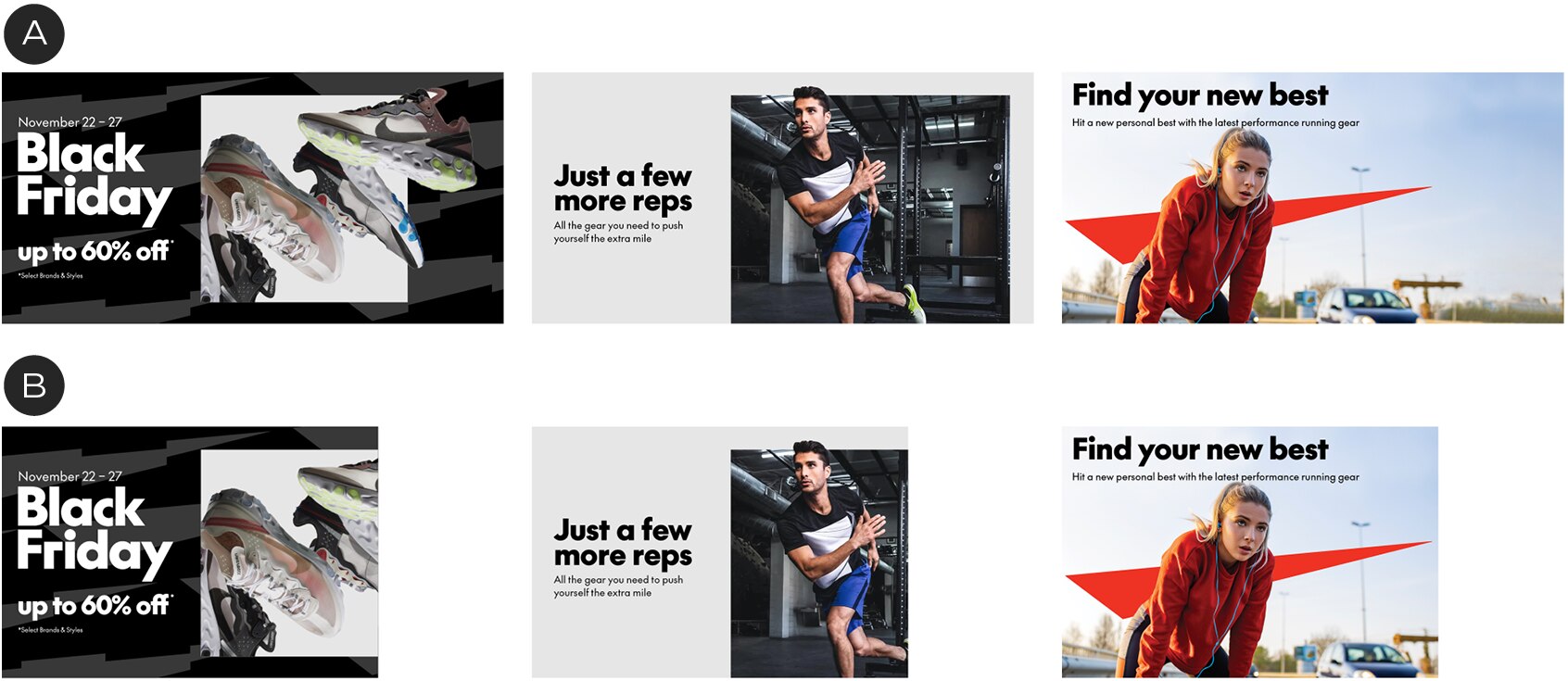
A – 4x2 (Desktop)
B – 3x2 (Mobile)
SKU placements
To add a sense of movement to our most basic product photography, we can use rotation and depth to bring energy to our SKU placements. This can break up rigid, gridded product layouts.


Overuse
In some situations the overuse of SKU rotation and cropping can make a grid layout feel too busy and distracting. In these situations, standard gridded SKU placements can be used with occasional rotated treatments to add energy and excitement.
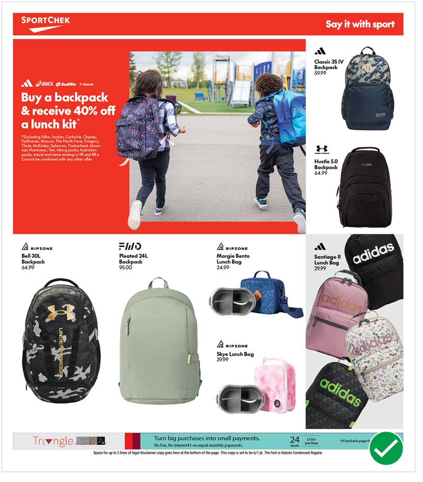
Do
Using the grid for simple SKU placements creates a clean layout and allows a single use of SKU rotation at bottom right to have impact.
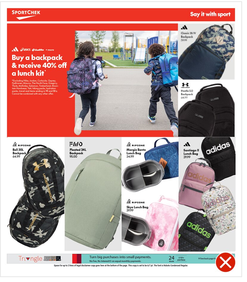
Do Not
This flyer page is feeling too busy and crowded. The overuse of the SKU treatments has made the layout feel messy and overwhelming.
Read more about SKU placements here.
Breaking the grid
Our grid cannot be altered for any circumstances because of the restrictions needed to convert to digital formats. Therefore, certain situations need special consideration. If the grid does not work for a particular layout, you can combine grid units (to a maximum of 3 col. wide) and deviate from the grid. If you need to do this, keep as close to the grid as possible. Below is an example of a situation where the grid needs to be altered.
In order to accommodate the category header, the top row of products need to be shifted down below the top row of modules. By grouping these items in to one 3x2 column grid module we can flow this in to the digital versions without revisions. It is still adhering to the grid when possible.
In the above example combining the grid modules allows for the category header to be integrated and also allows some odd shaped products to be shown at a larger scale by bleeding in to its neighbour row.
Featured Panels
For panels that need emphasis to stand out from the other slots we have options for layouts and backgrounds to separate them.
Only use a featured panel once per flyer spread maximum.
A – Seasonal Colour Backgrounds
Using our Seasonal Colour Palette as a background colour
B – Chek Box
Grouping items in an Implied Chek Box
C – Implied Chek Box
Using an Implied Chek Box with a featured SKU product arrangement.
D – Pattern Background
Pattern backgrounds that use the Seasonal Colour Palette
E – Photographic Backgrounds
Grayscale images with a flat and graphic perspective
Pattern Backgrounds


A – Winter
B – Spring
C – Summer
D – Fall

Examples in use
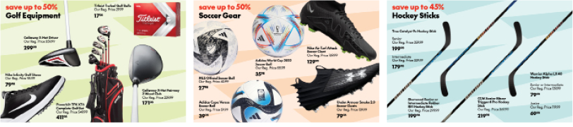
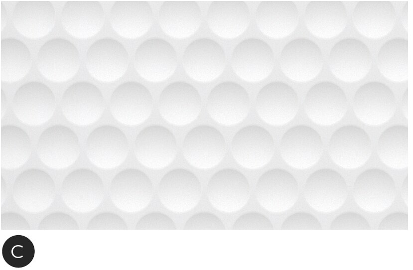
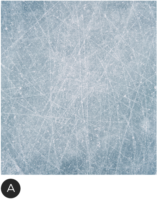
Photographic Backgrounds
Graphic and textural images in grayscale. These need to be light and simple enough that product images and text will still pop off of them. The perspective must be flat.


A – Generic Winter Snow
B – Hockey
C – Golf
D – Basketball
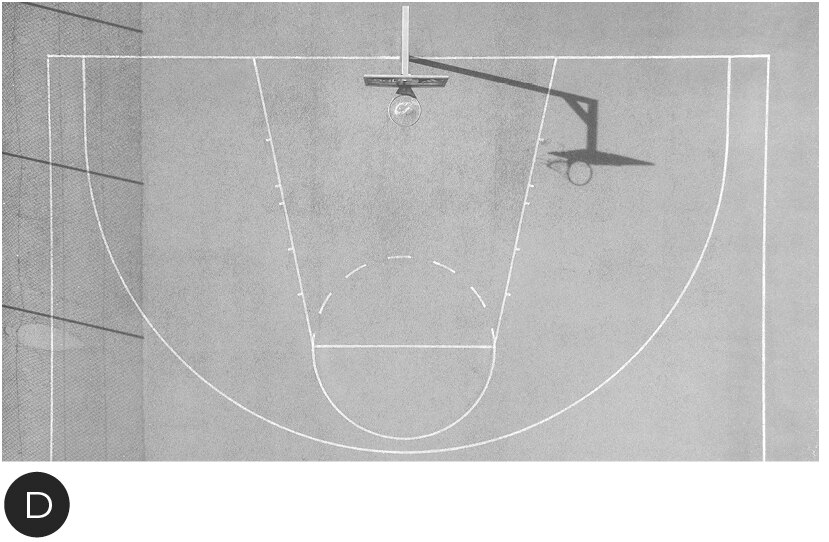
Examples in use
To create a background image first desaturate the image.
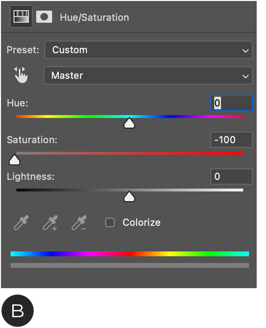

A – Original Image
B – Apply Hue/Saturation filter in photoshop. Take the saturation all the way down to 0. Some images may need an adjustment to lower the contrast.
C – Final background image
Do's and Don'ts

A – DO make sure the image is bright and has a low contrast
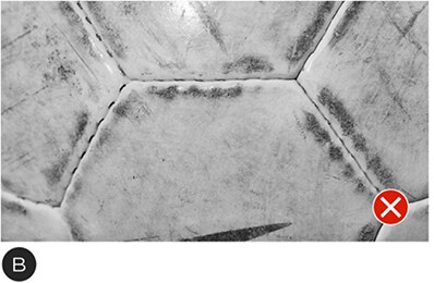
B – DO NOT make the image too dark with a high contrast

C – DO NOT tint images

D – DO NOT use images that show dimension and perspective
SKU Colour Tiles
In cases where there are a lot of colour options for a SKU, it is possible to use colour tiles as swatches to show options and reduce the amount of SKUs shown in a panel.
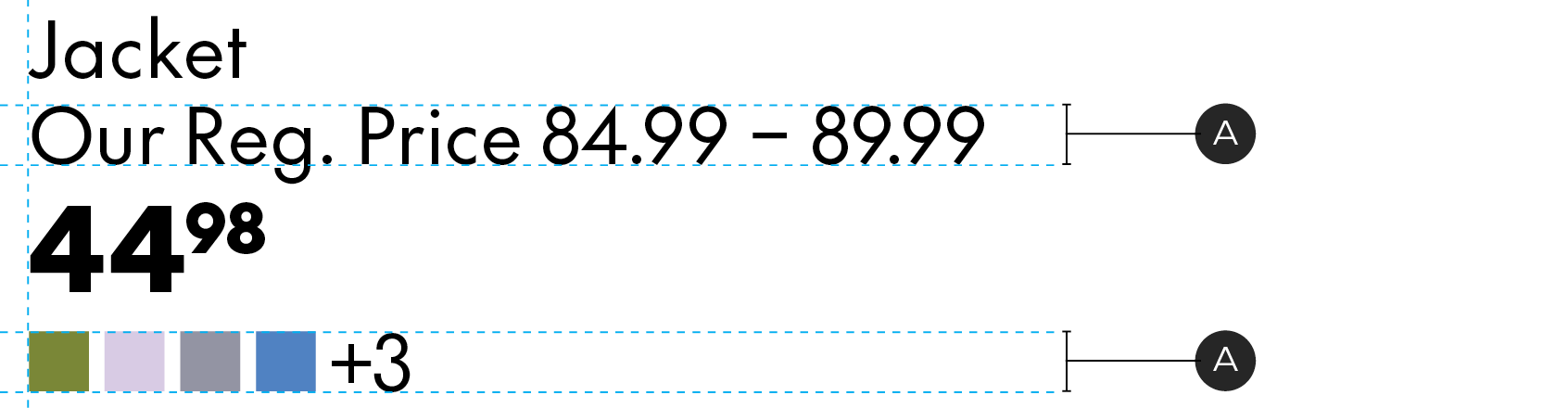
A – Colour tiles should match the cap height of the body copy and be left aligned to the product details. Keep the tiles to a maximum of 4 and list additional options by number.