
Email construction
This page outlines some best practices for laying out emails using the modular system.
Hierarchy
Adhering to the following design principles will make emails more organized and easier to read. Content that's simpler and easier to understand can increase user engagement.
Prioritization
The key message should always be the first thing the user sees when they open the email. There should be a correlation between the subject line and the A-Spot. The biggest, most important products or promotions should appear directly below the A-Spot, followed by secondary or tertiary information like upcoming promos, Triangle NPPs and suggested items.
As a rule of thumb, organize emails in order of largest, least dense information to smallest, most dense information. Eg. A-Spot, B-Spots, Product Tiles, C-Spot, Reco Feed.
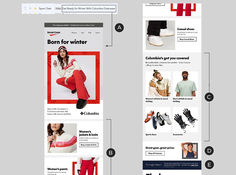
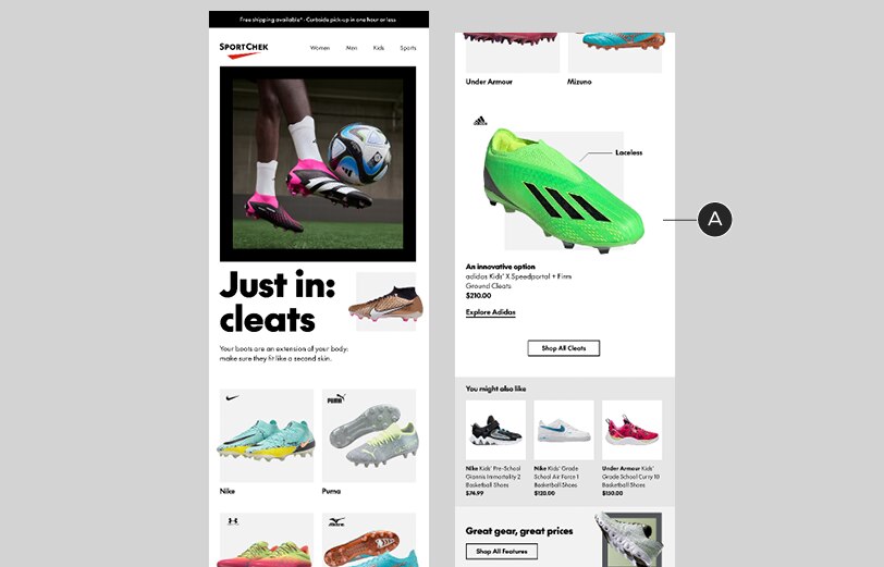
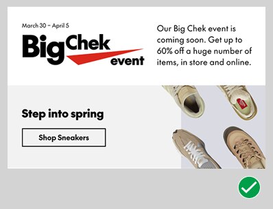
Example of an email with good hierarchy
A – A-Spot (which correlates to the subject line)
B – B-Spots, with categories related to the primary message
C – Category Tiles, with secondary (additional) categories
D, E – C-Spot & NPP, containing lower-priority, tertiary messages
Grouping
Modules that look alike should be grouped together, which will simplify the appearance of your emails. Don't interrupt a grid of Product or Category Tiles with a different type of module. Use the Standalone Copy Block and/or Button modules to frame sections and separate them from what comes above and below them. Breaking your layout into clearly-defined sections will greatly improve the reading experience.
A – Category Tiles grouped together. A headline helps define this area and further organize the layout
B – This section is created with a Feature Spot, a Standalone Copy Block and a set of Product Tiles. Adding a consistent background colour to every module groups them together, distinguishing this section from the rest of the content.
C – Secondary and tertiary messages are separated from the two groups of primary content
Variation and the element of surprise
The variety of modules allows you to present information in different ways, keeping emails from becoming monotonous. After prioritizing information and organizing it in clear groups, varying the presentation of those groups will keep the layout fresh and the viewer engaged.
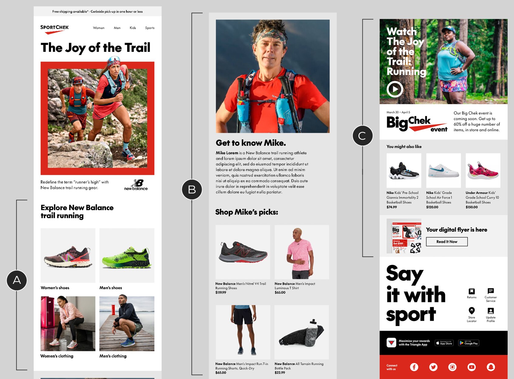
A – An email constructed entirely of B-Spots. This flat hierarchy is monotonous, which can detract from the impact of the B-Spots that come later in the sequence
B – An email composed of B-Spots, Category Tiles and a C-Spot. This layout keeps things interesting by presenting information in different ways as the user scrolls
Feature Spots are designed specifically to interrupt the expected flow of the information. They go against the rule-of-thumb, mentioned above, that modules should go from biggest and simplest to smallest and most dense. That's exactly why they can be effective: they surprise the reader.
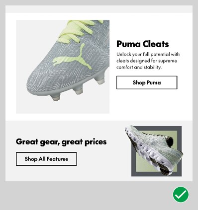
A – A Feature Spot, appearing after a group of B-Spots, adds an unexpected visual twist to this email
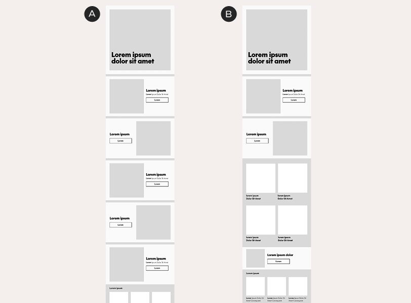
In-situ example
A – This Feature Spot is an unexpected follow-up to the Category Tiles above it
It's important to note that, to create variation or surprise, you first need to establish a rhythm by grouping similar modules. It's possible to go too far, creating too much variation in your layout: if your B-Spots are broken up by C-Spots and your Product Tiles are broken up by NPPs, inserting a Feature Spot won't create any surprise it will just add to the clutter.
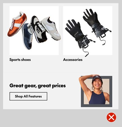
There's too much going on in this layout
Module relationships
Considering how one module flows into the next can keep users reading and will make layouts more polished.
Z-patterns
A back-and-forth arrangement of image-copy orientation, known as a z-pattern, is a layout based on people's natural eye movements. It can boost engagement with emails, keeping users scrolling down the page and it keeps layouts interesting, too. Use it with B-Spots and C-Spots.
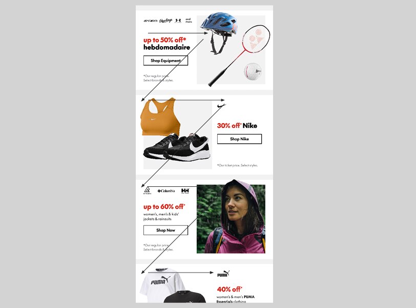
B-Spots arranged in a z-pattern
Alignment
While we've designed our modules to be mixed-and-matched, there are some combinations that work better than others. When laying out a module, always consider its relationship with the modules directly above and below it.
Here are some examples of alignment problems and how to fix them. Note that, in these examples, the issues have been resolved simply by switching the template in use. No custom modifications have been made.
This C-Spot's arrangement creates alignment issues with the NPP above it – the text placement is making the composition feel messy
An image-right C-Spot works better with the NPP, making for a much more organized layout

The same messy alignment issues are happening in this B-Spot / C-Spot combination
Once again, a z-pattern approach resolves the composition
Colour
As we discuss in the Grouping section of this page, colour can be used to group things, but it can also be used to keep modules separated. Use optional background colours to create relationships or distinctions between adjacent modules, helping readers understand what's all part of the same message and what's different.
This C-Spot contains a different message from the Category Tiles above it – but the modules are linked by their shared background colour
Updating the C-Spot's colour creates distinction and helps the reader understand that the two modules are not related