
Primary colour palette
Colour plays an important role in conveying our brand. Red and white have become what people envision when they think of Sport Chek.
Brand colours

SC Red
Pantone 485C
CMYK 0 / 95 / 100 / 0
RGB 218 / 41 / 28
HEX #DA291C

White
CMYK 0 / 0 / 0 / 0
RGB 255 / 255 / 255
HEX #FFFFFF

Pale Grey
Pantone Cool Gray 1C
CMYK 8 / 6 / 7 / 0
RGB 230 / 230 / 230
HEX #E6E6E6
Our primary brand colours are red, white and grey. They are used to provide simplicity and consistency throughout all of Sport Chek's brand communications.
Secondary colour palette

Black
Pantone Black C
CMYK 50 / 50 / 50 / 90
RGB 0 / 0 / 0
HEX #000000

Mid Grey
Pantone Cool Gray 11 C
CMYK 66 / 57 / 52 / 29
RGB 83 / 86 / 90
HEX #53565A

Light Grey
Pantone Cool Gray 3C
CMYK 8 / 5 / 7 / 16
RGB 200 / 201 / 199
HEX #C8C9C7
Our secondary colours are black, mid-grey and lighter grey.
Digital-only colours

Faint Grey
Pantone N/A
CMYK N/A
RGB 242 / 242 / 242
HEX #F2F2F2
Our digital colours are calibrated to for the wider-gamut screen environment, where more subtle colour differences are possible. Never use these colours in print.
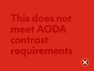
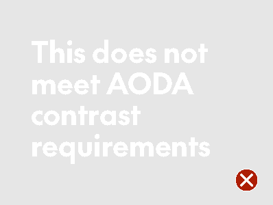
Accessibility
When it comes to the use of colour, websites and web content must have distinguishable content. This means colours must accommodate people with limited colour vision or colour blindness. Ignoring colour contrast standards means losing a significant portion of potential customers.
As a general rule, always ensure content has at least 50% difference in contrast. Check your colour combinations using an online tool to ensure it passes requirements.


Promo/seasonal colours
Promotional marketing channels use a palette of tertiary colours, customized to emphasize the feelings and events in the season. For more information on promotional/seasonal colours, visit the Promotional event lockups guide (coming soon).