Social media
Universal principles
The guidelines on this page form the foundation of all social media content. While specific use cases make exceptions to these rules, they should be treated as the default for all compositions.
As social media posts appear within the interface of the various platforms, reviewing your layouts in-situ will help you envision the final look of the post and produce better results. We've created templates to help review and present your work, available for download at the bottom of this page.
Avatar
Use the full Brandmark over a red field for all avatars. This ensures the avatar will be highly visible over all backgrounds, including dark mode.
Avatar construction
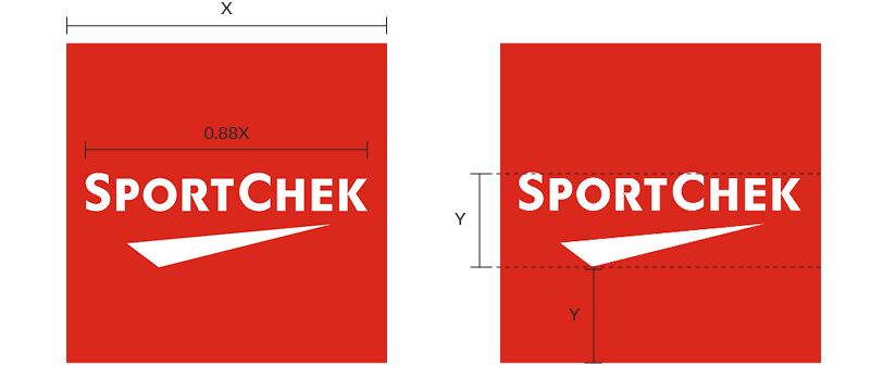
Place the Brandmark over a square field of SC Red, at 88% the width of the square. Optically centre the Brandmark, by placing it one Brandmark's height from the bottom of the square
Avatar don'ts
Don't change the recommended size of the Brandmark, as this could lead to poor results
Don't vertically centre the Brandmark inside the avatar – this makes it look like it's too high. Use the guidelines above to centre it optically
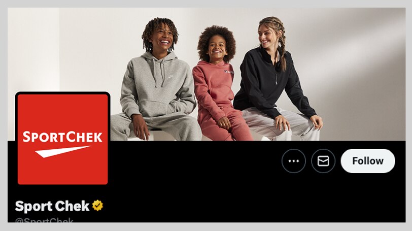
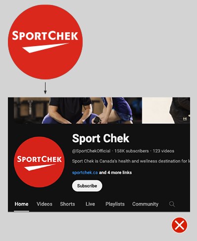
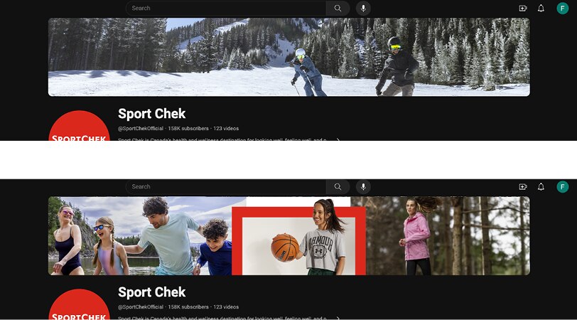
Profile images
No matter the platform, there are some general conventions that should be followed when designing profile images:
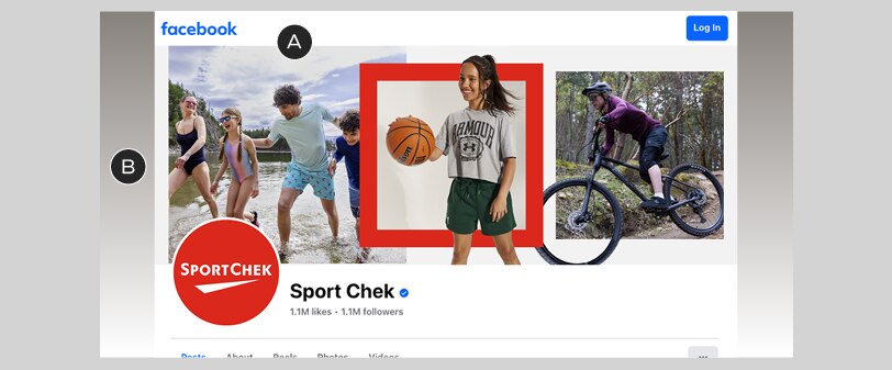
A – If combining images for the cover photo, use on-brand conventions, eg. the triptych style shown here
B – Consider how your cover photo interacts with the edges of the layout – cropped images can sometimes look a bit off; in other cases, an automated background colour (like in this Facebook example) may create unintended results
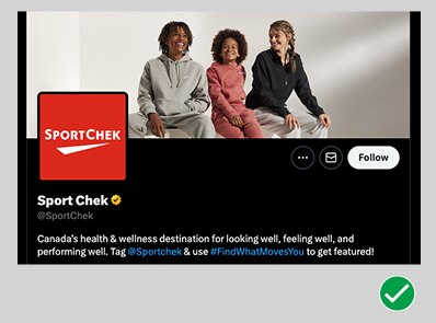
Do get close to your subjects, prioritizing emotion over products
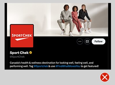
Don’t crop profile photos too wide – they will lose detail and interest
YouTube
YouTube wallpaper images must be designed at a 16:9 ratio, after which they are automatically cropped into various shapes for different devices and mediums. In most cases, the crop leaves only a very narrow slice from the middle of the image; accordingly, if you use a single lifestyle image it must be a very wide-angle shot.
Combinations of multiple images may also be used for YouTube – be sure to use on-brand conventions and follow necessary guidelines
Designing rock-solid YouTube wallpaper images can be tricky, so we've created a template to make things easier. Grab it from the Downloads section at the bottom of this page.
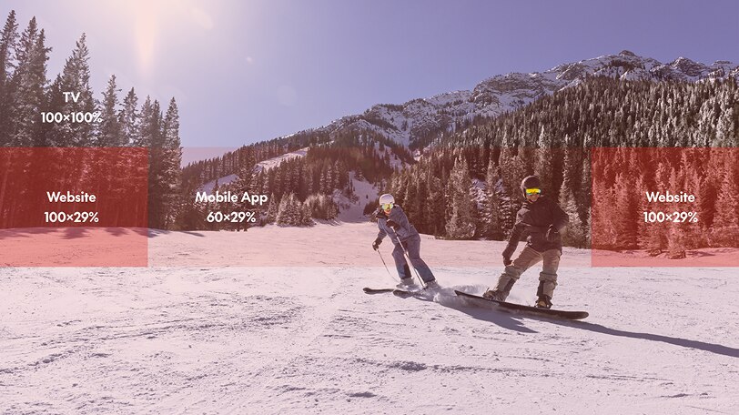
YouTube wallpaper images should be created at a 16:9 aspect ratio – their system automatically crops the image to fit the website, mobile app, and TV screens. The diagram above shows the safe areas for all three, in percentages of width and height with respect to the image
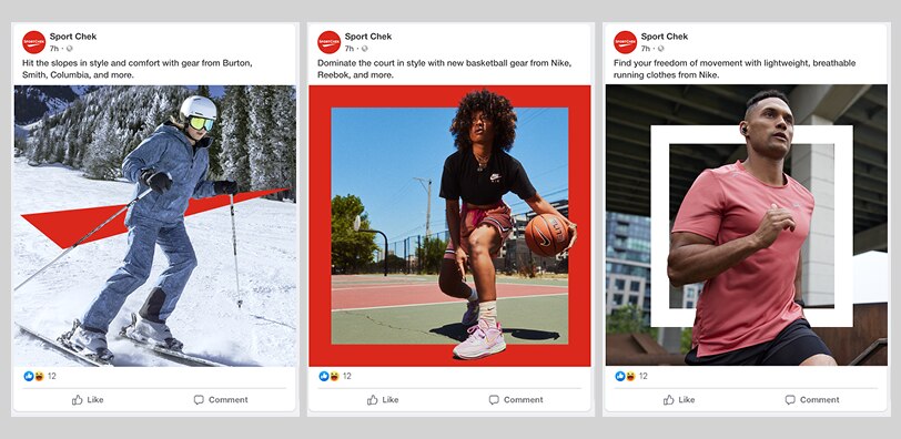
Post images
No matter the platform, there are some general conventions that should be followed when designing post images:
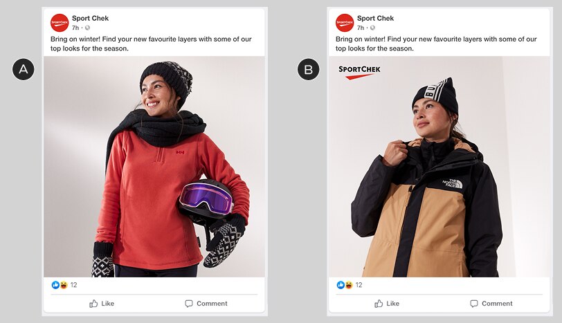
A – Single image view. Note the lack of Brandmark over the image: we don’t recommend adding one to organic posts because the avatar will always be visible
B – With optional Brandmark – see the application guidelines below
Optional Brandmark application
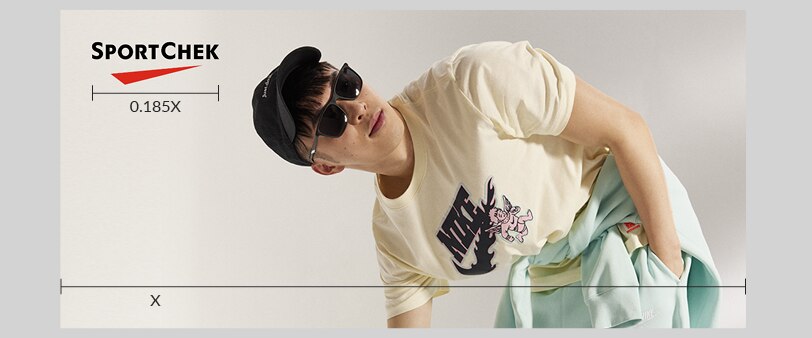
Always scale the Brandmark to 18.5% of the width of your image
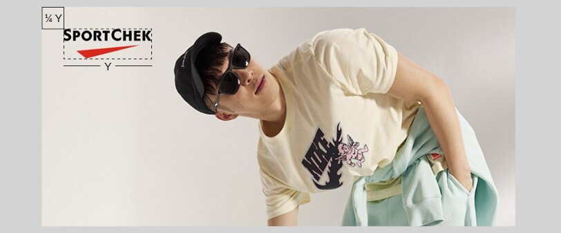
Always place the Brandmark in the top-left corner of the image, using the standard clear space requirements: 1/4 of the Brandmark's width from both the top and bottom edges
Graphic elements
To give post images a branded look without using the Brandmark, make use of our branded graphic elements, being sure to follow the guidelines for each type
3px border
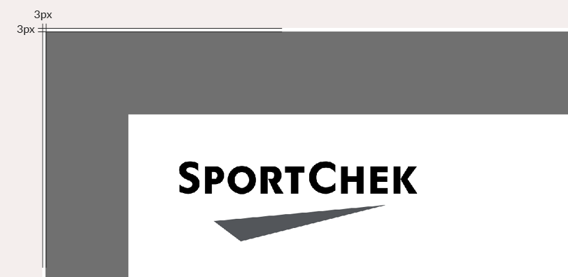
Carousel images must have a 3px white border on all sides: this keeps them from bleeding together
Aspect ratio
Most static images will be formatted in a 1:1 ratio – but if you're adapting a previously-designed 1:1 to a 9:16 format, you may do so using the 9:16 global safe zone, if desired.
Promo events/retail moments
Layouts for promo events & retail moments typically require more detail; as such, we've developed guidelines to help you quickly create consistent, on-brand layouts for static posts.
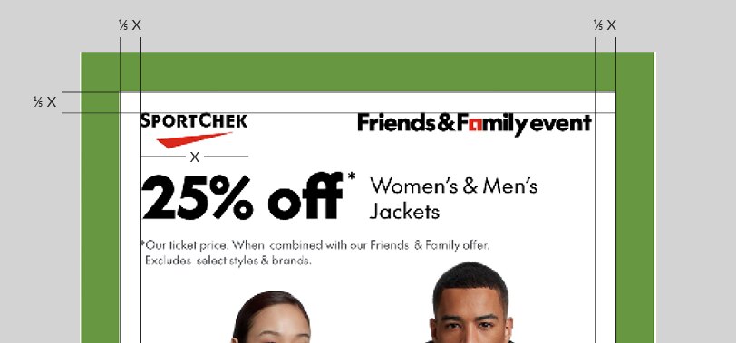
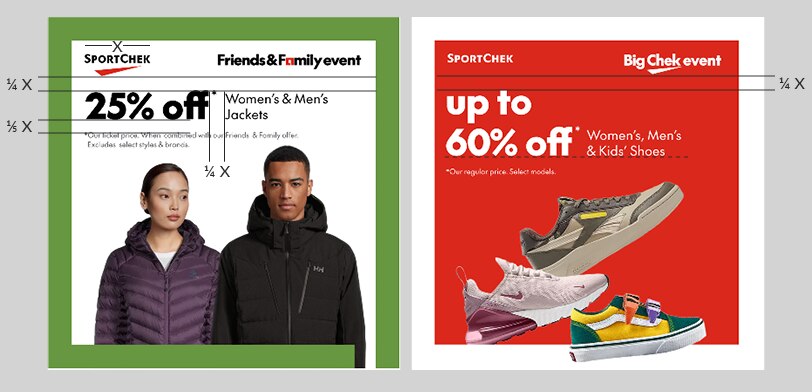
Basic layout
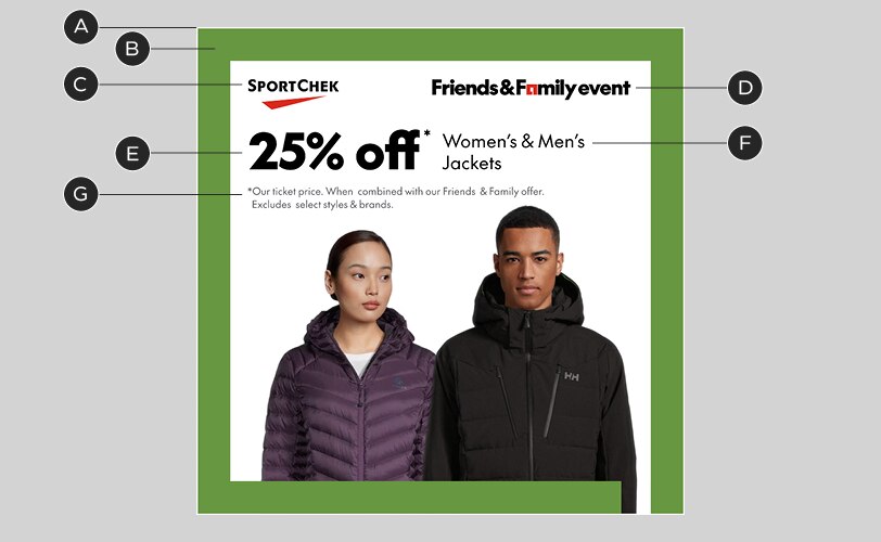
A – 3px white border
B – Chek Box frame: 6.5% of image width. Note that this is an exception to the general Chek Box guidelines.
C – Brandmark: see above for size guidelines
D – Event lockup: see below for size guidelines
E – Headline: 118/126px @1080x1080 canvas size*
F – Body copy: 40/48px @1080x1080 canvas size*
G – Legal copy: 22/29px @1080x1080 canvas size*
* Adjust type sizes proportionally for different widths of layouts
Lockup sizing & alignment
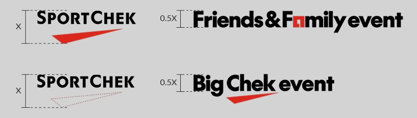
Size your lockups by adjusting the height of their capital letters to 50% the height of the full Brandmark. If you are using a separated (type-only) Brandmark, pretend that the Chek is still there when you adjust the size of your lockup

Always use the horizontal version of your event lockup, if available. Align the tops of the Brandmark and lockup
Margins & clear space
Layouts with Chek Box frames should use an inner margin of 1/5 the width of the Brandmark. This is an exception specifically for social media, due to spacing constraints
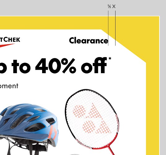
In Clearance layouts, lockups and text should maintain the 1/5-Brandmark-width distance from the point of contact with the cutout
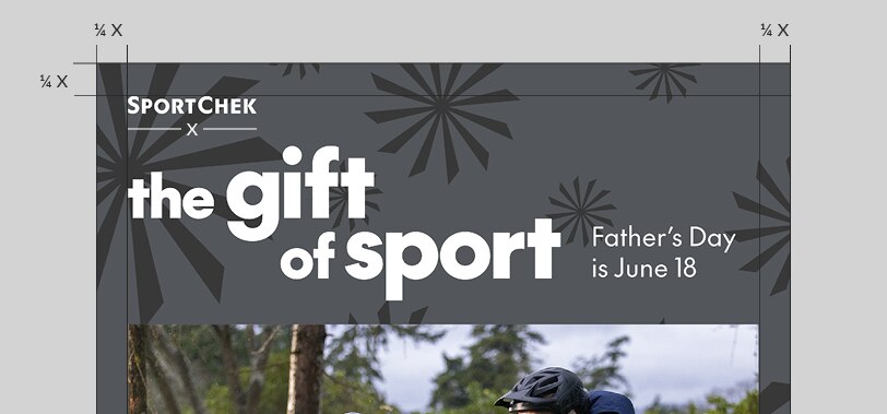
Layouts without Chek Box frames should revert to the standard margin: 1/4 the width of the Brandmark
Text spacing is also based on the width of the Brandmark:
• Headline sits 1/4-Brandmark-width from the bottom of the Brandmark or lockup, whichever is lower
• Body copy is 1/4-Brandmark-width from the headline, excluding asterisks. When placing body copy beside the headline, align it to the baseline of the last line of headline copy
• Legal copy is 1/5-Brandmark-width from the bottom of the headline
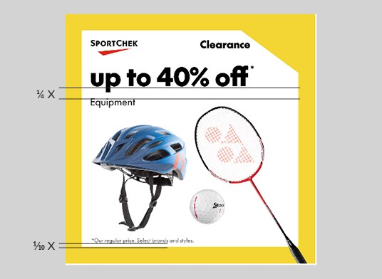
Body copy may be placed below the headline, using the same 1/4-Brandmark-width rule. Legal copy may be placed at the bottom of the layout, at 10% the Brandmark width from the bottom. Keep a consistent legal placement on all inner frames of carousels
9:16 video
The layout guidelines above generally refer to static layouts; there is more flexibility in video – always use the motion templates when possible. Videos, however, should still use the same sizing guidelines for the Brandmark, event lockups and legal copy.
Safe zones
Differences between social media platforms and smartphone dimensions can make it difficult to produce a single video that works in all situations.
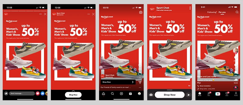
The same video frame on various social media platforms. Note the differences in left and right margins.
To avoid users seeing videos with cut-off text or key visuals, we have developed a universal safe zone for 9:16 video, available in the Motion section of this website. This safe zone accounts for size differences between platforms, as well as less common smartphone aspect ratios. See the universal safe zone.
Watch-outs
Videos need to work hard, but there are still some pitfalls to avoid if possible, even after paying attention to the safe zone:
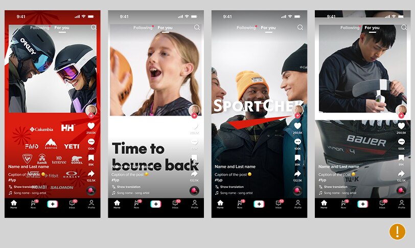
Groups of logos, layouts combining image and copy, or layered images don’t tend to do well with some interfaces, particularly TikTok. Simple is usually best.
Dynamic content
Dynamic content is likely to be template-based – but whenever possible, try to customize the template to match the Sport Chek visual identity as closely as can be done.
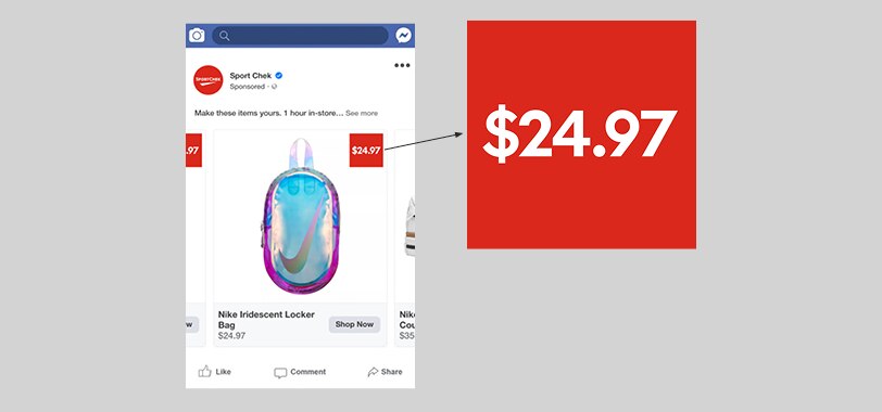
The price callouts in this Facebook dynamic ad should use our brand colours and font if possible, as well as a recognizable Sport Chek shape: a square box.