
New guidelines for product colour swatches in Feature Spot modules
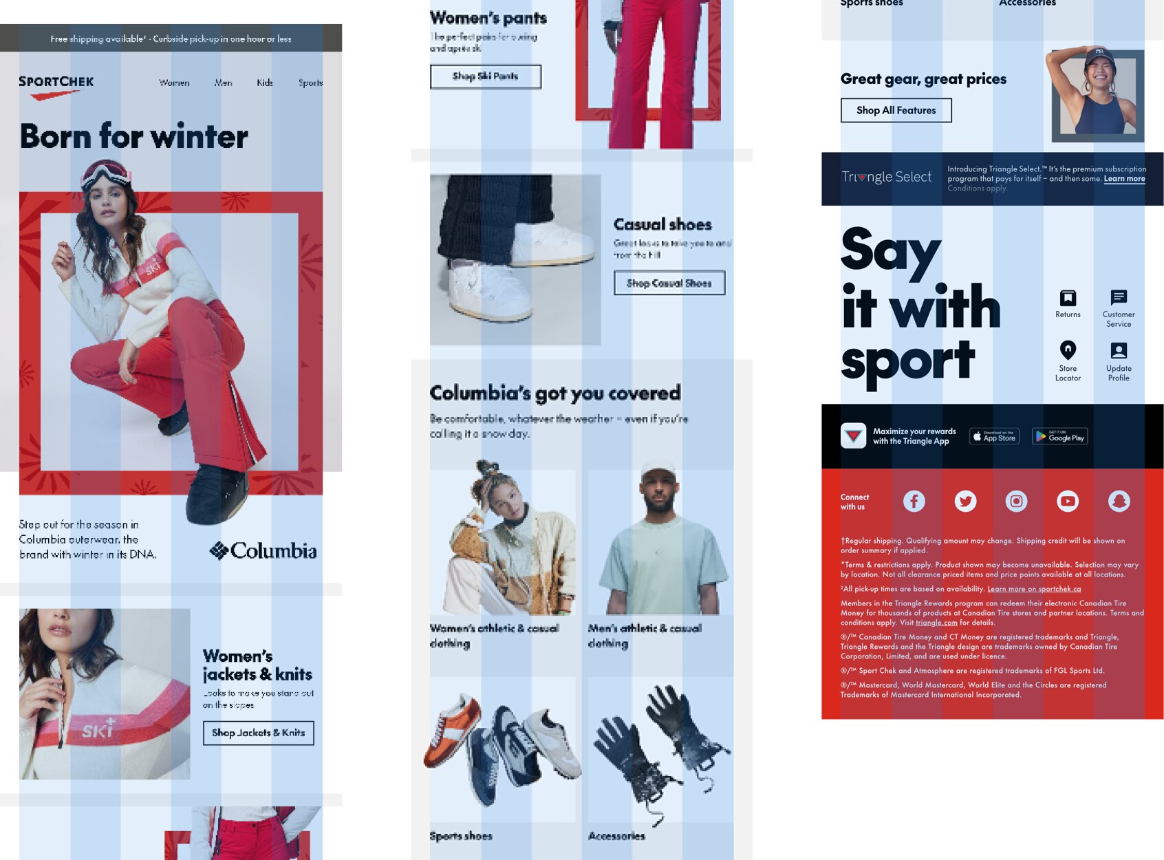
This is a system of tools, designed to handle the communication requirements for every type of email program, while streamlining the design process and maintaining a high level of brand consistency.
A modular system
There are no unique templates for different types of emails. Instead, this system is comprised of a set of modules that can be combined and customized to build every type of Sport Chek email.
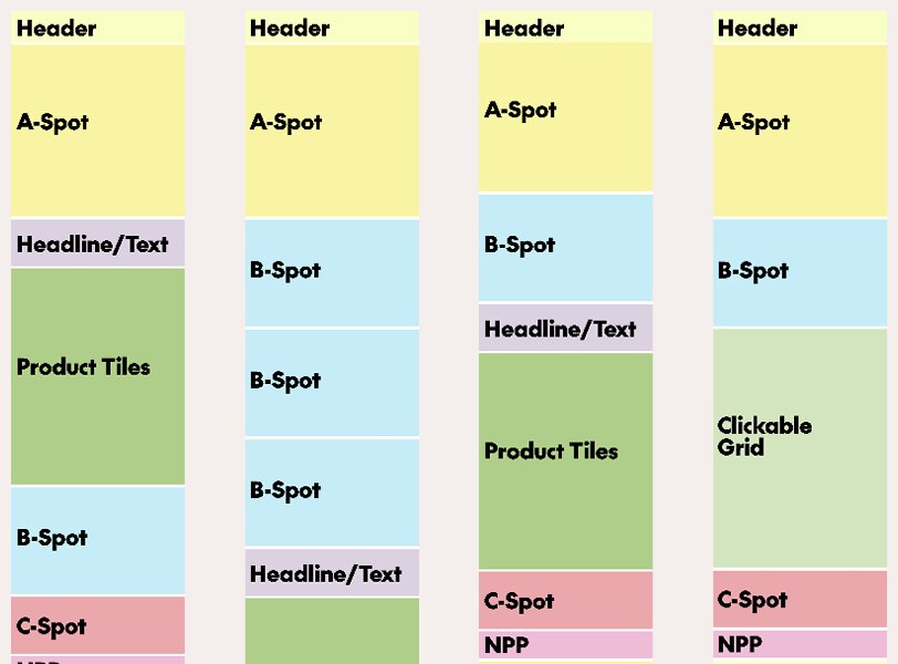
Each module has been designed with built-in margins, calibrated to work in combination with other module types. This means you can stack and rearrange modules without spending time worrying how they’ll fit together.
Build it once
Most modules are 100% image-based, including text. They are designed at desktop size and will scale up and down fit various browser widths. This means you will only ever need to design one layout for each module. Text sizes have been chosen to balance readability in both mobile and desktop environments, so it's important to follow the Typography guidelines outlines later on this page.
Fixed modules and responsiveness
A limited number of modules are fixed and not modifiable, with the exception of the Header. In general, using these modules in full email mockups is as simple as copy-and-pasting them into your artboard. Several fixed modules are also responsive, meaning there are separate layouts for desktop and mobile. This means that if you need to show a mobile mockup you will need to paste the mobile versions of these modules into your mobile layout.
Read more about fixed modules
Templates & slicing
Email templates have been built in Adobe XD at 640px—the width of our desktop emails. To ensure high quality emails, modules should be exported as individual groups at 2x size.
Grid
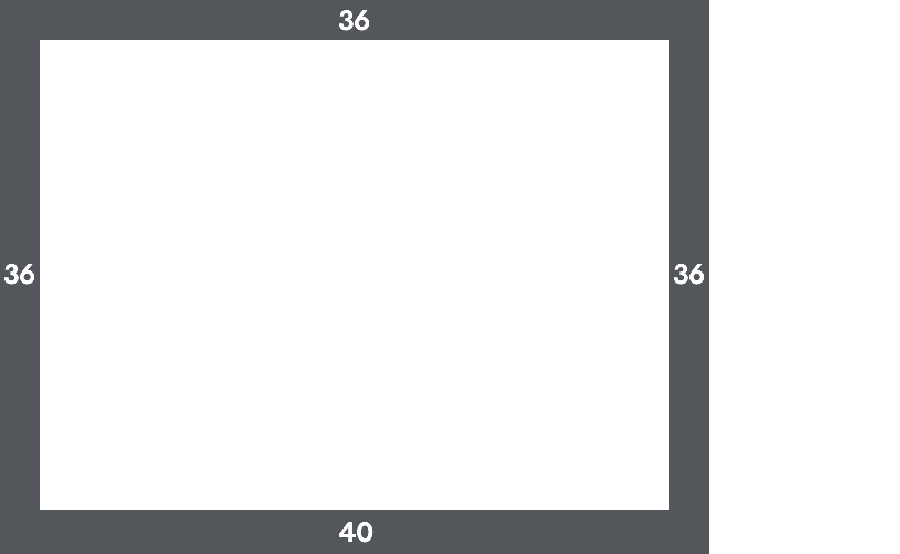
The 6-column grid sets the boundaries for text and box elements. Images and backgrounds may bleed into the margins. The grid is gutterless: the system is designed with object-level padding.
This grid features a thick margin to imply the Chek Box, no matter the content.
Grid construction
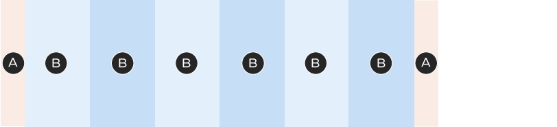
A – 36px
B – 94.7px
Total width: 640px
Chek Boxes
Chek Box sizing is standardized, with custom specs for each module to maintain consistency and to help speed up the design process. Adding a Chek Box to a module is as simple as turning on a layer. You may change the colour, but never the sizes or thicknesses of Chek Boxes.
Typography
Text is standardized across most modules. Sizing and colour is only customizable where indicated in this documentation. For most modules, you can assume that the type styles are not editable. For free-form units (like A-Spots or Banners/NPPs), you may choose the headline size and sometimes the body copy size.
Colour
Headlines & body copy


Legal copy


Fonts & Weights
• Titles 27px and above are set in SC The Future Black
• Titles 26 and below are set in SC The Future Bold. Bold is also used for emphasis within paragraphs
• Body copy is set in SC The Future Regular
• We don't typically use SC The Future Medium in emails, but it also may be useful for legibility with knocked-out body copy. Always test with the Regular weight first.
• Legal copy is set in SC The Future Regular, except at the bottom of the footer as live text, where it appears in Roboto Condensed.
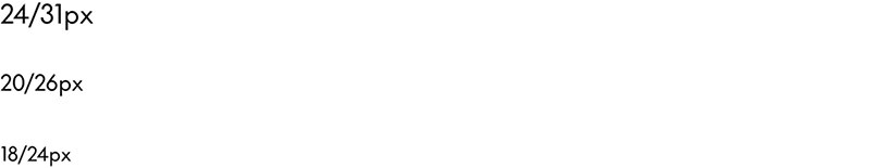
Common headline sizes & line height
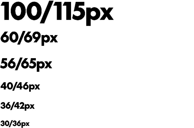
Body copy size/line height options
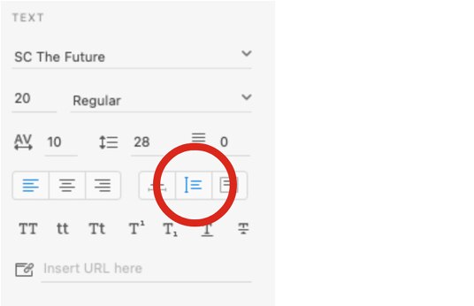
Only use these options for body copy. Note: to aid legibility, body copy tracking should be set to 10. In Adobe XD this property is called character spacing.
Legal copy sizes & line height
With the exception of the footer, legal copy is always set at 14/18px with no added tracking. Legal can sit within the bottom padding of modules.

Asterisks & other notations
Always apply superscript styling to asterisks, daggers, section marks and numerical foot/end notations, to keep them from overwhelming the copy. Note: this is not necessary in the 14px ("mice type") legal.
Without superscript
With superscript
Exception: A-Spots
Since A-Spots require more design attention than other modules, take the time to add a custom-sized asterisk. This asterisk should be created using a new text box and placed manually next to the copy.

A – Asterisk: 35% of headline font size
B – Spacing: 10% of asterisk font size
The asterisk's font size should be 35% of the headline font size. The spacing between the headline and the asterisk should be 10% of the asterisk's font size (rounded to the nearest pixel). For instance, with a headline size of 100px, the asterisk should be set at 35px and spaced 4px from the headline.
Tables
If an email requires tabular content, follow these guidelines to create your table:
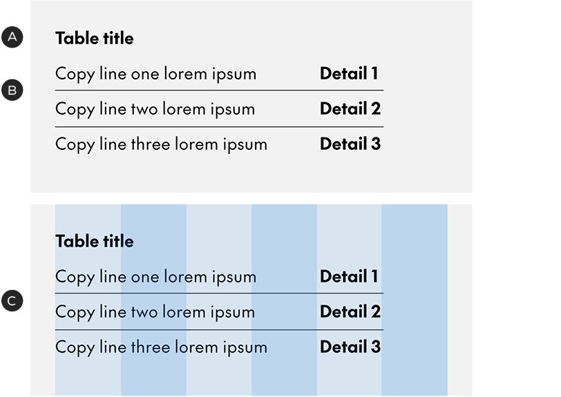
A – Title set in SC The Future Bold
B – Body copy is the same size as the title. Copy should be set with paragraph spacing at 50% of the leading size; eg. if the text is set in 24/34px, the paragraph spacing should be 17px
C – When possible, use the grid to organize the columns in your table (tables can be as narrow or as wide as needed, as long as they remain within the outer margins)
Product descriptions & brand names
When setting product descriptions in regular-weight body copy, set the brand name in bold.
Discount codes
Many discount codes will appear in a Dynamic Discount Code module but there may be instances where a custom solution is required. In this case, follow these guidelines to keep the codes consistent and usable.
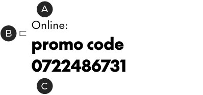
Numerical codes
A – Title set in SC The Future Regular, 20/28px with tracking set to 10
B – 7px spacing below title (aligns to text boxes – see Default Spacing section for details)
C – Code set in SC The Future Black, 30/41px with tracking set to 10
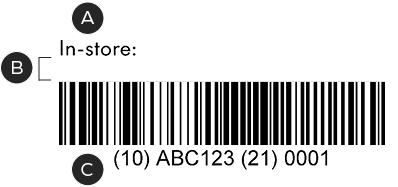
Barcodes
A – Title set in SC The Future Regular, 20/28px with tracking set to 10
B – 20px spacing below title (align to text box – see Default Spacing section for details)
C – Barcode, 320px wide: this is a safe minimum for scanning
Copy divider
In the rare instance that there is body copy and a product name/price point in the same module, the copy and details should be divided by a 96px horizontal rule in black, with 30px of padding above and below it.
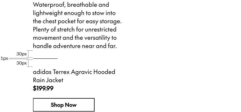
A block of body copy and a product description/price, separated by the copy divider. There are 30px of space above and below the divider; the blocks of copy do not have additional padding. The divider is always Black.
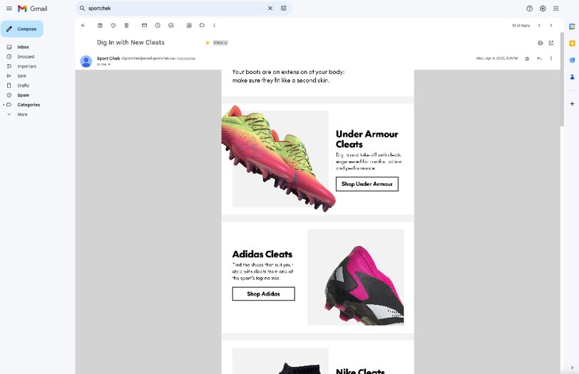
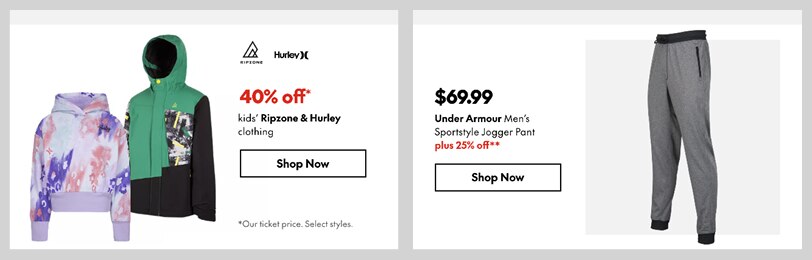
Colour swatches
From time to time, colour swatches may appear in Feature Spot modules, displaying the range of colours or patterns available for an item – to a maximum of six swatches per module.
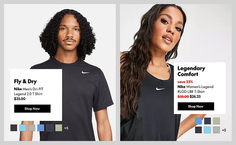
Colour swatches are based on the ODP style but customized to match the email templates. Swatches beyond the maximum of six are represented by a number.
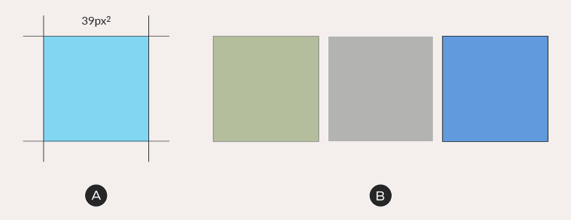
A – Set your swatches at 39 pixels square. If they are already on the website, you can copy and paste them directly into Adobe XD.
B – Add a 1px border at 50% grey (#808080). If you require more contrast with the background, use either white or black. All swatches in the same module must use the same border colour.
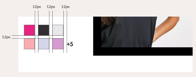
You may apply swatches in a single row or stack them, depending on your layout. Always space swatches at 12 pixels from each other. If an item has more than six colours or patterns available, annotate them with a +X set in SC The Future Medium at 20/26px. Annotations are also spaced at 12px from the swatches.
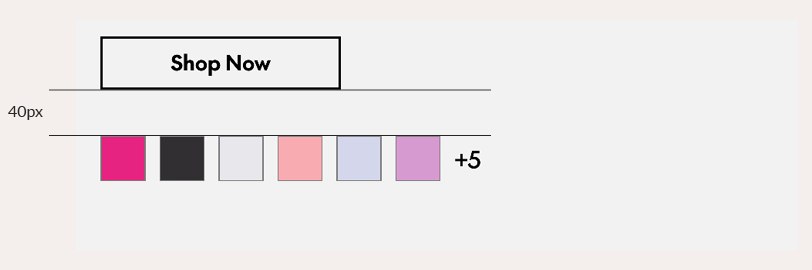
Place swatches 40px below buttons or text.
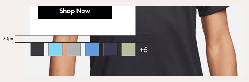
Place swatches 20px away from all other foreground elements.
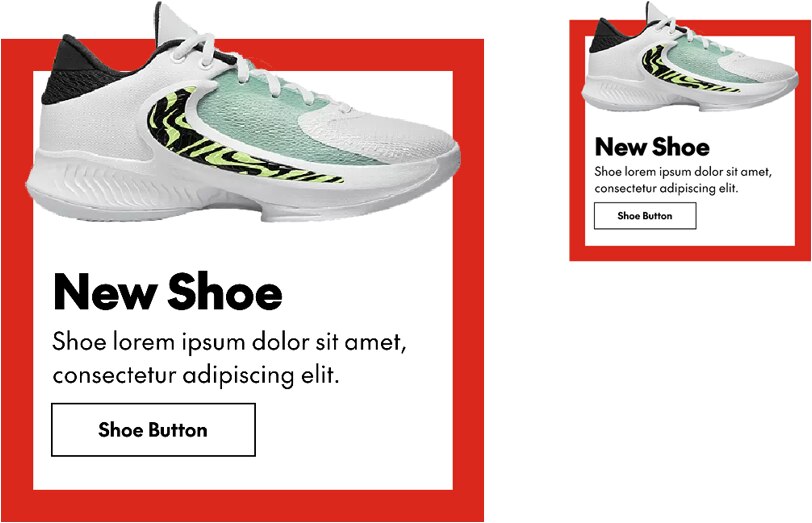
Buttons & links
Emails use a fixed-width button in two different styles: solid and ghost (outlined). Always start with the pre-designed button components from the XD template file, changing the text and colour as needed.
Button construction & character limit
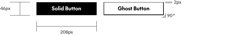
Button width and height is fixed, which means copy must fit within the limit of approximately 21 characters (including spaces). Never change the dimensions of buttons. Text is always set in SC The Future Bold at 18px, with character spacing set to 0.
Buttons are typically set in either Black or White but it's also possible to use SC Red – generally for the solid button only. The ghost button is built using a 2px solid inner stroke and no fill colour – the background colour of the module should show through.
Unlike the ODP style, Sport Chek email buttons have square corners.
Button hierarchy
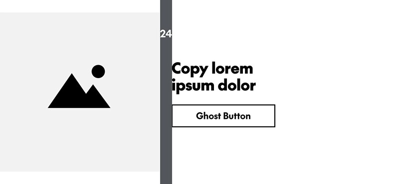
A solid button represents the primary call-to-action in an email – it should only ever be used once per layout. This could be in the A-Spot or farther down the page, if the A-Spot doesn't require a CTA. Use ghost buttons for secondary calls-to-action, eg. in B-Spots.
Text links
Text links are for times when a call-to-action doesn't need to be prominent. These are created by simply bolding and underlining the body copy (use the Bold weight).
Default spacing
When designing free-form modules, like A-Spots and Banners/NPPs, use the guidelines here to pad your modules and space out the elements within them.
Default margins & gutters
In general, there should be 24px of gutter space between elements within a module. This can be altered if necessary. Just ensure there is harmony with the modules above and below.
Default text & button spacing
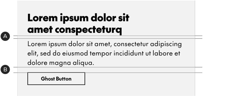
Text and buttons use a space-above model. The spacing comes before the element, not after it.
A – 10px above body copy
B – 20px above buttons
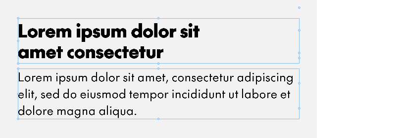
Note that, in Adobe XD, as in HTML, spacing is defined as the distance between the text boxes (shown here in blue) – not the baseline to cap height
For accurate spacing between text boxes, they must be set to Auto Height in Adobe XD.
When lockups are combined with body copy, the spacing is the same: 10px above the copy.
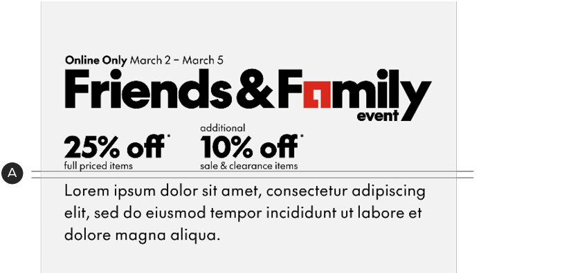
A – 10px above body copy, even with lockups
Legal copy sits 20px from the bottom of its module (unless noted), breaking the 40px default margin.
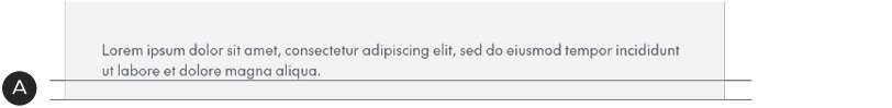
A – 20px between the legal and the bottom of the module
Rails
The "rails" of the email—which is the background visible to the left and right of the email in desktop—have a standard colour (#D3D3D3) to give the email form. Keep this in mind, especially when using images that bleed off the edge of the layout.