
Guidelines defining when to keep and when to remove the grey spacer above B-Spots.
Guidelines for multiple lifestyle images in A-Spots
New module for dealing with more than one CTA in A-Spots
Editable modules, page 1/2
This is the first of two pages regarding editable modules. The content in these modules can be customized per the guidelines on this page. All modules are 640px wide unless stated otherwise.
Whisper
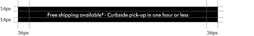
The Whisper module is used to announce broad benefits, like Free Shipping; or messages unrelated to the body of the email, like upcoming dates or brand/social copy. The Whisper should only be used once per email and always appear at the very top.
Colour
You can use any colour in the Whisper's background; it can also include images. The standard Whisper colours are Black, Mid Grey, SC Red or Faint Grey.
Content
The standard Whisper typically contains a Free Shipping/Curbside Pickup message but can be altered to contain different communications. In these cases, the shipping/pickup message could be moved to a C-Spot or Banner/NPP unit below the A-spot to respect the one-Whisper rule.
Text
Headlines: flexible size; see general typography guidelines. Character limit: ~77
A-Spot
The A-Spot is a module meant for big, bold messages and introducing the key theme of the email. The A-Spot should always be connected with the email's subject line.
A-Spots are flexible-height units, stretching to fit the content, but the copy should always be simple and clear.
As long as margins, typographic styles and brand guidelines are observed, the A-Spot is a blank canvas with near-unlimited layout potential.
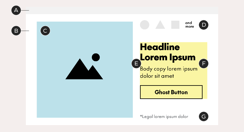
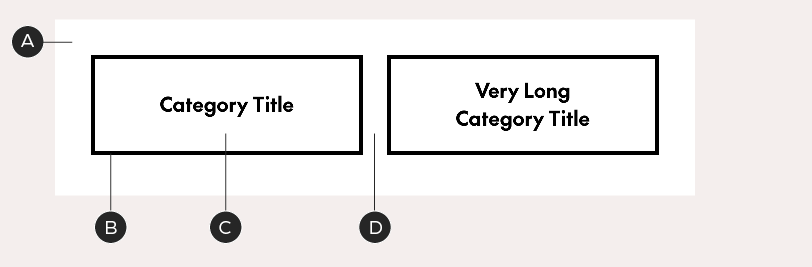
Grid
A-Spots use a series of grid lines, spaced out at 18px each to define where text sits. Text should sit on the outermost-possible grid line, moving inward only to make room for Chek Boxes.
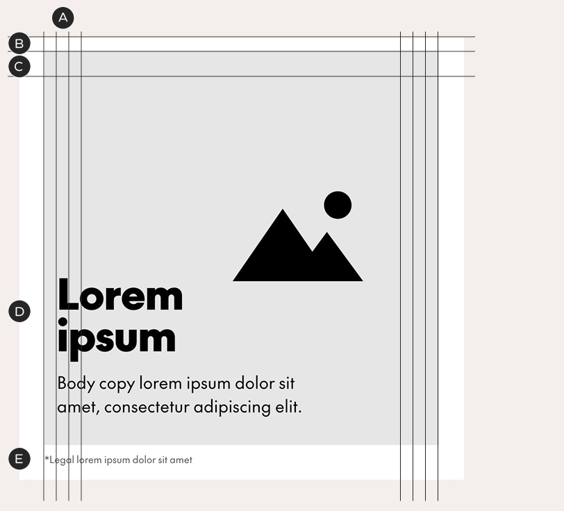
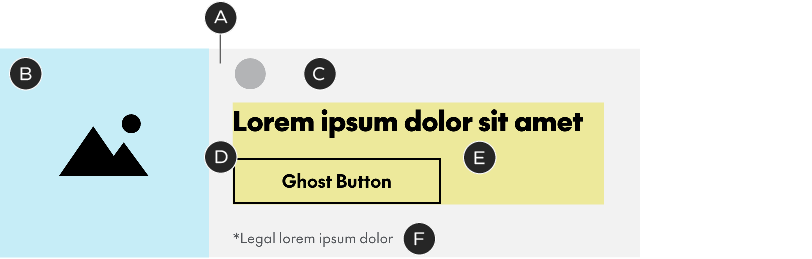
A – Four grid lines sit on each side of the A-Spot's image zone (within the 36px email margins). They are spaced 18px apart
B – A 20-px image buffer zone sits above the image. Headlines that sit above the image also sit above this buffer
C – Leave 36px of clear space at the top of the image (text may not enter this area)
D – This text sits inside an image with an implied Chek Box, so it is positioned against the second grid line
E – Copy that falls outside of the image zone, like this piece of legal, aligns to the first grid line
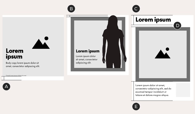
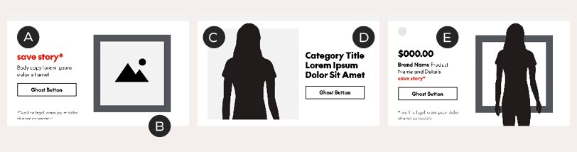
Examples of A-Spots with different text alignments
A – A full-bleed image means all text can sit on the first grid line
B – A visible Chek Box pushes text inside it to the fourth grid line. The optional A-Spot Chek Box is 568px² with a 36px border. You may change the colour of the box but do not alter its size, thickness. Do not bleed the Chek Box off the top or bottom of the A-Spot.
C – An implied Chek Box pushes the headline to the second grid line; but in this case, the body copy is set outside of the image, on the first grid line

Height and clear space
A-Spots are flexible-height units. In the basic A-Spot layout, the image zone sits against the top edge of the frame with a 20px buffer space for a protruding part of an isolated photograph. This buffer space is always white. The top of the A-Spot can also flex upwards to accommodate text – when this happens, the 20px buffer remains attached to the image zone. Space below the A-Spot is also flexible, although there must always be at least 40px of clear space at the bottom (20px if there's legal copy).
A – Basic A-Spot with full-bleed image and 40px of clear space at bottom
B – The top of this photograph protrudes into the 20px buffer zone. The background colour of this zone is always white
C – This A-Spot flexes to make room for a headline at the top
D – The 20px buffer remains above the image zone
E – The bottom of the A-Spot flexes to include body copy below the image
Feature Box
A pre-sized square, called the Feature Box, can be used to contain images or logos. It should be 146px² and must be aligned to the furthest grid line to the right.
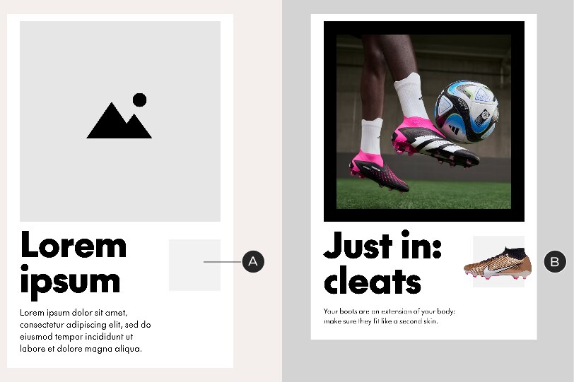
A – Feature Box. The default background colour is Faint Grey but can be anything of your choosing
B – In-situ example with isolated product shot
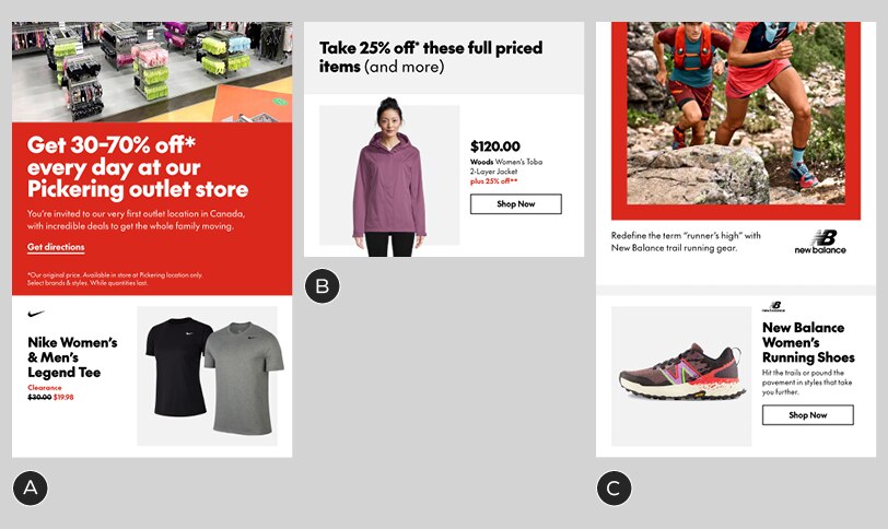
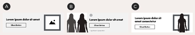
Multiple lifestyle images
If you need to combine two or more lifestyle images in an A-Spot, use one of the following methods.
Method 1: use inlaid Chek Boxes. Create purposeful separation between each image by containing one or more within a visible or implied Chek Box. Always follow the Graphic Elements guidelines when working with custom Chek Boxes.
Method 2: use an animated GIF. These should be made by switching between images with a simple cut and holding on each image for 3 seconds. The headline/body copy/button should be the same on each frame and sit in exactly the same position.
Multiple calls-to-action
When an A-Spot requires more than one CTA, do not place your calls-to-action within the A-Spot – use the A-Spot Split CTA module instead (guidelines below).
Text
Headlines: flexible size; see general typography guidelines. Character limit: none
Body copy: 24/34px. Character limit: none
Legal: see general typography guidelines
A-Spot Split CTA
When an A-Spot requires multiple calls-to-action, the CTAs must be placed in a separate module that allows for links to different URLs: the A-Spot Split CTA module. This module may only ever appear below the A-Spot and must use text links, never buttons.
An A-Spot Split CTA module, sitting below an A-Spot.
A-Spot Split CTAs are comprised of two equal halves and are flexible-height units, responding to the length of the content within them. Do not alter the position or styling of the links, aside from changes in colour.

Each text link leads to a different URL
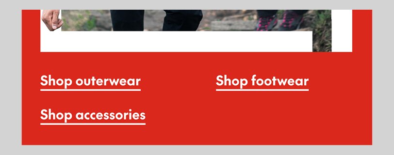
A second row of links may be added if necessary. To do this, simply add extra keyboard returns – the module height will respond accordingly.
Text
Text links: 24/34px. Character limit: none
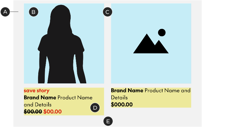
B-Spot
The B-Spot is for big, bold product imagery and brand callouts. It is a fixed-height, fixed-colour module. You may only change the imagery, copy or image position. We strongly encourage using a back-and-forth (z-pattern) layout when stacking B-Spots, which makes the page more readable and can increase engagement.
Construction and colour
B-Spots begin with a built-in 24px spacer, in Faint Grey, which helps to separate them from other modules. The rest of the module always sits on a white background. Do not change the background colour. You may use a coloured image zone OR a visible Chek Box but not both.
A – Spacer – 24px tall in Faint Grey
B – Background box – 370px tall, White
C – Image zone – 320px²; crop full-bleed images inside this box. Images may protrude from the image zone but may not enter the spacer (A). You may assign a colour or a pattern to this zone. The image zone must always be a square – never change its dimensions
D – Logo zone – logos must be in Black or White, no more than 30px tall or 40px wide, and be spaced out by 20px each. Logos sit 20px below the spacer. If required, use the "and more" copy provided in the templates.
E – Gutter – 24px wide
F – Copy zone – this is a flexible-height zone, growing and shrinking with changes in length. It must always be centered vertically in the white background box. All elements (headline, body copy, button) are optional. In B-Spots, body copy's space above is 6px instead of the standard 10
G – Legal zone – legal sits 20px above the bottom of the background box. If it spills onto multiple lines, move it upwards to maintain the 20px padding
Variations
A – This image-right B-Spot leads with a save story
B – B-Spots come with an optional Chek Box, which is 272px² with a 24px border thickness. You may change the colour of the box but do not alter its size, thickness, or position
C – On-body or product shots may be cropped by the image zone, the edges of the background box, or a combination of both
D – Example of a B-Spot with a category instead of a product. Note the loss of the optional body copy
E – B-Spot leading with a price
Text
Headlines: 30/34px
Body copy: 18/24 with 6px of space above instead of 10
Legal: see general typography guidelines
Character limits: 41 characters for headlines, 82 characters for body copy (assuming three lines of text for each and one line of legal). These are the extreme limits and less copy is recommended. Shorter headlines or body copy will increase the character limit in the other.
Spacer exceptions
The 24px grey spacer may be omitted in instances where it conflicts with the module that comes above it.
A – Remove: the red background in this A-Spot would make the grey spacer look out of place
B – Remove: since the background colour on this Standalone Copy Block matches the spacer, it would make the B-Spot look like it sits too far below the text.
C – Keep: without the spacer, this A-Spot's white background would bleed into the B-Spot. Keep the spacer in this instance
C-Spot
C-Spots are like simplified B-Spots and are great for quick hits of information at a lower hierarchy from the main email message. They are fixed-height, fixed-colour modules – you may only change the imagery and copy. Like B-Spots, they can be laid out in a z-pattern, but we recommend avoiding too many C-Spots in the same email. C-Spots are meant to be presented near the end of the email, typically only one per email, and not peppered throughout the layout. See the Email Construction page for more details on laying out emails.
Construction and colour
Unlike B-Spots, C-Spots have no top spacer. The also do not allow body copy – only headlines and buttons – and they do not support promo lockups. If the content requires body copy, a long headline or a promo lockup, use a different module. C-Spots sit on either a Faint Grey or White background; use only these background colours. You may use a coloured image zone OR a visible Chek Box – but not both.
A – Background box – 209px tall, Faint Grey or White
B – Image zone – 209px²; crop full-bleed images inside this box. Images may protrude from the image zone. You may assign a colour or a pattern to this zone
C – Logo zone – logos must be in Black or White, no more than 30px tall or 40px wide, and sit 10px below the spacer. We do not recommend using C-Spots for content that requires multiple brand logos.
D – Gutter – 24px wide
E – Copy zone – this is a flexible-height zone, growing and shrinking with changes in length. It must always be centered vertically in the background box. All elements (headline, button) are optional. There is no body copy in C-Spots
F – Legal zone – legal sits 10px above the bottom of the background box, breaking the standard 20px rule. If it spills onto multiple lines, move it upwards to maintain the 10px padding
C-Spot example
Variations
A – C-Spots come with an optional Chek Box, which is 173px² with a 16px border thickness. You may change the colour of the box but do not alter its size, thickness, or position
B – On-body or product shots may be cropped by the image zone, the edges of the background box, or a combination of both
C – This image-right C-Spot has a long headline – the copy zone has been re-centered vertically. This C-Spot sits on a white background
Text
Headlines: 27/32px. Character limit: ~56
Legal: see general typography guidelines
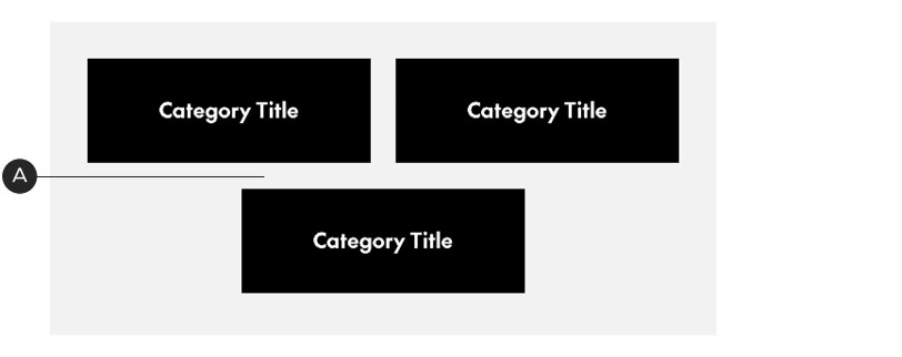
Category Tiles
This single-row module is designed to be stacked to create grids of categories. These modules may be combined to showcase 2, 4 or 6 categories. In order to prevent reader fatigue, we don’t recommend exceeding three rows of content.
Construction and colour
This is a flexible-height unit; its dimensions are dictated by the longest block of copy. The colour options for this module are the same as Product Tiles – Faint Grey with White image zones and White with Faint Grey image zones.
You may use isolated on-body photography, SKU photos or lifestyle shots. Unlike Product Tiles, these images may extend past the boundaries of the square. This module allows an optional logo in the image zone.
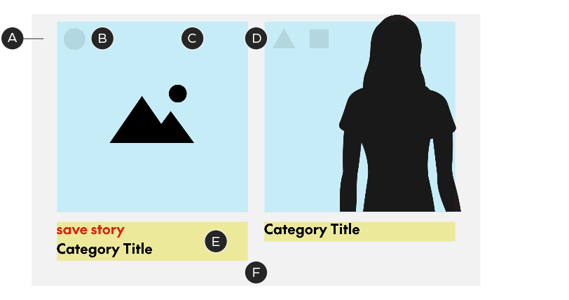
A – Background box – Faint Grey or White with 10px of top padding
B – Logo zone – logos must be in Black or White, no more than 30px tall or 40px wide, sit 10px below the top of the image zone and be spaced out by 20px each
C – Image zone – 272px²; crop all images inside this box. Images may protrude from the image zone – but only within the confines of the background box. We recommend not allowing them to protrude from the bottom of the square.
D – Gutter – 24px wide
E – Copy zone – this is a flexible-height zone, growing and shrinking with changes in length. It must always sit 10px below the image zone. Optional Save Stories should follow Save Story guidelines. There are no buttons in Category Tiles
F – Bottom padding – 40px. Include this padding with every row when stacking tiles
When stacking Category Tiles, always use the same background colour for each row to make the modules feel like a single layout element.
Variations
A – Category Tile module in Faint Grey with White image zones
B – Module in White with Faint Grey image zones; no logos
C – Clearance version with cropped corners – use only in Clearance emails
Text
Body copy: 20/28px, bold. Character limit: none
Adding buttons
Like Product Tiles, Category Tiles do not include buttons, but you can create a general CTA by adding a Standalone Button module to the bottom of your Category Tile layout.
Text-Based Category Tiles
This module is to be used when no images are available. It consists of
1 – 3 rows of tiles with simple category name. Note: these are not to be confused with buttons and should never be used outside of this module. The tiles may be set in Black or White and used with a background in Faint Grey, White or Clearance Yellow. Do not change the type size or style.
A – Background box – Faint Grey, White or Clearance Yellow with the standard 36–36-40-36px padding
B – Tile – 272x100px with a 4px border in Black. The border is always present, even if the tile background is set to Black
C – Category title – SC The Future Bold, 20/28px, in Black or White. Maximum two lines of copy.
D – Gutter – 24px wide
Stacked category tiles in Black on a Faint Grey background. When there's an uneven number of tiles, the last one is centered.
A – When tiles stack, the space between each row is 24px. The padding around the group of tiles remains the standard 36-36-40-36px
Text
Body copy: 20/28px, bold. Character limit: ~48
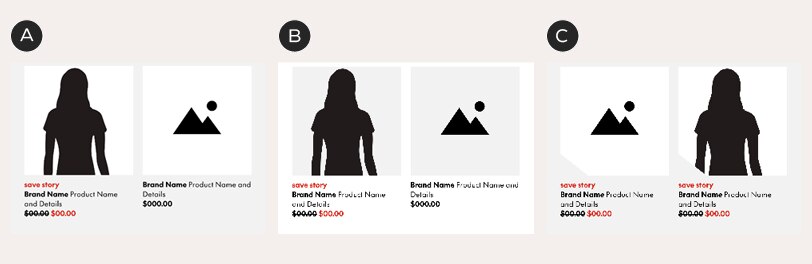
Product Tiles
Product Tiles, like Category Tiles, consist of stackable rows of square-cropped products in 1×2 sections. These modules may be combined to showcase 2, 4 or 6 products. As with Category Tiles, we don’t recommend exceeding three rows of content.
Construction and colour
This is a flexible-height unit; its dimensions are dictated by the longest block of copy. There are two colour options for this module – Faint Grey with White image zones and white with Faint Grey image zones.
You may use isolated on-body photography, SKU photos or lifestyle shots and all must fit within the image area – do not extend images past the boundaries of the square.
A – Background box – Faint Grey or White with 10px of top padding
B – Image zone – 272px²; crop all images inside this box. Images may not protrude from the image zone
C – Gutter – 24px wide
D – Copy zone – this is a flexible-height zone, growing and shrinking with changes in length. It must always sit 10px below the image zone. Optional elements (Save Story, discount) should follow Save Story guidelines. There are no buttons in Product Tiles
E – Bottom padding – 40px. Include this padding with every row when stacking tiles
When stacking Product Tiles, always use the same background colour for each row to make the modules feel like a single layout element.
Variations
A – Product Tile module in Faint Grey with White image zones
B – Module in White with Faint Grey image zones
C – Clearance version with cropped corners – use only in Clearance emails
Text
Body copy: 18/24px. Character limit: none
Adding buttons
Product Tiles do not include buttons – but you can create a general CTA by adding a Standalone Button module to the bottom of your Product Tile layout.