Editable modules, page 2/2
This is the second of two pages regarding editable modules. The content in these modules can be customized per the guidelines on this page. All modules are 640px wide unless stated otherwise.
Feature Spots
These modules allow for large, mid-page callouts to add visual interest and/or call out a featured product. Multiple variations help you keep things fresh. Feature Spots excel at showing off custom photography or vendor-provided media, but can be equally impactful using SKU images.
There are three types of Feature Spots, each with their own set of guidelines. Some general rules: body copy in Feature Spots should always be 20/28px; you may use any size of headline. All Feature Spots are flexible-height. You may apply background colours other than White, when it makes sense, as well as Promo Patterns.
Type 1
Full-bleed images with text inset in White squares. This Feature Spot works best with big, beautiful images and short copy.
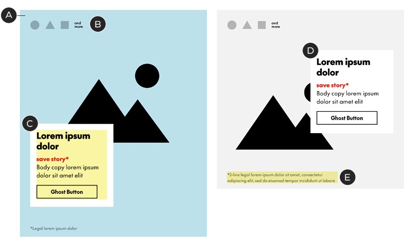
A – Images are full-bleed, edge-to-edge – breaking the standard 36px margins. The size of the image determines the height of the module in this variation
B – Logos (optional) must be in Black or White, no more than 30px tall or 40px wide, and be spaced out by 20px each. Logos sit 36px from the top and 36px from the left edge. If required, use the "and more" copy provided in the templates
C – Copy sits inside a 284px² White square. The copy’s minimum padding is 21px left-right and 18px top-bottom. Do not change the size or colour of the square. If longer copy is required, it's best to choose a different module, like Type 2 (see below)
D – The copy block may sit on either the left or right margin and be placed in any vertical position (min. 36px from top, 40px from bottom)
E – Legal copy sits 21px from the bottom and is 379px wide
Headlines: any size; see general typography guidelines for details
Body copy: 20/28px
Legal: see general typography guidelines
Character limits: 33 for headlines, 75 for body assuming two and three lines of type with a button. Shorter headlines or body copy will increase the character limit in the other.
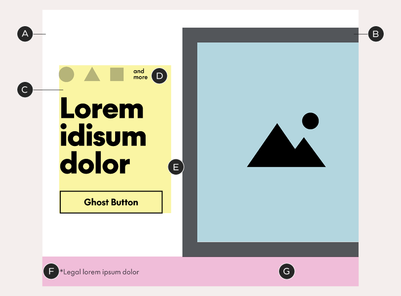
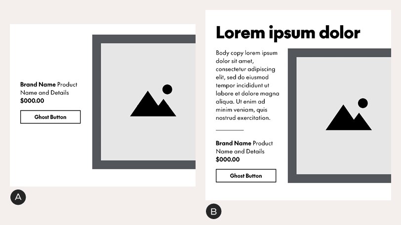
Type 2
Implied Chek Box with text below. This type of Feature Spot can be treated like a jumbo B-Spot or used to pair a long block of copy with a large image.
A – Images sit inside an implied Chek Box, using the standard 36px margins on the top and sides
B – Logos (optional) must be in Black or White, no more than 30px tall or 40px wide, and be spaced out by 20px each. Logos sit 20px from the top and 20px from the left edge. If required, use the "and more" copy provided in the templates
C – The copy zone is 473px wide and sits 18px below the image zone. It can be as tall as necessary
D – Single logos may also appear in a feature box 18px below the image area. Feature boxes can be in a colour of your choosing (or White), are 90px² and must be aligned to the right margin. See the A-Spot guidelines for more on feature boxes.
E – Legal sits outside of the copy zone, at least 20px below the copy zone and 20px above the bottom of the module
F – Images may protrude from the Chek Box, extending the module upwards – always include 36px of white space at the top
G – Bottom padding – 60px
Headlines: any size; see general typography guidelines for details
Body copy: 20/28px
Legal: see general typography guidelines
Character limits: none
Type 3
Offset Chek Box with sidebar text. This type creates an unexpected shape by pushing the Chek Box off the right side of the email. It works best with short, punchy headlines or simple product descriptions.
A – Background box – default colour is White but may be customized. 640px tall; 36px top padding
B – Visible Chek Box, 356x464px, with a 30px border. It breaks the standard margin on the right side, sitting against the edge of the email layout. You may change the colour of the box but do not alter its size, thickness, or position. Images may protrude from the box
C – The copy zone is 224px wide and vertically-centered with the Chek Box. It sits 36px from the left edge of the email – the standard margin width
D – Logos (optional) sit within the copy zone in this variation. They must be in Black or White, no more than 30px tall or 40px wide, sit 20px above the headline or copy, and be spaced out by 20px each. If required, use the "and more" copy provided in the templates
E – Gutter – 24px
F – Legal sits outside of the copy zone, 20px from bottom edge of background box
G – Bottom padding – 60px
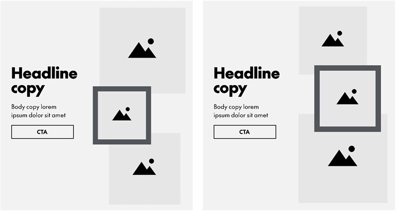
Type 3 variations
A – Example with product copy instead of a headline. Always re-center the copy zone in the Chek Box as the length of copy changes
B – Example with headline set above the Chek Box in a copy-heavy layouts. There is 20px between headline and Chek Box and the height of the background box is extended to preserve the 36px padding. This example shows the maximum amount of body copy possible in this unit – it should never exceed the height of the Chek Box.
Type 3 Feature Spots include an option for a triptych. There are three pre-formatted layouts from which you can choose, each with two borderless images and one image inside a visible Chek Box. Do not change the size/position of the image frames or the Chek Box thickness.
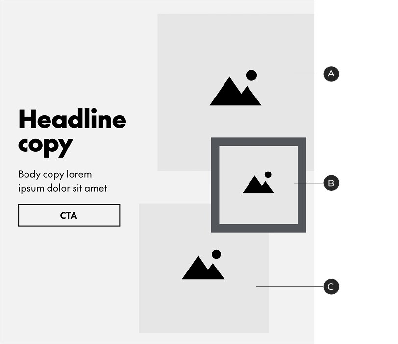
Type 3: tryptych option A
A, C – Crop full-bleed photography inside these boxes. Images may protrude from the boxes
B – A third full-bleed image or a SKU shot can be placed inside this box (images may also protrude from the frame)
Type 3: tryptych options B and C
Triptych example
Headlines: any size; see general typography guidelines for details
Body copy: 20/28px
Legal: see general typography guidelines
Character limits
• Headlines set above the image: none
• Only body copy and button beside image (with button): ~300
• Only headline beside image (with button): ~45 – this assumes a
headline size of 56px – smaller text will allow for more characters
• Adding the copy divider, to separate body copy from a product
description and price, removes 45 characters from the copy limit
Standalone Copy Block
This flexible-height module can accommodate any combination of headline, body copy and buttons. Note that this is still exported as a rasterized image. Among other things, Standalone Copy Blocks can be used to create titles for sections of B-Spots or Product/Category tiles.
This module may use Black or White text in combination with any background colour. Headline size can be customized; do not change the body copy size or style.
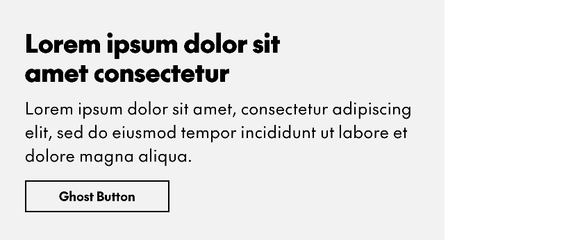
Standalone Copy Blocks can be either a single column of text or a table and use the default spacing guidelines. All elements are optional.
Text
Headlines: flexible size; see general typography guidelines. Character limit: none
Body copy: 24/34px. Character limit: none
Standalone Button
This centered, standalone button can be used below any module, most commonly Product or Category Tiles.
This is a fixed-height module and may use any background colour.

A – Background box – any colour
B – The button is 10px below the top of the background box and always centered. You may use a solid button if one isn't already in use elsewhere in the layout
C – Bottom padding – 60px
Text
All buttons follow the same basic specifications for type size and styling and character limits. See the Email landing page for details.
Banner/NPP
The Banner/NPP module is a free-form area for messaging that isn’t product oriented. It is a flexible height unit. The only rules for this module are that type must remain within the margins, preferably flush-left and aligned to the left margin; and that you use standard body copy sizes and buttons. Use the email grid to organize your layouts. In the rare case where an NPP sits above the Header, it should be no taller than 100px.
Banners/NPPs are not as fast to produce as the more standardized templates but are useful for laying out brand messages, upcoming promo events, video thumbnails, maps, etc—provided the basic guidelines are observed.
Third parties, eg. Triangle, should use the same margins, grid and spacing logic when designing inserts for emails.
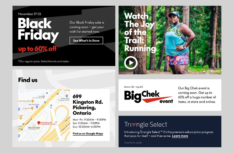
Examples of NPPs – while they're all very different from each other, note the commonalities: margins & spacing, type size & styling, flush-left text, and alignment to the email grid.
Text
Banner/NPP units must follow the general typography specifications. They do not have character limits.
Clickable Grid
The Clickable Grid consists of a single composition, sliced into a clickable matrix with unique links in every tile. This allows for more expressive layouts and interesting groupings of products.
It may be created using a 1- or 2-column grid. For the latter, the columns must be of equal width.
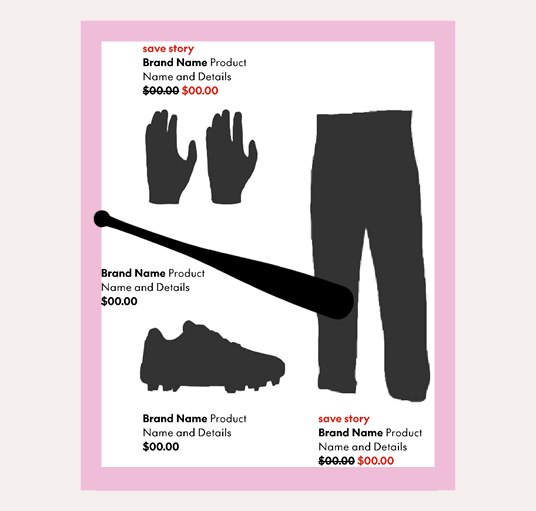
Product captions may be as wide or narrow as necessary but must always be at least 36px away from the edge of the layout (40px from the bottom)
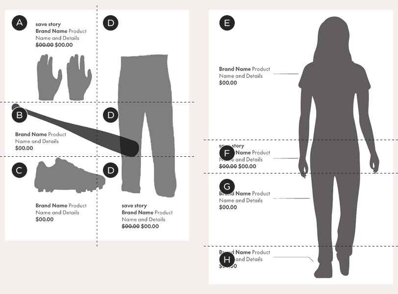
A–H – each letter represents a link to a unique URL
Left example – 2-column layout slicing – in this example, all slices in the second column (D) lead to the same URL – but this is completely customizable, depending on your layout. The rows may be different heights but the columns must be split 50/50
Right example – 1-column layout slicing – the slices may be different heights; they all run across the entire module
Text
Captions: 18/24px. Character limit: none