Digital—display advertising
Introduction: universal principles
The guidelines on this page form the foundation of all digital display advertising. While specific use cases make exceptions to these rules, they should be treated as the default for all compositions.
Anatomy
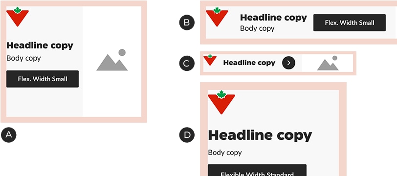
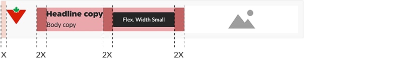
Digital advertising layouts can be broken down into a series of basic, predefined components, each with either a variable or fixed dimension.
Fixed dimension components
• Brandmark & clear space
• Button
• Badges
• Margins
• Padding
Variable dimension components
• Copy zone
• Foreground image zone
• Headline
• Body copy
• Caption
• Product name
• Images & patterns
The sizing and layout of fixed dimension components has been optimized for every common IAB/network banner size. This means margins, padding, Brandmarks, buttons and badges are different for each common size—and they cannot be adjusted. Variable dimension components—e.g., headlines, images—may be adjusted to suit the layout.
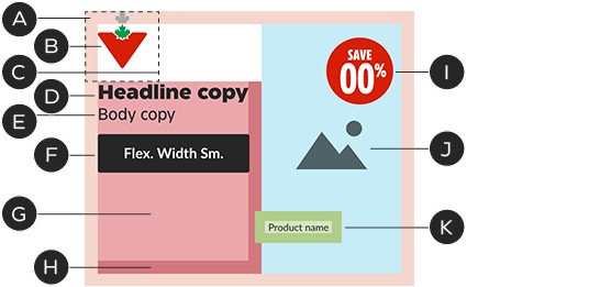
A – Margins
B – Brandmark
C – Logo clear space
D – Headline
E – Body copy
F – Button
G – Copy zone
H – Copy zone padding
I – Save circle
J – Foreground image zone
K – Product name
Brandmark
Always use the micro version of the Canadian Tire Brandmark in digital display advertising.
Size and boundaries
The Brandmark is the key to display advertising layout: the Brandmark and its clear space define major elements such as margins and padding (see the Layout section for more details). Brandmark dimensions are optimized for every common banner size—it is a fixed dimension component: do not adjust its size.
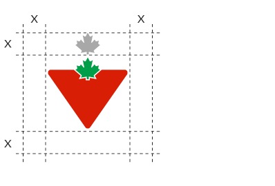
The Brandmark's clear space is equal to the height of one maple leaf.
The Brandmark's clear space defines the banner’s margins.
Common banner dimensions with Brandmark height and margins:
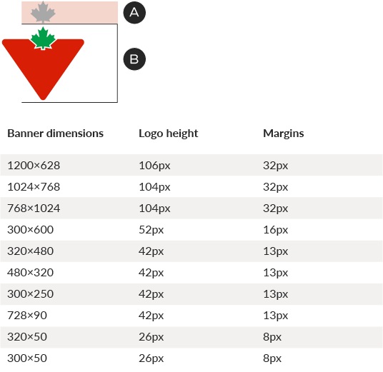
A – Margin
B – Logo height
Position
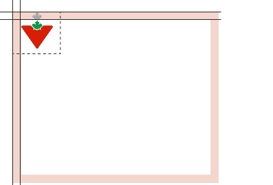
For IAB/network (banner units, the Brandmark must always appear in the top-left position. In social media, where the Brandmark is displayed in the avatar, it is possible to align it to the bottom of the layout.
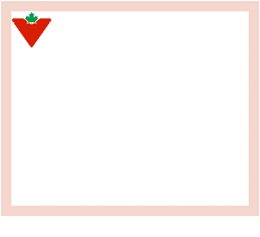
In most instances, including IAB/network banners, the Brandmark must sit in the top-left position.
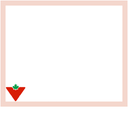
Where the Brandmark appears in an avatar, like in social media, it may be placed at the bottom.
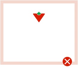
Do not place the Brandmark in any position other than top-left or bottom-left.
Brand Signature
Display advertising layouts should default to the horizontal versions of Brand Signature lockups. The clear space is one maple leaf around the entire lockup. The Brandmark—and thus the margins—remain the same predefined size for each common banner dimension.
The Brandmark portion of the Brand Signature is the same size as in non-lockup layouts.
The standard clear space expands to contain the entire lockup.
Layout
Margins
Margins are defined on a unit-by-unit basis, optimized for every common size of banner and based on the Brandmark's clear space. They are a fixed dimension component: do not alter the margin sizes. If you encounter a banner size that is not documented, match the specs with the nearest documented size. See the Brandmark section for a table of common sizes. The Brandmark, copy block, and foreground image must sit within the boundaries of the margins, with some exceptions.
Common margin sizes:
A – 300×250—12px
B – 728×90—12px
C – 320×50—7px
D – 300×600—16px
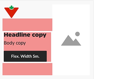
Padding
The copy zone and product name components contain padding, designed to keep type at a reasonable distance from Brandmarks and foreground images. Type may not pass the padding lines.
In most banners, padding only sits between the copy and the image and is equal to one margin width.
In narrow horizontal banners (e.g., 728×90, 320×50), the padding is increased to two margin widths. Columns within the copy zone also use this padding.
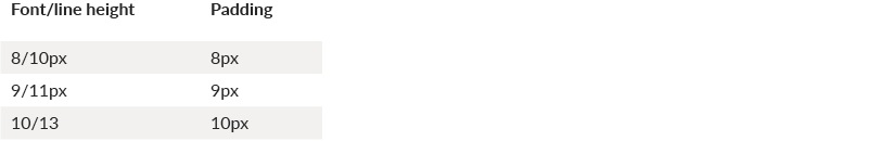
In product names, padding surrounds the text and is equal to the font size (e.g., 8px font = 8px padding). This padding may not overlap type or foreground images.
This 9px product name has 9px of padding around it on all sides, which is its minimum distance from text and foreground images.
Zones
The main area of a banner’s grid consists of two zones, bordered by the margins and edge of the logo’s clear space:
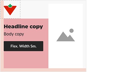
Copy zone
Foreground image zone
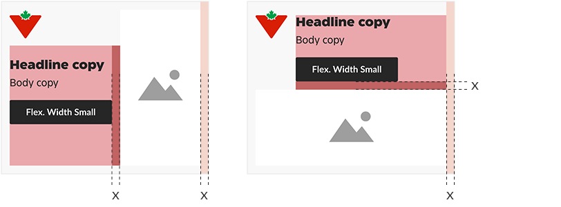
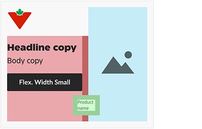
Zones may sit beside each other or stacked one on top of the other:
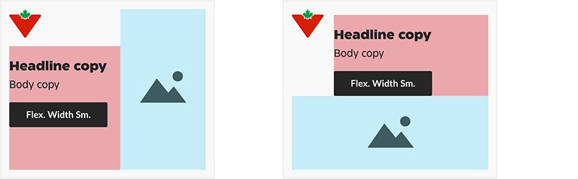
These zones are flexible, meaning you may make them larger or smaller to suit the layout. They have an inverse size relationship: as one zone gets bigger, the other becomes smaller.
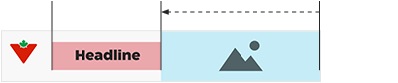
A larger foreground image reduces
the size of the copy zone.
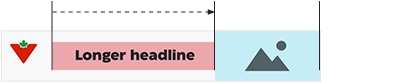
A longer headline reduces the size of the foreground image zone.
In stacked layouts, the copy and foreground image zones grow and shrink vertically.
Copy zone in detail
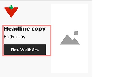
Treat the headline, body copy and
button as a block.
The copy block can be placed anywhere inside the copy zone. It’s recommended to make it look centered in the banner.
See the Typography section of this document for more information on copy blocks.
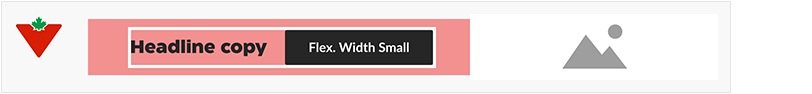
In narrow horizontal banners (e.g., 728×90, 320×50), the copy block should always be vertically centered.
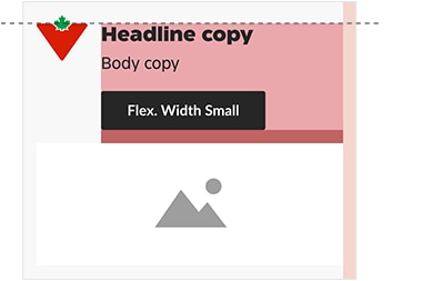
The copy zone may not sit above the top of the Triangle in the logo.
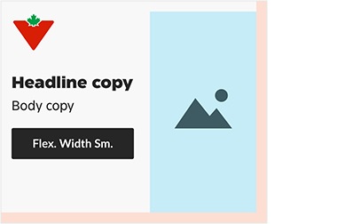
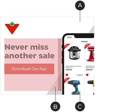
Foreground image zone in detail
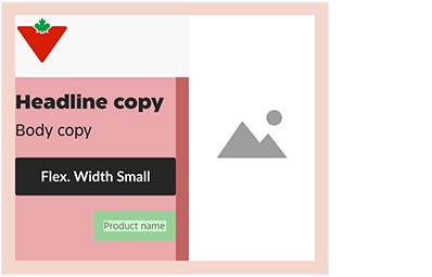
It’s important to remember that the foreground image zone is a tool to be used for blocking out space, rather than a box into which images must fit. For instance, foreground images may, at times, break out of the foreground image zone and cross the margins. No matter the layout, foreground images must respect the copy zone padding and logo clear space.

Typical use: Isolated image fits within the image zone.
Acceptable use: This foreground image breaks the right and bottom margins.
Not acceptable: This foreground image breaks into the copy zone’s padding.
While background images are not affected by zone layout, the foreground image zone can be used to create a focal point within a background image—a safe space where text may not enter.

Acceptable use: This foreground image zone is used to create a clear space within a full—bleed background image. Note that the key image elements stay out of the logo clear space.
Zones in practice
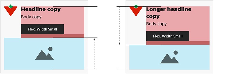
A – Foreground image defines width of
copy zone
B – Copy stays within its padding
C – Background image not affected by grid
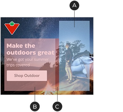
A – Foreground image zone used to create a focal point within a full—bleed background image
B – Copy stays within its padding
C – Focal point stays clear of the copy zone padding
Foreground images are not mandatory. In text—only banners, the copy zone occupies the full available space beyond the logo.
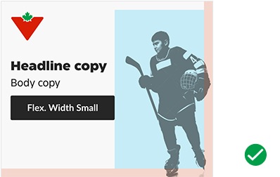
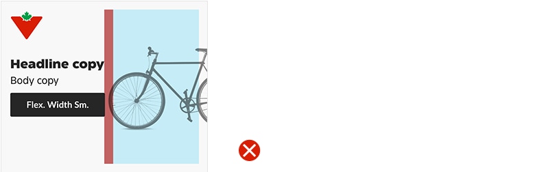
Buttons
The display advertising system makes use of two standard button types: the Flexible Width Button and Chevron. Each is designated for a various size of banner to work with the allotted space and stay in scale with the typography. Don’t alter them in any way other than updating the copy or colour. See the Digital interactions: buttons guidelines for details.
In display advertising work, we typically use the primary (solid) button style, for maximum impact. It may be applied in one of three basic colour combinations, depending on the design:

CT Soft Black with white text
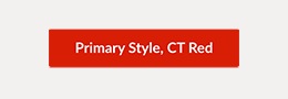
CT Red with white text

White with text in CT Soft Black
Common banner dimensions and button sizes:

Borders
IAB/network banners should always include a 1px border in #E5E5E5, regardless of size or background colour.

1px #E5E5E5
Typography
Styling
A selection of font styles has been made to achieve consistency across executions. Always use the styles defined here, keeping the tone of voice (Authoritative/Human/Functional) in mind. Colours may be chosen from the brand or promotional palettes.

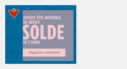
A – Authoritative headlines—CT Eastman Compressed Extrabold, all caps. Default colours: CT Red, white.
B – Human headlines—CT Eastman Roman ExtraBold, sentence case. Default colours: ODP Soft Black, white.
C – Body copy & product names—CT Eastman Grotesque Medium, sentence case. Default colour: ODP Soft Black, white.
Font sizes
The following guidelines will help us keep a consistent typographic voice and streamline the design process. As a general rule, copy should be set at 16px or higher to ensure it is readable by all viewers. Never set headlines or body copy below 12px in size.
The headline font size : line height ratio is always 1 : 1.125, rounded to the nearest pixel. Example headline font size/line height combinations:

The body copy font size : line height ratio is always 1 : 1.25, rounded to the nearest pixel. Example body copy font size/line height combinations:

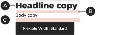
Copy blocks
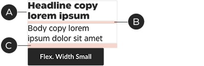
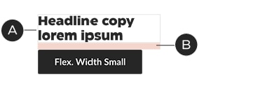
Headlines, body copy and buttons are treated as single units, referred to as copy blocks. Vertical spacing between elements in a copy block is based on the headline size:
• Vertical spacing above body copy is 1⁄4 the headline font size, in pixels
• Vertical spacing above buttons is 1⁄2 the headline font size, in pixels
A – Headline: 28/32px
B – Space above body copy: 7px
C – Space above button: 14px
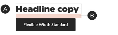
A – Headline: 28/32px
B – Space above button: 14px
A – Headline: 18/20px
B – Space above body copy: 5px
C – Space above button: 9px
A – Headline: 18/20px
B – Space above button: 9px
Event lockups
For promo events, a graphical lockup replaces the headline and may be scaled to any size. In promo event layouts, the vertical space above the body copy and button is always 10px and 15px, respectively, no matter the size of lockup (or layout).
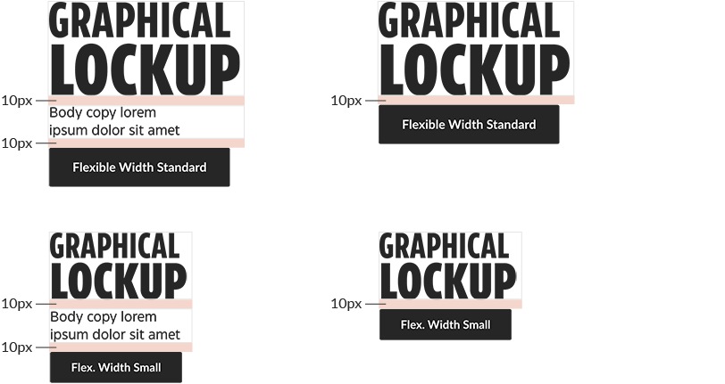
Lockups must follow the same rules as other pieces of typography, staying within the copy zone and its padding.
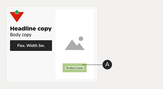
Product names
At times, product names may be included in banners. These can be placed anywhere within the banner’s margins and may break the zone boundaries. They are always set flush-left. Product name text has padding that corresponds to its font size; for example: 9-pixel product name text has a padding of 9 pixels. This padding should be used to keep the product name clear of foreground images, copy, logo and margins.
Product names are exempt from the minimum size guidelines indicated in the Typography section above.
This product name straddles both the copy zone and the foreground image zone. Its padding keeps it at a reasonable distance from the foreground image.
This product name sits fully within the copy zone but it stays above the bottom margin—padding included.
Product names use the 1 : 1.25 ratio for font : line height. There are three sizes available: