Process Icons
Summary
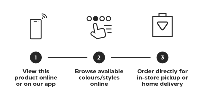
Process Icons appear in both print and digital channels and are used to quickly communicate the steps a customer must take in order to complete the process of a program/call to action. These icons are most commonly featured as level 2 icons in relation to Customer Experience Icons.
Many of the programs that we have describe similar processes. When laying out the visuals for a process, always check the Symbols storyboard for commonly used step icons (ie. Browse online, Submit order) to ensure we are communicating with consistency to our customers. When outlining a process, there should only ever be one icon per step.
To create a new Process Icon from scratch, refer to the build specs on the Iconography landing page.
Construction
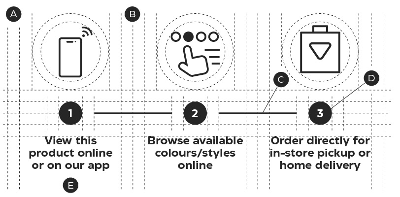
A – Equal margins
B – One margin width on either side of the dividing stroke
C – Steps are divided by a 1pt horizontal stroke
D – Steps can be numered for clarify
E – Labels for Process icons are in sentence case
Process Icons may be displayed vertically or horizontally and should be equally spaced out. Each step should be divided by a single 1pt stroke.
Exceptions
Process Icons follow all of the iconography guidelines outlined on the Iconography Foundations page, with one exception. Labels on Process icons should always appear sentence case and describe the action the customer must take to navigate through a process.