Universal email modules: basic elements
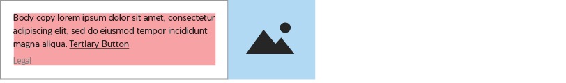
Universal modules may be used in both email types—their construction does not change between the types of emails. Note that some graphics on this page have had outlines added for visibility—email modules do not typically contain outlines, unless specifically indicated in the guidelines.
Zone & spacing systems
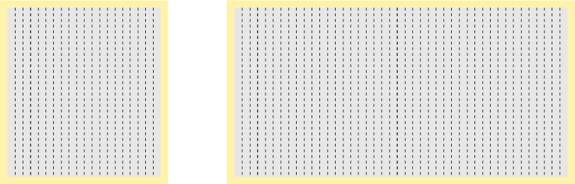
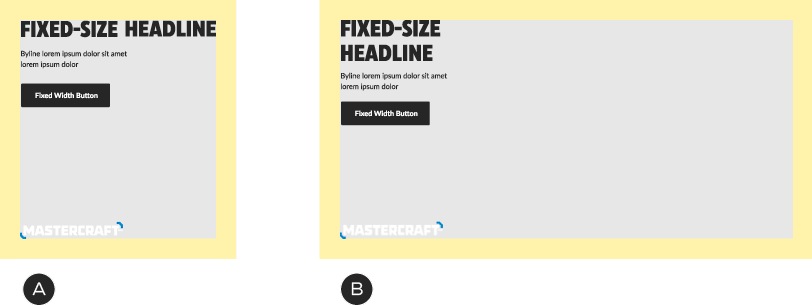
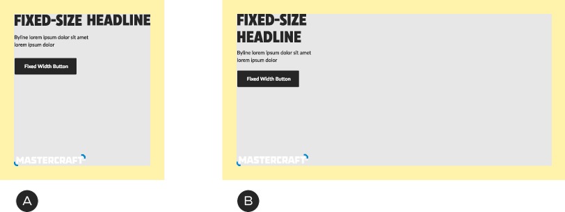
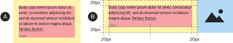
Email zone system
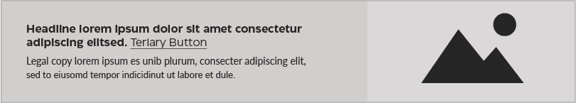
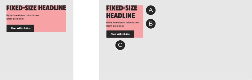
In emails, copy and image zones are used to organize text and photography, although they are ultimately flattened into a single raster image. Most email modules make use of this system.
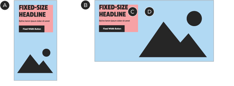
A – Mobile
B – Desktop
C – Copy zone—text and button
D – Image zone—product images, lockups, branded elements (i.e., portal, patterns). Fixed size—some components use different images for mobile and desktop; others use the same image
Email spacing system
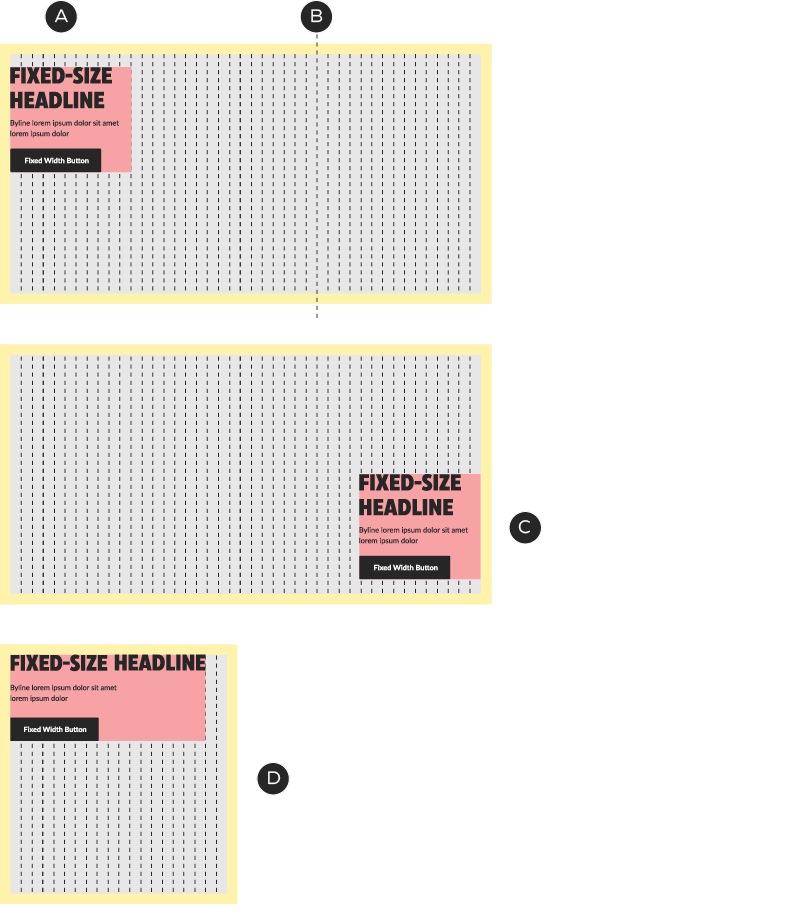
Emails are laid out using a universal spacing system at the module level. Margins (outer spacing) and padding (spacing between elements) are pre-defined and consistent between desktop and mobile sizes, simplifying the job of designing for both screen types.

All modules have 40px left and right margins, regardless of size or screen type
A – Full-width desktop module
B – Full-width mobile module
C – Four-column desktop layout—each of the four modules contains 40px margins
Base colours, buttons and text
Emails use a specific and limited palette of base colours, buttons and text to maintain a consistent, organized look. In some cases, Foundational and Omni-Channel components, such as typography and Tertiary buttons, have been customized for emails. These are email-only exceptions: do not apply these customizations anywhere else.
Email base colours
The basic email palette combines a selection of the basic Canadian Tire brand colours with several the greys from ODP, for consistency with other digital touchpoints.

Text, backgrounds, buttons

Text, backgrounds

Text, backgrounds, buttons

ODP Grey 3
Hex #F8F8F8
Backgrounds

ODP Grey 65
Hex #737373
Legal copy
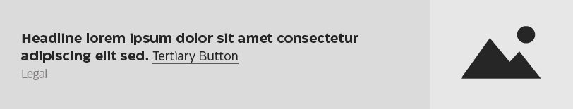
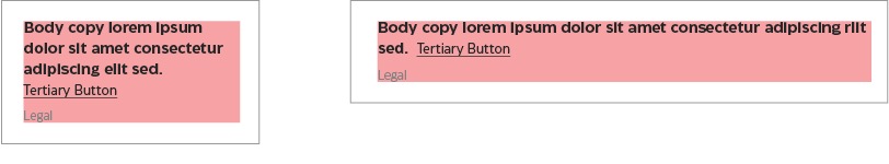
Email buttons
Emails use the Fixed Width button and a customized version of the Tertiary Button. Do not use any other types of button or link in email layouts. See the Button guidelines for basic construction details.
The primary (filled) Fixed Width button only appears in the A-spot of emails. Everywhere else, use the secondary (outlined) style. The Tertiary button has been customized by changing the font from Lato to CT Eastman Grotesque Medium, so that it better matches the typography throughout the email system. The Fixed Width button remains in Lato.
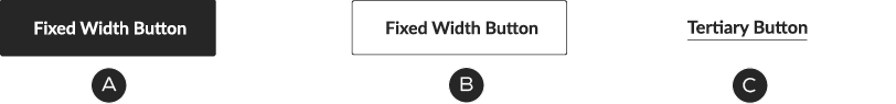
A – The primary style of the Fixed Width button appears in the A-Spot only.
B – The secondary Fixed Width button style appears everywhere else a square button is called for.
C – The customized Tertiary button style is used in the smallest components. In emails, it is set in CT Eastman Grotesque Medium, rather than Lato (the Fixed Width button remains in Lato).
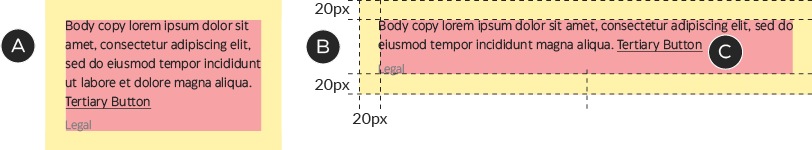
Buttons always have a padding-top of 20px—this is the distance by which they should be separated by any text or lockups above them (not including any padding-bottom on the other element).

Buttons must include 20px of clear space between them and the element above.
Typography in emails
Set headlines in CT Eastman, using either the Human or Urgent Promo visual tone of voice. Font options are restricted to CT Eastman Roman Bold for Human headlines and CT Eastman Condensed Extrabold for Authoritative headlines.
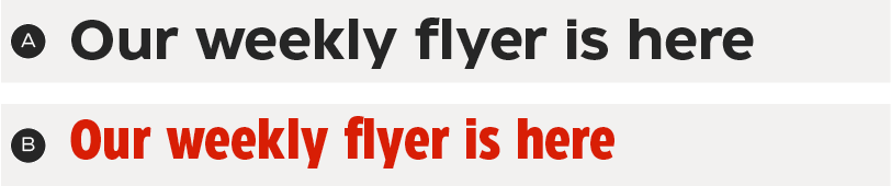
A – Human—CT Eastman Roman Bold
B – Authoritative—CT Eastman Condensed Extrabold
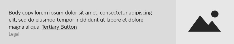
Use CT Eastman Grotesque Medium for body and legal copy.

Text sizing and spacing
With the exception of the header and footer, the font sizes shown here are the only ones to be used in email layouts—do not create new font sizes. Like buttons, type styles have fixed spacing, designed to be easily stacked in the various combinations required by email layouts. Do not change the default spacing between text and other elements.
Sizing and spacing cheat sheet (grey outlines indicate bounding boxes in Adobe XD):

A-Spot Authoritative headline, desktop
Size: 30/33px
Padding: 0px
A-Spot Authoritative headline, mobile
Size: 28/30px
Padding: 0px

A-Spot Human headline, desktop
Size: 25/30px
Padding: 0px
A-Spot Human headline, mobile
Size: 23/27px
Padding: 0px

Authoritative headline, non-A-spot (all breakpoints)
Size: 25/27px
Padding: 0px
Human headline, non-A-spot (all breakpoints)
Size: 21/25px
Padding: 0px
Body copy
Size: 16/22px
Padding-top: 10px
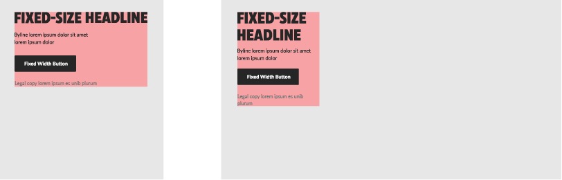
Legal
Size: 12/15px
Padding-top: 20px
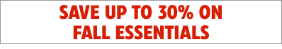
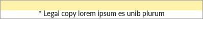
Legal: Character limits
Character limits apply to legal copy.
English: 120 characters
French: 150 characters
An example with 120 characters of legal copy.
Save Stories & TESTED Badge
Emails use two different formats of Save Stories—always choose the version indicated for the application in question.
Inline: appears in text blocks
within modules.

Badge: for broad savings messages; appears in A-Spot and Banner modules.
The TESTED Badge appears at the top right of the image zone on product tiles and in a free-form position in Banners and A-Spots.
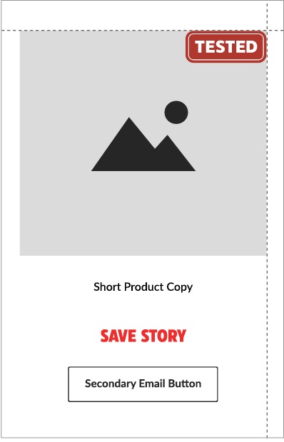
In Product Display modules, the Badge sits against the top right corner of the image zone.
In A-Spots and Banners, the Badge should be placed in the location that best connects it to the product shot—other than respecting the clear space of other elements, there are no additional placement requirements.
There are two sizes of the TESTED Badge for use in emails:

90px wide: Use in Product Display 1–2, Banner and A-Spot modules

56px wide: Use in Product Display 3–4
Header
The header is one of two elements that uses live text. This is to accommodate an account number and make it easy to update the navigation.
The header is a locked element: do not adjust its layout in any way.
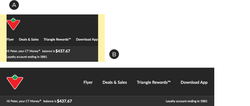
A – Logo and text sit against the outer margins
B – Optional CTM balance bar appears when relevant

French version: slightly smaller link copy in mobile
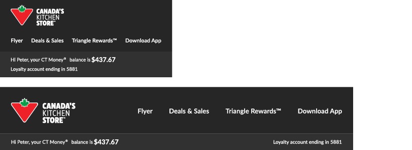
Logo-only version
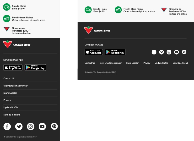
Footer
The footer is one of two elements that uses live text. This is to accommodate personalization and changing requirements for navigation and legal copy.
The footer is a locked element: do not adjust its layout in any way
A-Spot
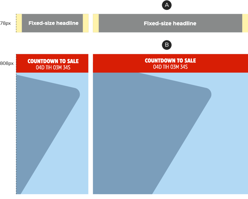
A-Spot: size
A-Spots are fixed-size modules. Do not change the height. This module is designed with a built-in 5px white spacer along its top edge, which is meant to keep the A-spot separated from the content above it.
A – Mobile
B – Desktop
A-Spot: grid system
To keep layouts organized and consistent, the A-Spot’s copy zone sits on a 40-pixel vertical grid, which allows designers to choose unique placements while lending a consistency and rhythm to the email system.
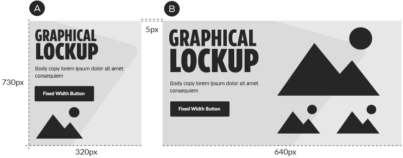
A-Spot: copy zone
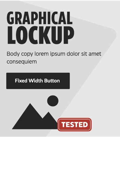
In emails, the copy zone is a flexible-size floating component that sits over top of the image zone. This allows for maximum versatility and variety in composition.
A – A-Spot Headline text style
B – Subcopy text style
C – Primary-style Fixed Width button
The copy zone contains the headline, subcopy and CTA button. Copy zones may use either fixed size headlines or graphical lockups for the key message. Text and buttons must follow the typesetting guidelines described in the Base Colours, Buttons and Text section of this document.
Copy zones may sit anywhere within the A-spot layout, but they must conform to the grid.
A – Copy zones snap to the width of grid units.
B – While copy zones are flexible in size, they should generally use no more than 2/3 of the vertical grid in desktop.
C – Copy zones may be placed anywhere within the A-spot, as long as they conform to the grid.
D – The 2/3 rule does not apply in mobile, as space is limited.
A-Spot: image zone
The image zone occupies the full area of the A-spot. It may contain any combination of product shots, lifestyle images, Triangle/portal motifs and patterns. Images may be placed anywhere within the image zone and should be arranged to create clean and organized layouts that prioritize copy legibility.

The Triangle/portal may be applied as an optional graphical element to embellish a set of isolated images or to crop a lifestyle shot. In emails tier 1–3 promotions, the Triangle/portal must always be used. We have developed several positions for the Triangle/portal, which allow for flexibility and variety in layouts.

The mobile options include a simple horizon line, which is useful for cropping lifestyle photos or adding a splash of colour in complex layouts.
A-Spot: legal copy
In A-Spots, legal copy should be fixed to the bottom of the button (be sure to include the 20px padding, but if there isn’t room, it may be placed beneath the A-spot—flush-left and within the email margins).
Legal copy must always be set in #737373.
If copy must sit outside the A-Spot, place it underneath—include its native 20px padding, set the type flush-left and keep it within the global 20px margins.
A-Spot: logos
From time to time, brand logos may be required in the A-spot. This application is particularly suited to Dedicated-type emails. Logos must sit within the margins of the A-Spot and be placed at a size and location that does not compete with the primary content.
A – Logos must sit within the margins of the A-spot.
B – The logos may sit anywhere within the layout, so long as they don’t compete with the primary content. Lower corners are typically good locations.
A-Spot: pre-header
The A-Spot contains an optional pre-header, to be activated for important, high-visibility messaging. This is a fixed-height component and sits within the A-Spot, below the 5px spacer.
The pre-header must be set in white type over either CT Soft Black or CT Red. Text follows the Authoritative/Human Headline specs for emails (see above) and must be centre-aligned. Average character limit: 48.
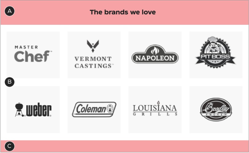
Brands We Love
The Brands We Love module is a simple, monochromatic grid of featured brands related to the primary email message.
Brands We Love: mandatory & optional components
Brands We Love is a compound module, made up of three different pieces: a Headline module, the Logo Grid and a Spacer module. These are stacked together to form a module with a title and clear space. Never use the Logo Grid on its own.
A – Headline module
B – Logo grid
C – Spacer module
Brands We Love: construction
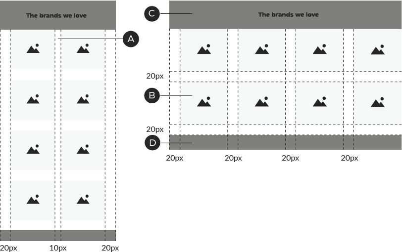
A – The columns stack 2×2 in mobile. The image zones remain the same size but the central gutter shrinks to 10px.
B – Each image zone is 120×120px, with 20px padding right, left and below.
C, D – See the Headline and Spacer sections of the email documentation for details regarding the top and bottom pieces of this module.
When odd numbers of logos appear in this module, they should populate the rows from left to right: this ensures the unit always looks organized and will ensure proper responsive behaviour in the future.
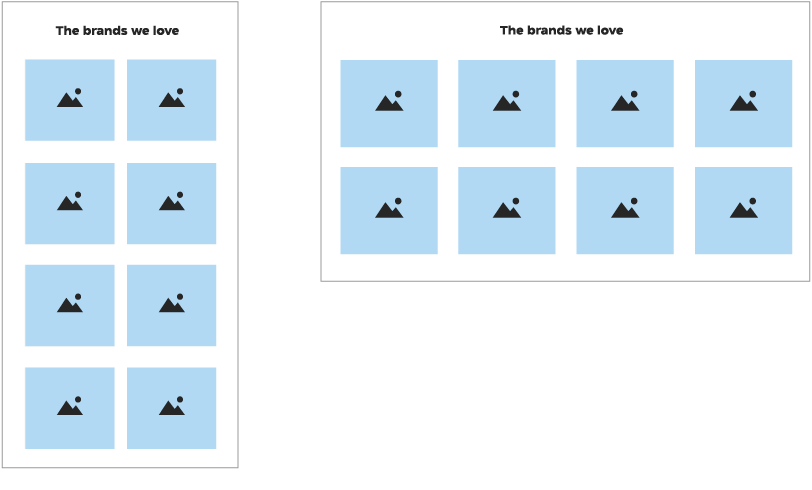
Brands We Love: colour
The Brands We Love module may only appear with a white background; its logos sit inside ODP Grey 3 boxes and must always be monochromatic, in CT White and CT Soft Black.


A – Background colour is always CT White.
B – Boxes are ODP Grey 3.
C – Logos are monochromatic, with the dark areas adjusted to be as close as possible to ODP Soft Black.
NPPs
There are two ways to construct an NPP: first, a mid-page NPP, which uses the Banner 1 module; and second, a Slim NPP module that sits at the top of the email layout. This section will focus on the second approach: the Slim NPP module. See the Banner 1 section of this document for details on constructing a mid-page NPP.

Mid-page NPP, created with the Banner 1 module
Slim NPP, to be placed at the top of the email, beneath the header
Slim NPP: mandatory & optional components
The Slim NPP is a flexible-height element, with two typesetting styles and an optional image (desktop only). To save space, this module does not include a 5px white spacer.
A – Headline or body copy
B – Optional Tertiary button
C – Optional legal copy
D – Optional background colour
E – Optional image
Type may be set in one of two ways, depending on the copy length: in NPP Headline or Body Copy format, but never both.
For short, punchy messages: NPP headline
For longer, detailed messages: Body Copy
Slim NPP: construction—without images
A – In mobile, the unit’s height flexes to accommodate the copy
B – Desktop copy zone: 600px wide, flush left
C – In Slim NPPs, the Tertiary button sits on the same line as the copy
Example using the NPP Headline type style. You may use either the NPP Headline or Body Copy styles, but never both.
Slim NPP: construction—with images
A – Images disappear in mobile
B – Desktop copy zone: copy zone: 420px wide, flush left
C – Image zone: 180px wide. Images may bleed off the background of this unit
Images may dictate the height of this unit, if desired. In this case, the copy zone should remain vertically centered.
Slim NPP: colour
The background colour of the text area may be any Foundational brand colour or a promo colour that suits the NPP creative. For promo messages, the text area may also contain a matching pattern.


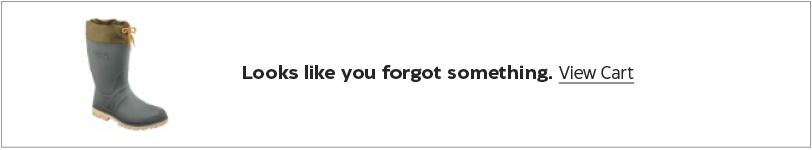
Abandoned Cart
Abandoned Cart modules are designed to hold the image of a product left in a user’s cart, with some very simple copy to encourage purchase. The expectation is that this layout will not change, although the module supports copy updates for things such as A/B testing. This module always sits at the top of the layout, directly beneath the header.
Abandoned Cart: mandatory & optional components
The abandoned cart module always has a product image on the left and a text/CTA area, with a white background, on the right. It is a fixed-height element. To save space, this module does not include a 5px white spacer.
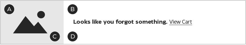
A – Product image
B – Headline & Tertiary button
C – White image background
D – White module background
Abandoned Cart: construction
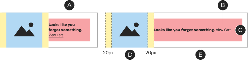
A – In mobile, the copy zone shrinks to 151px in width; all other elements remain the same.
B – In Abandoned Cart modules, the Tertiary button sits on the same line as the headline.
C – Copy is vertically centered.
D – Image zone: 109×109px. Product images should be scaled so that they fit completely within this area. Images should always be centered (horizontally and vertically) within the image zone.
E – Copy zone: 471×79px, flush left. The copy for both the headline and button are designed as fixed elements, although this module supports copy changes for things such as A/B testing. In case of a change, the copy zone may not be be any taller than 79px.
Abandoned Cart: colour
The background colour of this unit is always CTWhite, to ensure product images retain a seamless effect (border applied here to show module boundaries—do not apply a border to your design.
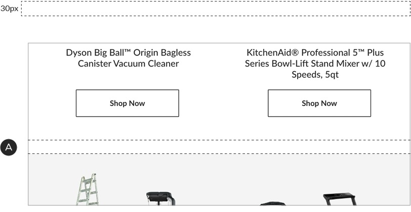
Spacer
While modules are designed for maximum flexibility in layout, there will be times when you require additional room between elements. In these situations, apply a 30px transparent spacer to loosen things up.
A – Spacer in use