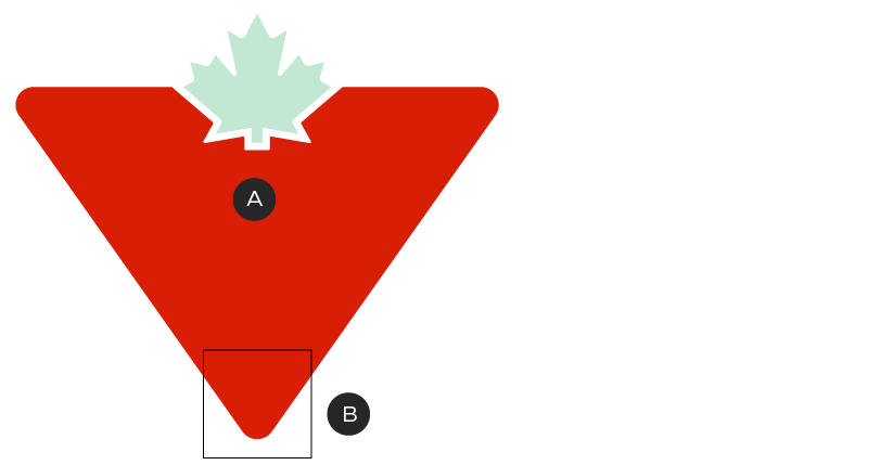
Triangle Element
A graphical element of our own

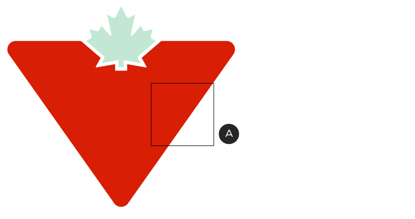
A – Triangle Element
B – Triangle Element—Corner
C – Triangle Element—Slash
The Triangle Element is created by cropping sections of the Canadian Tire Brandmark, making it a unique and ownable element that can be used across all brand touchpoints. The cropped sections of the Triangle Element are the Corner and the Slash. The cropped sections can be used as a portal to house various images, a graphic background, and an additional layer between elements.
While the Triangle Element creates a consistent and unique look, it isn’t required on all Canadian Tire communications. Think of it as an additional tool to have in your brand design toolbox.
Triangle Element—Corner
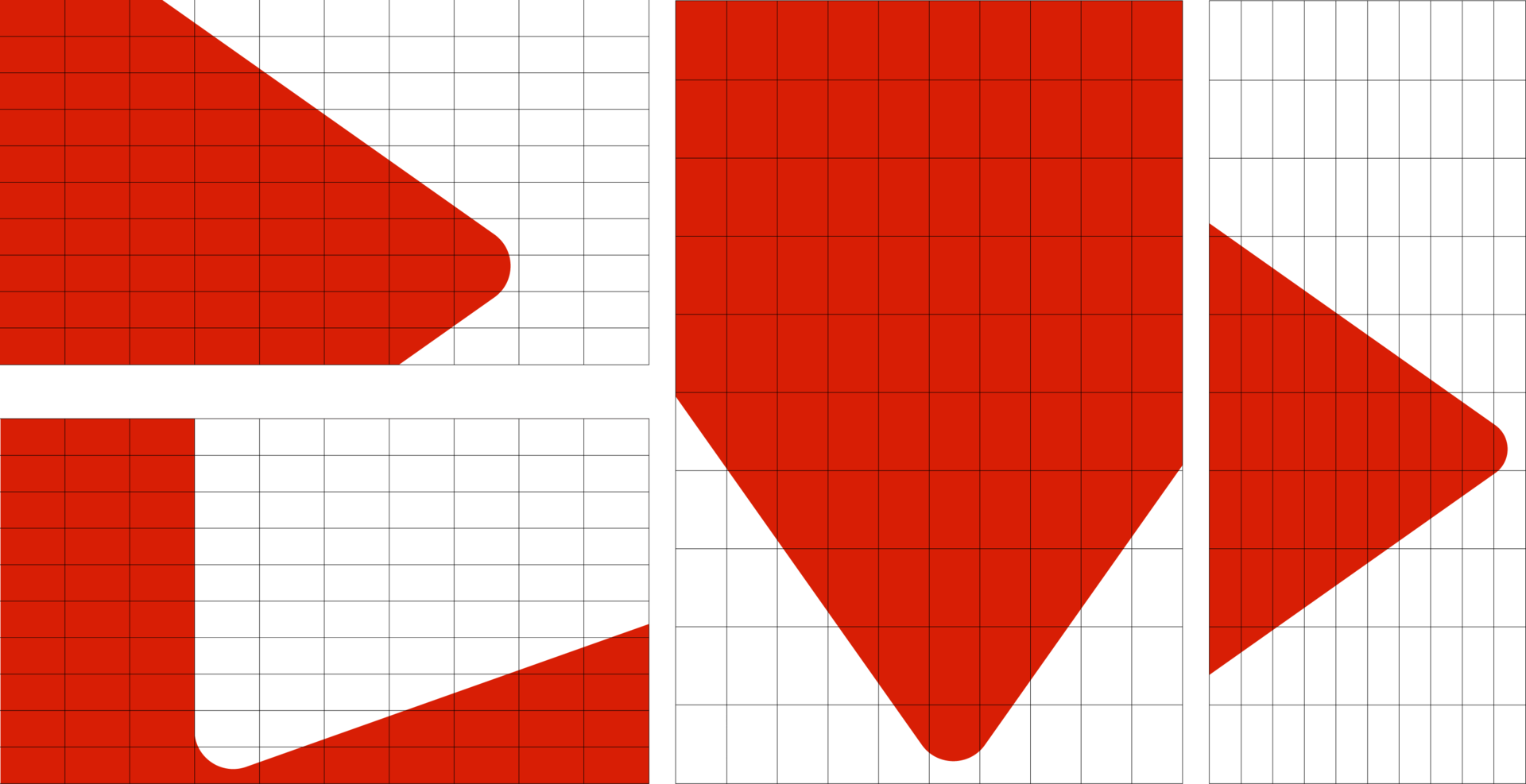
A – Isosceles triangle
B – Vertex corner (70°)
The Corner of the Triangle Element is created by cropping the bottom corner of the Canadian Tire Brandmark, making it a unique and ownable element that can be used across all brand touchpoints.
The Triangle Element is based on an isosceles triangle. It should be noted that the bottom angle, also known as the vertex, is the widest of the three corners. The large vertex angle should be the corner of the triangle used for the Triangle Element. Please do not use the upper two corners, as they will be too narrow and inconsistent with our brand.

The Corner can enter the composition from a variety of directions.
How to apply the Triangle Element—Corner
You can use the Triangle Element's Corner in three different ways:

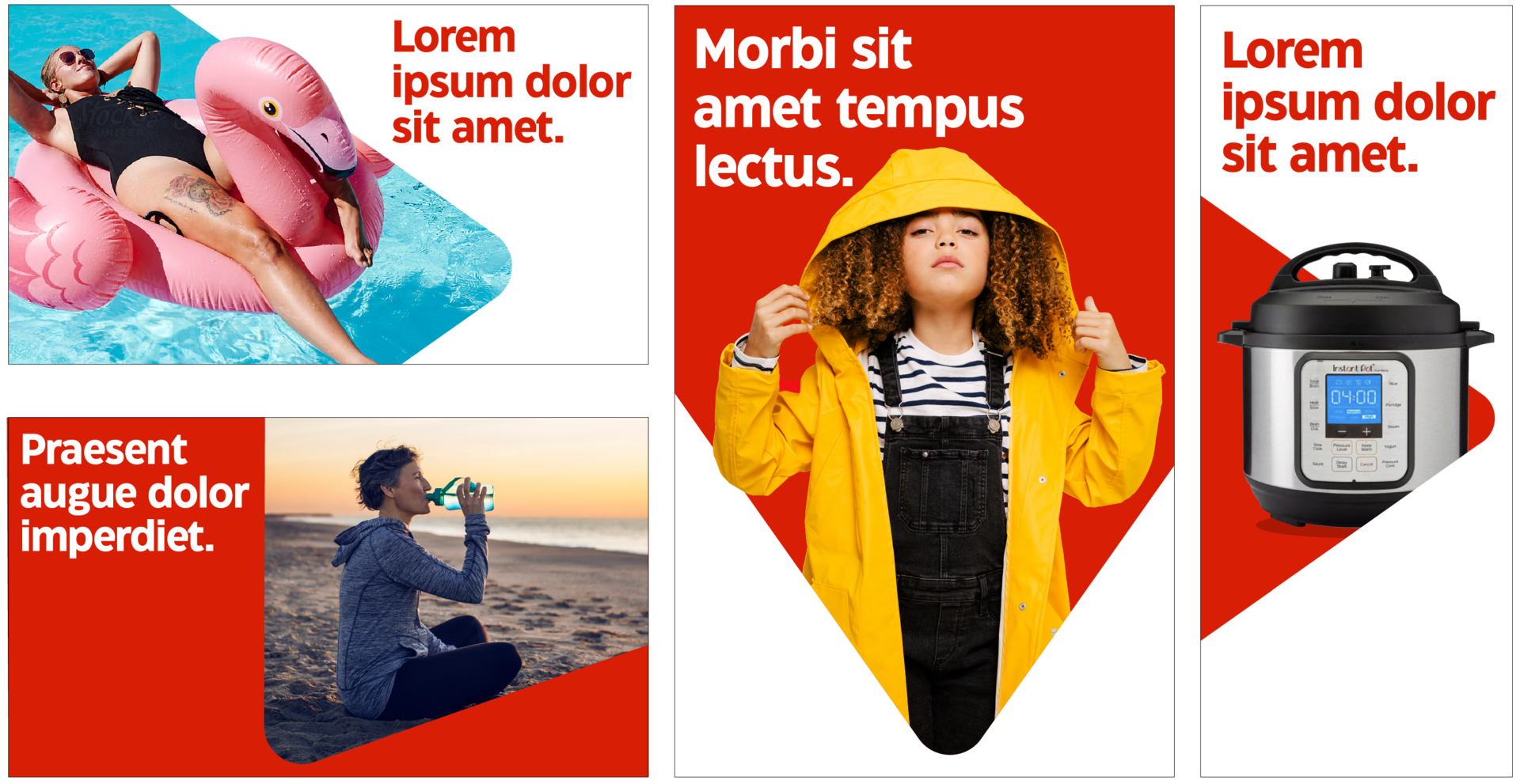
The Corner can be used as a portal, where images pop-out of the Element. In order to achieve this effect, only one side of the Triangle should be disrupted by an image.

The Corner can be placed as a background behind close-cropped images.

The Corner can be used as an additional layer between elements. For example, the Triangle can act as a separation between text and image.
No matter how you apply the Triangle Element's Corner, always ensure it is enhancing the layout: it should add a strong sense of our brand and always highlight products or copy, not obscure them.
Use of primary compositions—Corner
To ensure consistency across brand materials, the angle of the Corner should start with the primary angles and placements shown below. They keep the featured corner aligned to the grid to allow the Triangle Element to looks its best. Only rotate to customized angles if one of the featured options doesn't work for your specific application.
The primary compositions will take up 30 - 70% of the space of any given dimensions. Using a 10x10 grid can be helpful when you’re trying to figure out this percentage but it can also be “eye-balled.”
Examples of Triangle placements in primary compositions, using the 10X10 grid.
Examples of primary compositions. Note that when an image breaks out of the Triangle, it only does so on one side.
Use of secondary compositions
Secondary compositions are for use in layouts where the primary compositions don't provide enough flexibility. This can include very small layouts, like digital display banners; or narrow layouts, like interior transit ads or blade flags. In these situations, use a closely-cropped version of the Triangle to create space for image and copy and to retain the bold nature of our branding. In these compositions, the Triangle should take up 80–95% of the available layout space. Using a 10X10 grid can be helpful when you’re trying to determine how much space is being used but is not strictly necessary.
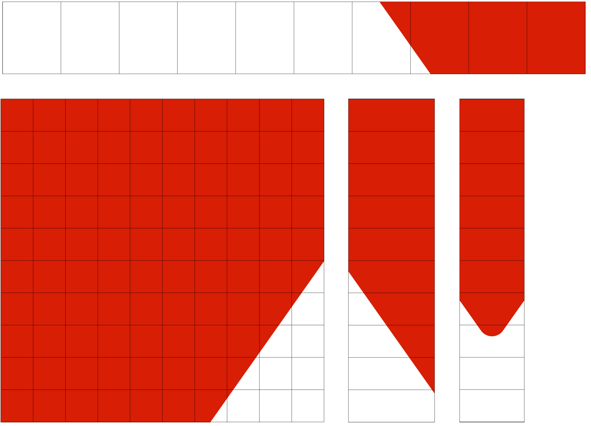
Examples of Triangle placements in secondary compositions, using the 10X10 grid.
Here are some examples that use the Triangle Element on pieces with limited space:

Examples of secondary compositions.
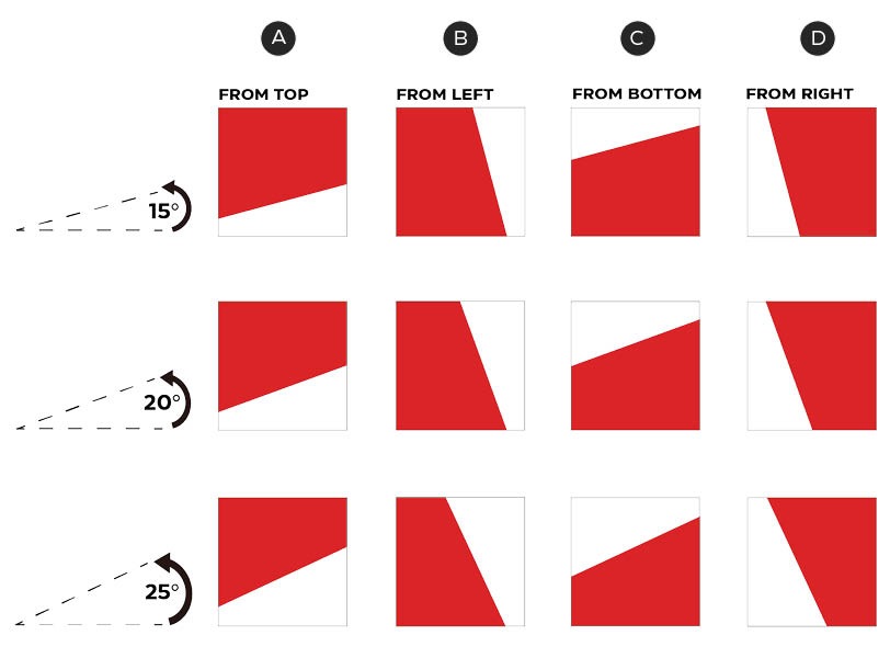
Use of consistent angles—Corner
When the primary compositions don't provide enough flexibility, you can create custom angles within a set range. The below angles will ensure that the angle between the artwork frame and the side of the triangle is not less than 15°. Any angle less than 15° will create a tight and awkward space in your composition.
Starting with a 0° rotation (as per the Canadian Tire Brandmark), there are a number of rotational variations that can enter a composition from left, top, right, or bottom. In all cases of rotation, please be sure to showcase the largest corner of the Triangle.
Do not use any other angles outside of the recommendation.

Please keep the angle of the Corner within this set of rotations.
Shown in the diagram are the following compositions:
A – From top (20°, 10°, 0°, 350° and 340° rotations)
B – From left (110°, 100°, 90°, 80° and 70° rotations)
C – From bottom (200°, 190°, 180°, 70° and 160° rotations)
D – From right (290°, 280°, 270°, 260° and 250° rotations)
Triangle Element—Slash
A – Slash Element
The Triangle Element may also be cropped by isolating a side, or "Slash". One can use the side of the Triangle, with no corners present, as a Slash, which still suggests our Triangle Element. It is yet another unique and ownable element that can be used across all brand touchpoints.

The Slash can enter the composition from a variety of directions.
The Slash can enter a composition from a number of directions. The cropped section can be used as a portal to house various images, a graphic background and an additional layer between elements.
How to apply the Triangle Element—Slash
You can use the Triangle Element's Slash in three different ways:

The Slash can be used as a portal, where images pop-out of the Element.

The Slash can be placed as a background behind close-cropped images.

The Slash can be used as an additional layer between elements. For example, the Slash can act as a separation between text and image.
No matter how you apply the Triangle Element's Slash, always ensure it is enhancing the layout: it should add a strong sense of our brand and always highlight products or copy, not obscure them.
Use of consistent angles–Slash
The Slash should also be used within a preferred range of angles. When using the Slash, one should use a 15°, 20° or 25° angle (in relation to the side of the composition) for optimal usage. Any angles smaller than 15° don't look purposeful, and any angles larger than 25° become too aggressive.
Do not use any other angles outside of the recommendation.
Please keep the angle of the Slash within this set of rotations.
Shown in the diagrams are compositions of 15°, 20° and 25° angles.
A – From top
B – From left
C – From bottom
D – From right
Curve consistency
To ensure consistency across brand materials, the curvature of the Triangle should feel balanced within the specific piece, thus the radius shouldn’t be too small or too large.

Curve is correct.

Curve is too small in comparison to grid.

Curve is too large in comparison to grid.
Triangle Element—dos & don'ts
In summary, the Triangle is another tool in your toolbox to employ the Canadian Tire look and feel. In applying the Triangle Element, one should be wary of some common errors you may encounter;
Always use the correct corner of the Triangle.
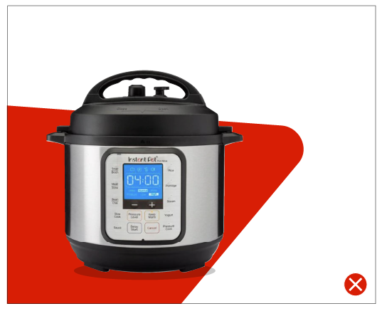
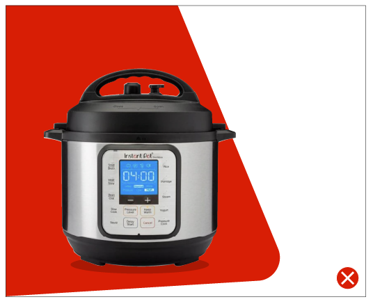
Don't use the narrow corners of the Triangle. Only the vertex corner may be used.
Always use the optimal angles for the Corner and Slash as provided.
We have outlined several recommended angles for presentation of both the Corner and the Slash. Please use the preferred angles, as they allow for movement and optimal presentation of the shape.

Reveal the Triangle shape and do not overcrowd.
When the Triangle Corner or multiple large sections of the Triangle are obscured, the shape becomes difficult to recognize. Consider either (a) rearranging your composition, (b) using the Slash, or (c) consider using neither element.
Use the element judiciously.
If the Corner or Slash do not enhance your compositions, feel free to leave them out.