Promo emails
This page deals with the specifics of A-spots in Promo emails. For basic A-spot guidelines and general information about emails, visit the Universal email modules pages.
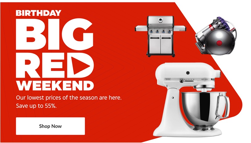
Promo A-spots typically feature compositions of product shots.
Copy zone
Promo emails may use either graphical lockups or type for headlines, depending on the nature of the promotion.
Flyer teaser
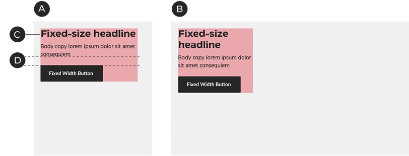
A – Mobile
B – Desktop
C – Typeset headline
D – Fixed spacing
Omni-channel event
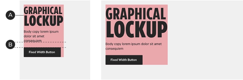
A – Graphical lockups replace headlines
B – Fixed spacing
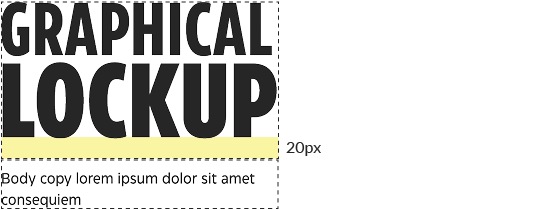
Add 20px of padding below graphical lockups to keep them at an appropriate distance from the body copy (in addition to the body copy's native top padding).
Copy zones may sit anywhere within the A-spot layout, but they must conform to the grid.
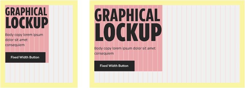
Graphical lockups are treated the same way as headlines, sitting above the body copy; they are sized to fit the grid.
Image zone
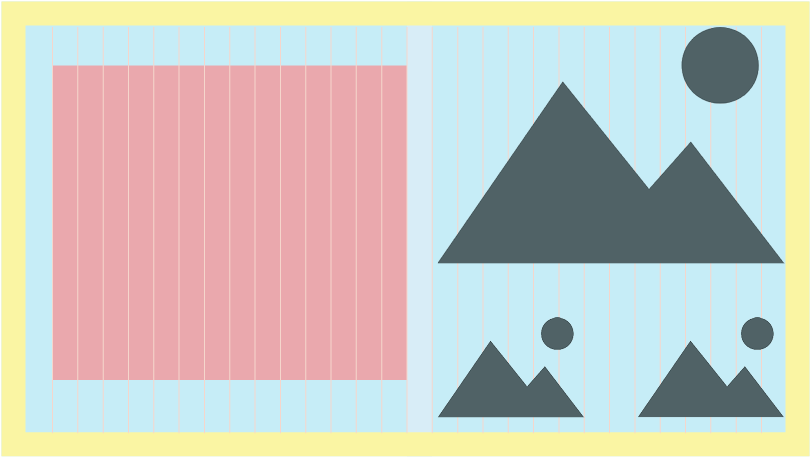
Promo A-spots typically contain isolated product shots or composited representations of the Weekly Flyer; this leaves room for colour, shape and pattern in the background and the ability for precise arrangement of text and image.

When only isolated product shots are shown, the Triangle should be added for visual alignment with the website and Flyer. Photography may be placed anywhere within the image zone; it is not confined to any one area.
Image-copy zone relationship
In general, product shots or focal points should be separated from the copy zone by at least one column of space:
Multi-product composition
Layout within the image area is relatively flexible—above all, make sure the products look good—but there are some basic rules to follow when arranging the elements.
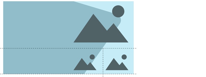
Techniques like shared base/centre lines and optical sizing will make layouts feel more organized.
Patterns
Patterns are used in tiers 1 & 2, to add excitement and mark a special event. They should always play a background role to the other graphics and never compete with the product images.
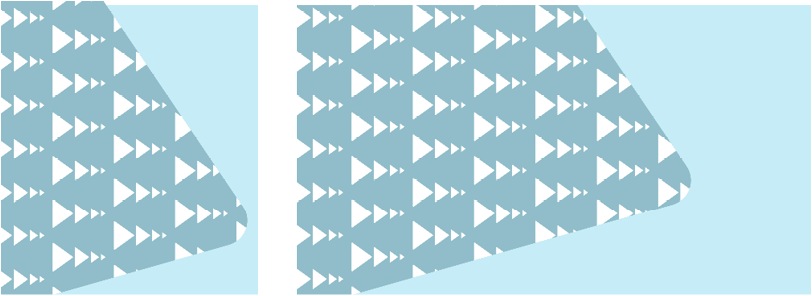
A – To match the Flyer, the patterns are generally contained within the Triangle, but may be also used in the background.
B – The pattern should use a tint of the Triangle colour and be small and faint enough as not to compete with the product images.
C – In mobile, the pattern should be scaled down to match the new proportions.