User interface (UI) icons
Summary
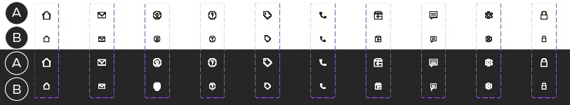
A – 20x20px icons
B – 16x16px icons
UI Icons appear across our CT Digital platform and are commonly used in Navigation, Toggles, Social Media Links, Reviews, Notifications, In Line Messaging/Assistive Text and more. The areas of focus that may differ from other icon categories include colour, label and shape container size. Due to the nature of these icons, the UX/UI team will own this set.
These icons must integrate into our ODP platform and adhere to accessibility rules and best practices. The latest Accessibility guidelines (WCAG 2.1) can be found online. Icons should aim to meet the same contrast guidelines that are required for text. Icons that include text must meet a 4:5:1 contrast ratio to meet accessibility requirements. For graphics and user interface components, WCAG 2.1 requires a contrast ratio of at least 3:1.
Exceptions
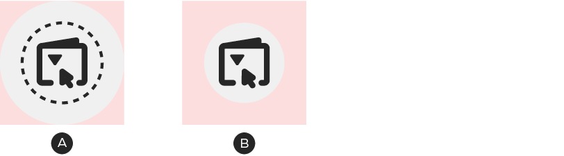
A – Enlarged icon container shape
B – Enlarged clickable area
In the case of Mobile design, WCAG 2.1 standards require clickable buttons to be a minimum of 44px square. This means in some instances the size of the icon container may be larger than the foundational guidelines state.
Alternatively, the clickable area surrounding an icon can extend beyond the edges of the container shape.