Typography
Primary typeface

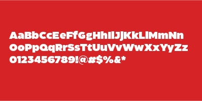
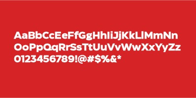
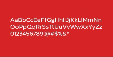
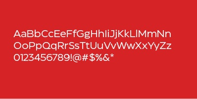
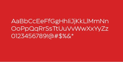
CT Eastman is a custom, geometric sans-serif typeface with a humanist feel. The typeface was designed as a highly reliable tool for solving design problems. The typeface design is highly reliable and can support 1,000-plus languages. This is the default typeface for all CTR applications.
Widths & weights
CT Eastman comes in four standard widths:
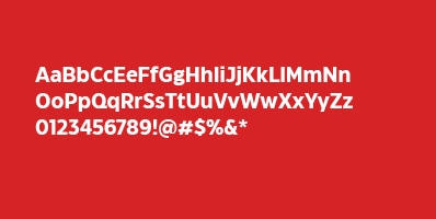
Grotesque
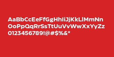
Regular
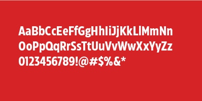
Condensed
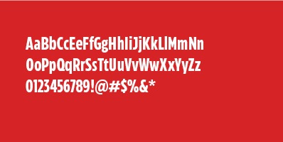
Compressed
Each width can be set in one of six standard weights:
Heavy
Extra Bold

Bold
Medium
Roman
Light
About variable fonts

As well as containing standard widths and weights, CT Eastman is a variable font that provides flexibility and more options when developing marketing materials and creative. A variable font can be set to any width and weight required by the design, providing maximum flexibility and a huge variation of personalities. Variable options should be limited to specific advertising and design situations when the default widths and weights of CT Eastman will not suffice for the application at hand. Always defer to the widths and weights defined for your particular application before considering the use of variables.
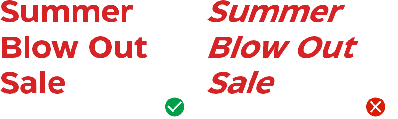
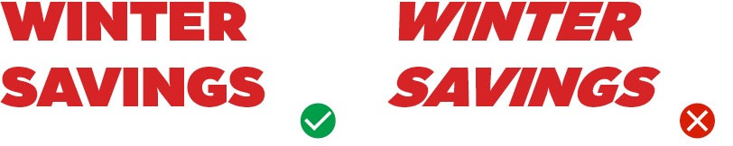
No italics
To keep things consistent, italics are never used for headlines or large text. They can be used in body copy when it makes sense.
Alternate glyphs
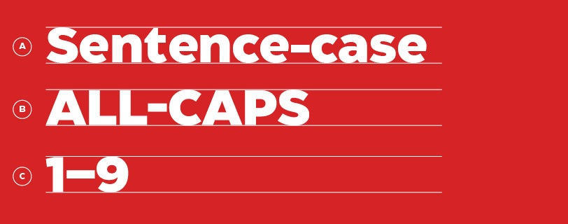
CT Eastman has an alternate dash set, which sits slightly higher than the default set:
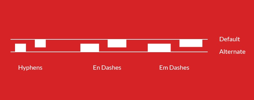
The default position works well with sentence‐case typography–but the alternates feel better with ALL-CAPS and numbers (0–9):
Languages

Need something translated? CT Eastman supports over 1,000 languages. For bilingual text, use the compressed/condensed version of CT Eastman when translating to ensure copy fits in components (unless stated otherwise). Unfortunately, Asian languages aren’t supported by CT Eastman at this time.
Visual tones of voice
The Canadian Tire Brand Design System uses three tones of voice, which are expressed visually through typography. Referred to as Urgent Promo (Authoritative), Human and Functional, these tones of voice are differentiated by their use of typecase (sentence case or ALL CAPS).
Here’s how to apply the proper typecase according to the tones identified:
Urgent Promo (Authoritative) tone

All promo copy, save stories, event lockups or sale taglines should be used in the Urgent Promo tone which is all caps. This typecase gives prominence to these messages and sets it apart from regular copy. All caps treatment is reserved for this type of messaging only.
Human tone
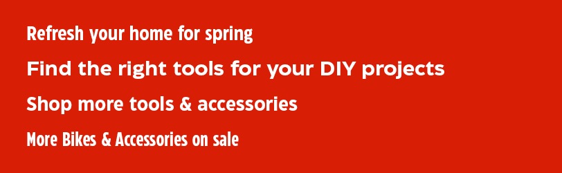
All other supporting copy such as lifestyle headlines, product titles and descriptive body copy should be in sentence or title case style.
Always set subheads and body copy in sentence case
Functional tone
This tone of voice is used to describe hardworking copy such as product descriptions, which is set in sentence case.
There are instances when functional messages need to stand out, such as important dates, whispers and disclaimers. In these instances, these messages can be set in either sentence case or all caps, depending on the situation. Note: this only applies to short snippets of text not to body copy.
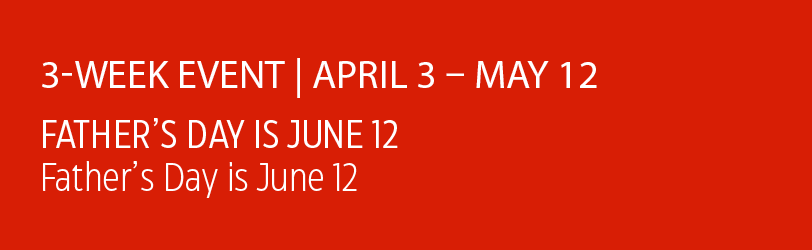
Functional messages should only be typeset in light, regular or medium font weights.
Secondary font: Lato
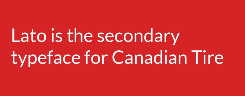
When CT Eastman isn’t available, use Lato, which is a free font provided by Google. Lato is the default font for email, cloud documents and the Brand Design Systems website. The same rules applied for CT Eastman should be applied when using Lato.
Accent font: Take Note
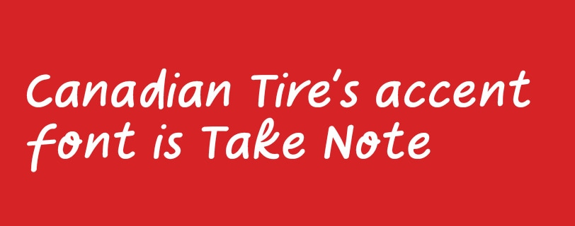
Meet Take Note, an accent font that gives a personal, handwritten feel to Canadian Tire’s more human-centric communication. It is used sparingly and should only be applied in small call-outs when an extra hint of human touch is needed. It should never be used in headlines.
Take Note is available to download for members of the Canadian Tire creative team; others may purchase the font from Colt Type Co. or their preferred font vendor.
Copy Style Guide
This style guide details a set of standards for writing, editing and formatting content. While a Brand Guide focuses on the overall look, feel and visual identity, this type of manual or “style sheet” focuses on writing, editing, grammar, punctuation and common brand terms. Click here to review the latest guidelines.
Downloads
Download CT Eastman
Download Take Note
Lato is a free font, available from Google. Download it here.