• Only the large fonts in the lockup should be set in caps, as shown.
• The date, address, any legal notes or promo qualifiers should be typeset in sentence case.
Grand Opening
Identity
The Grand Opening program encompasses a variety of locally-targeted special events that celebrate Grand Openings, Grand Re-Openings, Anniversary Celebrations and Customer Appreciation events.

Grand Opening identity
Identity components
Lockup
The Grand Opening system is comprised of a family of lockups for each type of event.

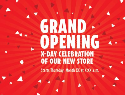
Pattern
A celebratory confetti pattern adds energy and excitement to the program identity.

CT Red
The strong use of red helps with brand recognition.
Lockup construction
The Grand Opening program employs two types of lockups. Choose the one that best suits the nature of the communications:

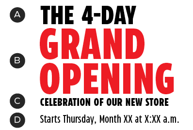
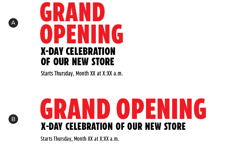
Standard
A – Event name
B – Tagline
C – Dates
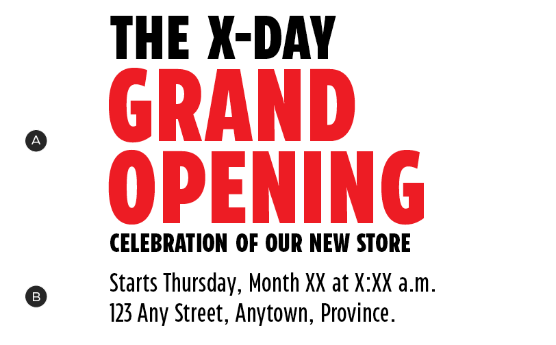
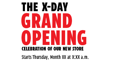
Duration-priority
A – Duration
B – Event name
C – Tagline
D – Dates
The duration and event copy may change from sale to sale. Here's how to update them, if required:

A – CT Eastman Compressed Extrabold
B – CT Eastman Compressed Extrabold
C – CT Eastman Compressed Extrabold
D – CT Eastman Compressed Medium
E – Consistent leading
F – Leading ×2
Always begin with the pre-designed lockups, available in the downloads section of this page. Updates should be minimal and limited to wording only. If more substantial changes are required, please contact the Brand Design Systems Team at BrandSteward@cantire.com.
Type case
Only the large fonts in the lockup should be set in caps, as shown. The date, address, any legal notes or promo qualifiers should be typeset in sentence case.
A – Main headline, set in caps
B – Secondary detail text (date, location), set in sentence case
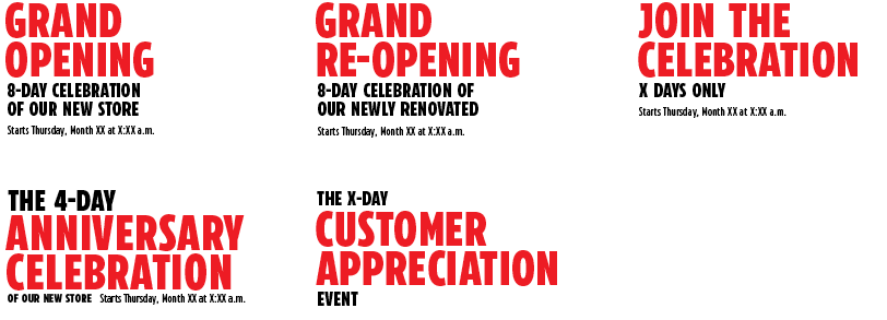
Variations
Where possible, always use the pre-existing lockup variations that fit your event. Here are some examples:
Orientation
Grand Opening lockups may be set in one of two orientations in order to best fit the needs of different channels. Always select the orientation that has the most presence in your layout.
A – Vertical
B – Horizontal
Colour
The Grand Opening program uses either CT White or a combination of CT Red and CT Soft Black for lockups. CT Dark Red and CT Steel may be used as accent colours.
Primary colour palette
Lockups and primary background colours should be composed using a combination of these colours:


Secondary colour palette
The secondary palette is most commonly used to create patterns (see below).


Lockup colour options
The lockup may be set in either CT White or a combination of CT Red and CT Soft Black, depending on the background colour of your layout.

Lockup in CT White
Lockup in CT Red and CT Soft Black. Note: only the event name appears in CT Red.
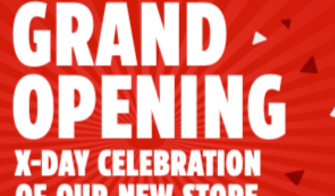
Pattern
Confetti
The Grand Opening toolkit contains a confetti pattern to build excitement and energy around the events. This pattern must be used as a supporting element—it should never detract from products or messaging.


The confetti pattern is composed of slightly-skewed triangles, based on the Triangle Graphic Element. It may appear over red or white backgrounds.
The pattern is flexible in shape, size and density and should appear to be emanating from the lockup. In order to create a sense of depth, the further the confetti is from the logo, the larger the pieces should appear. The pattern may appear on both the red and white backgrounds, can sit behind product images and may bleed off the edges of the layout.
Starburst
The pattern toolkit also contains a starburst, to be layered under the confetti pattern – never use it on its own. The starburst, like the confetti, should appear to be emanating from the centre of the lockup.

Pattern dos and don'ts

Always use the pre-designed shapes to create the confetti.

Don't use a different confetti shape.

Use distance and density to fade out the confetti pattern.

Don't use masking or decreasing opacity to fade out the confetti.

Apply the starburst at the pre-set opacity.

Don't lighten or darken the starburst.
To finish the starburst, fade it out or bleed it off the edge of the layout.

Don't cut off the starburst with a hard edge.

Do not set detail text (date, time, legal qualifiers) in caps. This secondary text should be set in sentence case.
Downloads
For the latest versions, please contact the Omni-Channel Team.