Digital interactions: buttons
Introduction
Each channel within the Canadian Tire digital ecosystem has its own set of CTA button designs, optimized for the needs of that channel. While they are consistent with each other in appearance, other factors, such as sizing and responsive behaviours, change from channel to channel.
Always use the button styles indicated for your specific channel.

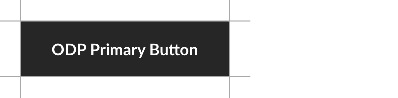
All call-to-action buttons are based on the ODP Button style
Universal principles
No matter which channel, there are a basic set of guidelines which all button designs must follow:

Corner radius: 2px, all buttons (4px for large buttons)

Height: fixed, unique to each button type

Typography: Lato Bold, in Title Case
Padding: fixed, unique to each button type

Basic secondary colour options:
• Transparent, with 1px border in ODP Soft Black (2px for large buttons)
Button text is set in Title Case for English copy and Sentence case for French.
Primary & secondary buttons
Most buttons are designed with a primary and secondary style. As a general rule, only one primary button may appear within a given portal or page. For example: in emails, the primary button style may only appear in the A-spot at the top of the layout.

Primary (filled) buttons should only appear once in a given layout.

Secondary (outlined or “ghost”) buttons can be used multiple times within layouts.
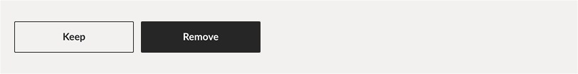
In some instances, primary and secondary buttons may be combined to create hierarchy for user actions.
Exceptions
Chevrons and tertiary (text) buttons do not have alternate styles.

Button types & construction
There are four basic categories of buttons:

A – Flexible Width, where the button stretches to accommodate different lengths of text.
B – Fixed Width, with a set character limit.
C – Tertiary, for assigning lower hierarchy to links, controlling visual clutter, or links with long copy.
D – Chevron, for use in very tight spaces.
Flexible Width: Standard
The Standard Flexible Width button is the closest in size and behaviour to the ODP Button, along with being the most adaptable—when in doubt, use this version.

Corner radius: 2px
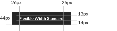
Height & padding

Typography: Lato Bold 14/16px
Flexible Width buttons stretch to accommodate different lengths of text—but the padding remains constant
Flexible Width: Small
The Small Flexible Width button is designed for applications where space is limited. Both the dimensions and text are smaller than in standard-sized buttons—so ensure you only use this where it will remain in proportion with the rest of your typography.
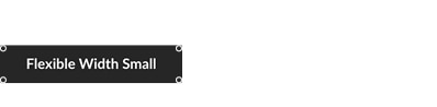
Corner radius: 2px
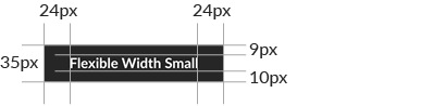
Height & padding

Typography: Lato Bold 13/15px
Flexible Width: Large
Large Flexible Width buttons are for layouts designed at 2× (or larger) of their rendered size. For example, designing a layout at 2,000×2,000px, which will appear on a smartphones (average screen width of 1000px), use the Large button.
Note: do not simply double the size of the Standard button; the proportions are slightly different.
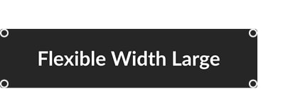
Corner radius: 4px
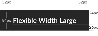
Height & padding

Typography: Lato Bold 28/32px
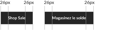
Fixed Width
Fixed Width buttons are for layouts with rigid grid systems, where Flexible buttons would cause the composition to look messy. You may find them too limiting in most other cases.

Corner radius: 2px
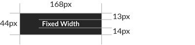
Size & padding

Typography: Lato Bold 14/16px; character limit: 21
Fixed Width: dos and don'ts
Fixed Width buttons are always 168px wide, no matter the copy length.

Copy may not exceed 21 characters or enter the padding area.
Tertiary button
Tertiary buttons, aka text links, are useful for creating hierarchy on a layout with many links, simplifying a composition where multiple square buttons would create visual clutter and typesetting link copy that is too long to fit into a square button.

Typography: Lato Medium 16/22px, underlined; no character limit.

Tertiary button copy may break onto multiple lines.
Chevron
The Chevron, based on existing ODP interface, has been designed for use in extremely tight layouts where a full-size button would be impractical. This button comes in one size only—do not alter it in any way except to change its colour.
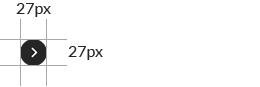
Diameter

Chevron size

Chevron thickness: 1.6px