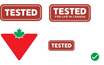
TESTED Badge
The TESTED program means putting the quality of products to the test. Products are tested, rated and reviewed by Canadians and earn our customers' seal of approval. The TESTED Badge has been updated with balanced spacing, CT Eastman and has incorporated subtle styling to create a modern design to be used across all materials and channels.
Variations
There are two variations of the TESTED Badge: the TESTED Badge and the TESTED badge with Brandmark, but each have different use cases.
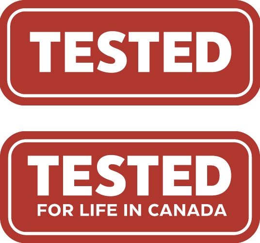
TESTED badge
The TESTED Badge without CT brandmark is used to promote products that have been tested.

TESTED
A smaller, simplified badge with no tagline.

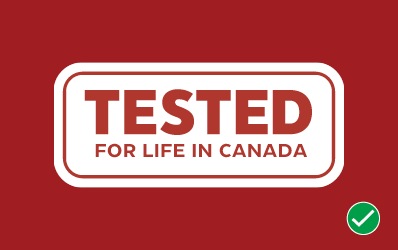
TESTED for Life in Canada
The full version of the TESTED program Badge, including the tagline.
TESTED Badge with CT Brandmark
The TESTED Badge with CT brandmark is used to promote the TESTED program. This Badge should not be used to promote a single product. The TESTED Badge with the Brandmark is available both with and without the tagline. This version of the TESTED Badge must follow the foundational spacing rules. See the Brandmark page for more information.

TESTED Badge with CT Brandmark Horizontal
TESTED Badge with CT Brandmark Vertical
Colour

Full Colour
Primarily CT Dark Red with White text.

Knockout
Primarily White with CT Dark Red text.
Languages
All variations and colours versions of the TESTED Badges are available in English, French and Bilingual.
English
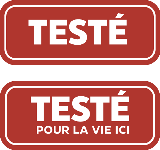
French
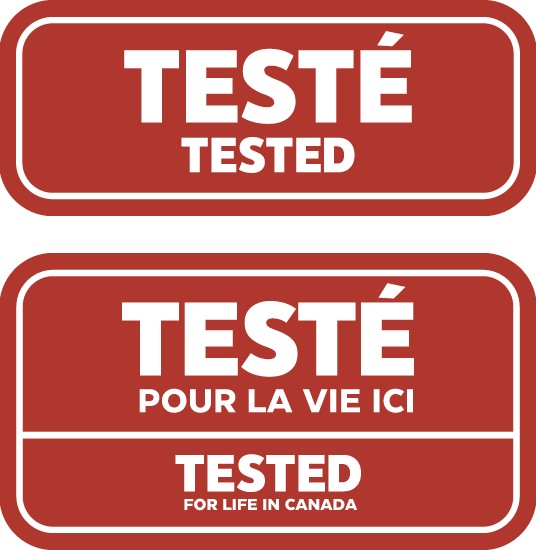
Bilingual
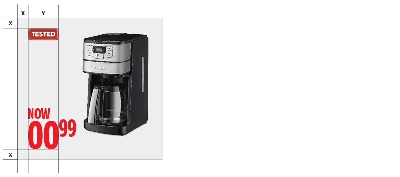
Size and positioning
The TESTED Badge should always be placed in the top left corner of the image area unless a brand logo is present. When a brand logo appears, the badge appears on the right.
The size and alignment should be proportionate to the Save Story. Note that the badge should never increase in size and is always based on the measure of 2 digits of the price point width.
Do's and don'ts
Do select the best badge variation for your composition.
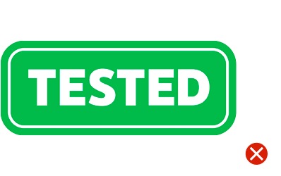
Don't alter the appearance of the badge. This includes colour, keylines, shape and typeface.
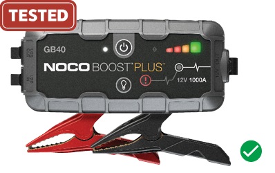
Do place the badge overtop of a portion of the product image when needed.
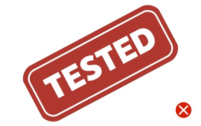
Don't place the badge on an angle.
Do ensure there is enough contrast between the badge and the background colour.
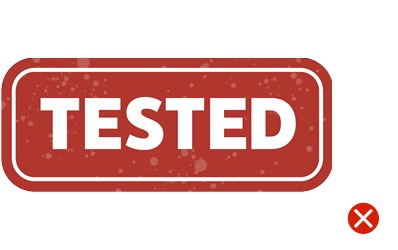
Don't add a texture or effect.