Promotional colour palette
Introduction
Colour plays an important role in the Promotional Marketing channels. In addition to the iconic red and white that has become what people envision when they think of Canadian Tire, the Promotional Marketing channels will utilize a series of colours, customized to emphasize the feelings and events in the season.
Each week will make use of a Dominant colour and its corresponding Accent colour. The application of the colours will be dictated by the tier level of the week. Dominant colours can be used to draw more attention to certain elements on a page such as a lockup, headline or messaging slot. Accent colours are meant to be used as supporting elements. They can be used in backgrounds, to hold and separate category stories, or for messaging slots. In order to meet accessibility requirements, some Dominant colours have been adjusted for contrast in digital applications—when available, always choose the accessible colour for text, rather than a Dominant colour.
For more information on how to apply colour to the various tiers, see the Promotional event lockups guide.
Spring
Dominant colours

MUSKOKA BLUE
PMS 640
CMYK 90 / 40 / 0 / 0 @90%
RGB 0 / 123 / 188
HEX #007BBC

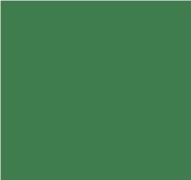
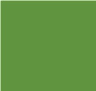
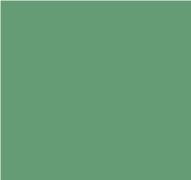
GREAT BEAR RAINFOREST
PMS 7739 @95%
CMYK 80 / 15 / 85 / 0
RGB 82 / 156 / 99
HEX #529C63
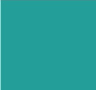
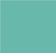
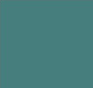
EMERALD LAKE
PMS 7473 @ 80%
CMYK 85 / 10 / 45 / 0 @85%
RGB 33 / 158 / 152
HEX #219E98
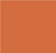
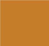
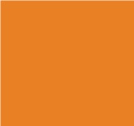
ALBERTA BADLANDS
PMS 1595 @ 90%
CMYK 5 / 80 / 100 / 0 @90%
RGB 211 / 110 / 65
HEX #D36E41
Accent colours
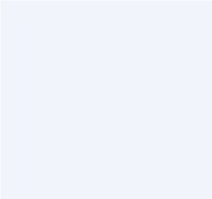
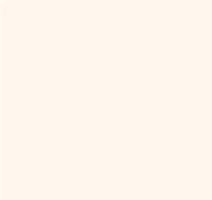
NORTHWEST PASSAGE
PMS 656
CMYK 90 / 40 / 0 / 0 @20%
RGB 239 / 243 / 252
HEX #EFF3FC

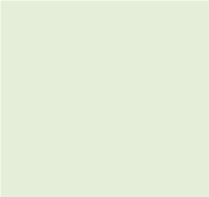
PINERY GREEN
PMS 621
CMYK 80 / 15 / 85 / 0 @20%
RGB 225 / 235 / 229
HEX #E1EBE5

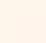
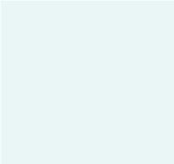
FIVE FINGER RAPIDS
PMS 566
CMYK 85 / 10 / 45 / 0 @20%
RGB 255 / 250 / 249
HEX #E1FAF9
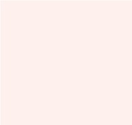
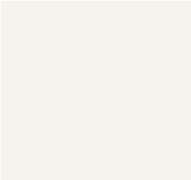
ÎLES DE LA MADELEINE
PMS 475
CMYK 5 / 80 / 100 / 0 @20%
RGB 255 / 240 / 235
HEX #FFF0EB
Digital text
NEWFOUNDLAND GREEN
Use in place of: Great Bear Rainforest
RGB 64 / 123 / 78
HEX #407B4E
Summer
Dominant colours

SWIMMING POOL
PMS 7703 @ 70%
CMYK 70 / 10 / 10 / 0
RGB 0 / 153 / 191
HEX #0099BF

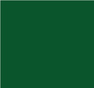
MOWED LAWN
PMS 7489
CMYK 60 / 10 / 100 / 0 @80%
RGB / 118 / 176 / 67
HEX #76B043
LAKE LOUISE
PMS 7465
CMYK 70 / 0 / 40 / 0
RGB 104 / 183 / 171
HEX #68B7AB

PRAIRIE SUNSET
PMS 1375
CMYK 0 / 45 / 100 / 0
RGB 249 / 157 / 28
HEX #F99D1C
Accent colours

NIAGARA FALLS
PMS 628 @ 50%
CMYK 70 / 10 / 10 / 0 @20%
RGB 212 / 239 / 246
HEX #D5EFF6
COMMUNITY GARDEN
PMS 580 @ 50%
CMYK 60 / 10 / 100 / 0 @20%
RGB 228 / 239 / 217
HEX #E4EFD9

NORTHERN LIGHTS
PMS 573 @ 45%
CMYK 70 / 00 / 40 / 0 @20%
RGB 0 / 0 / 0
HEX #EBF8F7
HOPEWELL ROCKS
PMS 148 @ 30%
CMYK 0 / 45 / 100 / 0 @20%
RGB 254 / 245 / 232
HEX #FEF5E8
Digital text

LAKE SUPERIOR
Use in place of: Swimming Pool
RGB 0 / 140 / 175
HEX #008CAF
BALSAM FIR
Use in place of: Mowed Lawn
RGB 99 / 148 / 56
HEX #639438

SASKATCHEWAN GLACIER
Use in place of: Lake Louise
RGB 43 / 158 / 145
HEX #2B9E91
BOARDWALK
Use in place of: Prairie Sunset
RGB 199 / 125 / 22
HEX #C77D16
Fall
Dominant colours

RIDEAU CANAL
PMS 5415
CMYK 85 / 50 / 30 / 0 @85%
RGB 86 / 119 / 145
HEX #567791
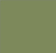
HIGH PARK
PMS 7495
CMYK 70 / 40 / 100 / 0 @80%
RGB 134 / 147 / 92
HEX #86935C
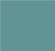
PEGGY’S COVE
PMS 5493
CMYK 70 / 30 / 40 / 0 @90%
RGB 96 / 149 / 150
HEX #609596
FALL HARVEST
PMS 158
CMYK 5 / 60 / 100 / 0
RGB 234 / 128 / 36
HEX #EA8024
Accent colours

FRESH POWDER
PMS 7541 @ 70%
CMYK 85 / 50 / 30 / 0 @20%
RGB 234 / 241 / 245
HEX #EAF1F5
CAPE BRETON HIGHLANDS
PMS 5803 @ 50%
CMYK 70 / 40 / 100 / 0 @20%
RGB 243 / 244 / 236
HEX #F3F4EC
SKATING RINK
PMS 5523 @ 40%
CMYK 70 / 30 / 40 / 0 @20%
RGB 235 / 245 / 245
HEX #EBF5F5
PUMPKIN PATCH
PMS 1345 @ 40%
CMYK 5 / 60 / 100 / 0 @20%
RGB 253 / 245 / 237
HEX #FDF5ED
Digital text

CAVENDISH BEACH
Use in place of: Pumpkin Patch
RGB 214 / 117 / 32
HEX #D67520
Winter
Dominant colours

LAKE ANNETTE
PMS 315 @ 75%
CMYK 79 / 38 / 28 / 0
RGB 73 / 122 / 145
HEX #497A91
SITKA SPRUCE
PMS 7731 @ 75%
CMYK 100 / 35 / 100/ /0 @75%
RGB 103 / 155 / 116
HEX #679B74
POINT PELEE
PMS 7474 @ 80%
CMYK 100 / 40 / 60 / 0 @80%
RGB 69 / 124 / 124
HEX #457C7C
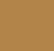
LUCKY LOONIE
PMS 7572 @ 80%
CMYK 25 / 50 / 90 / 0
RGB 177 / 132 / 74
HEX #B1844A
Accent colours

FROZEN POND
PMS 549 @ 25%
CMYK 79 / 38 / 28 / 0 @ 20%
RGB 255 / 237 / 241
HEX #E1EDF1

GATINEAU PARK
PMS 349 @ 15%
CMYK 100 / 35 / 100 / 0 @20%
RGB 239 / 242 / 241
HEX #EFF2F1
BAY OF FUNDY
PMS 7714 @ 15%
CMYK 100 / 40 / 60 / 0 @20%
RGB 237 / 244 / 244
HEX #EDF4F4
WHEAT FIELD
PMS 154 @ 10%
CMYK 25 / 50 / 90 / 0 @20%
RGB 250 / 244 / 237
HEX #FAF4ED
Black Friday / Cyber Monday
Additional colours
In addition to standard brand colours, Black Friday and Cyber Monday make use of additional colours, specific to these events. Do not use them outside of these promotions.
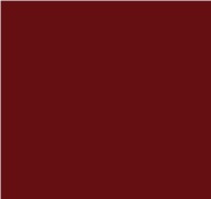
BLACK FRIDAY MAROON
Pattern colour
PMS 1815
CMYK 35 /100 / 100 / 50
RGB 105 / 12 / 13
HEX #660C0D

BLACK FRIDAY DARK RED
Pattern colour
PMS 704
CMYK 25 /100 / 100 / 25
RGB 152 / 27 / 30
HEX #981B1E

BLACK FRIDAY MEDIUM RED
Pattern colour
PMS 1645
CMYK 0 / 75 / 75 / 0
RGB 242 / 102 / 73
HEX #F26649

BLACK FRIDAY LIGHT RED
Pattern colour
PMS 1625
CMYK 0 / 50 / 50 / 0
RGB 246 / 150 / 121
HEX #F69679
CYBER MONDAY DARK GREEN
Pattern colour
PMS 357
CMYK 90 / 40 / 100 / 40
RGB 7 / 84 / 43
HEX #07542B
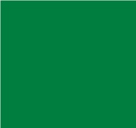
CYBER MONDAY MEDIUM GREEN
Pattern colour
PMS 348
CMYK 90 / 25 / 100 / 15
RGB 0 / 125 / 63
HEX #007D3F

CYBER MONDAY LIGHT GREEN
Pattern colour
PMS 346
CMYK 60 / 0 / 60 / 0
RGB 103 / 193 / 140
HEX #67C18C

CYBER MONDAY PALE GREEN
Pattern colour
PMS 352
CMYK 40 / 0 / 45 / 0
RGB 156 / 210 / 165
HEX #9CD2A5
Fête nationale
Additional colours

QUÉBEC BLUE
PMS 2132 C
CMYK 88 / 68 / 8 / 0
RGB 51 / 95 / 162
HEX #335FA2
MILKY WAY
PMS 656 C
CMYK 85 / 30 / 25 / 0 @20%
RGB 230 / 244 / 247
HEX #E6F4F7
Back to it
Additional colours
NAVY
PMS 2728 C
CMYK 100 / 90 / 10 / 0
RGB 1 / 45 / 128
HEX #012D80

MIST
PMS 656 C
CMYK 13 / 3 / 0 / 0 @100%
RGB 228 / 239 / 249
HEX #E4EFF9
Father's Day
Additional colours

FATHER'S DAY BLUE
PMS 2727 C
CMYK 90 / 60 / 0 / 0
RGB 46 / 104 / 173
HEX #2E68AD
NORTHWEST PASSAGE
PMS 656
CMYK 90 / 40 / 0 / 0 @20%
RGB 239 / 243 / 252
HEX #EFF3FC
Dollar Rush
Additional colours

CORNFLOWER BLUE
PMS 277 C
CMYK 32 / 20 / 0 / 0
RGB 168 / 192 / 22
HEX #A8C0DE

WHITE LILAC
PMS 277C @20%
CMYK 32 / 20 / 0 / 0 @20%
RGB 238 / 241 / 249
HEX #EEF1F9
Accessibility
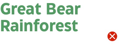
Great Bear Rainforest over white: does not pass.
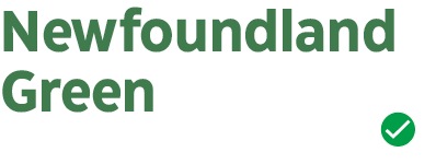
Newfoundland Green over white: passes.
Just because a colour combination looks great doesn't mean it will meet standards for digital accessibility. Use a digital tool to check your colour choices and ensure they meet WCAG 2.0 level-AA contrast ratios:
4.5:1 for small text
3:1 for large text
4.5:1 for graphical objects