Logo, triangle & lockup placements
The logo, triangle/slash and lockups are three elements found on the cover of almost all flyers. Each build off their respective Omni-Channel guidelines to create a set of more specific, in-channel rules which help to maintain the consistency of their placement and appearance while still allowing room for some creative variances.
Logo size & placement
To read the in-depth Canadian Tire logo guidelines, please refer to the Brandmark page.
The Canadian Tire Logo always appears in the upper left corner of all print flyer materials. The logo must sit a 1 leaf from the bottom edge of the header bar and 1⁄2 leaf from the margin.
The clear space measurement of the top of the logo is adjusted slightly in flyer to reduce the amount a dead space that appears at the top of the page. Be mindful when placing the logo that the 1 leaf measurement if from the bottom of the header bar to the top of the red of the triangle of the logo.
Logo size
Due to the variety of paper sizes in which the flyer if printed, the logo size is designed to be relative to the grid. Based on the current flyer, we have two general flyer sizes: Narrow Broad and Square Tab. The logo size has been determined for both of these sizes in order to create a similar visual presence as well as optimization with the grid.
Narrow Broad
The logo in the narrow broad format is designed as to be 1 grid unit in width, offset a half-leaf from the margin.
Square Tab
The logo in the square tab format is designed to be 1 grid unit in width minus a half-leaf.
When converted to the digital flyer, the logo is removed and appears in the header space alongside the navigation.
Logo Violations
Do not adjust the size of the logo.
Do not change the placement of the logo.
Front Cover Brand Signature
The front cover of the flyer requires a special treatment to be applied to the Brand SIgnature system. In order to maximize the SKU space, the Brand Signature aligns to the top of the red triangle of the brandmark, rather than its standard centered position. This version of the Brand Signature can ONLY be used on the flyer front cover. It must not appear on any other flyer pages or in any other channels.
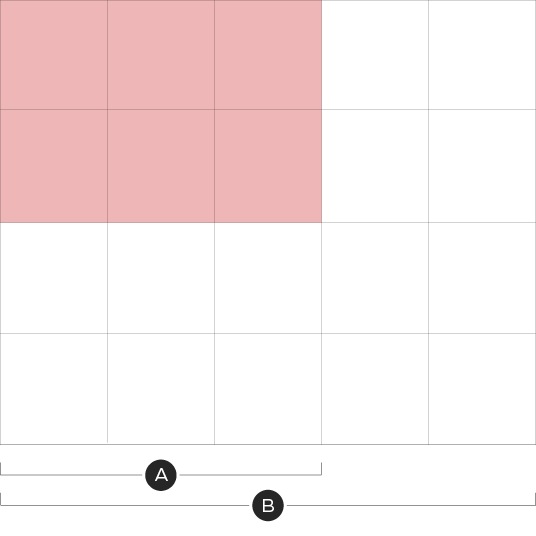
A – Available space for the Brand Signature
B – The furthest righthand column commonly holds an NPP or Deal Zone. To create a consistent flyer design, regardless of whether the space is used or not, the Brand Signature cannot extend within this column.
A – The Brand Signature cannot exceed more than 1 leaf in height.
With the standardized size and placement of the brandmark on the flyer front covers, the Brand Signature can appear top aligned to the red of the triangle and to a maximum width of three grid units or maximum height of 1 leaf. This system can apply to any version of the Brand Signature.
The flyer is only produced in English and Bilingual. French versions of these Brand Signatures do not exist. When arranging products on the English front cover, ensure there is enough clear space for when the Bilingual brand signature is in use.
English flyer brand signature.
Bilingual flyer brand signature.
The Front Cover Brand Signature must follow the established spacing and positioning rules described on the Brand Signature page.
Logo Violations
Do not adjust the size or position of the Brand Signature.
Do not create new version of the Brand Signature.
Triangle/Slash Placement
The triangle/slash element is a tool which can be used on the flyer front cover as a subtle background or to contain a colour, pattern or lockup. The placement of this element is flexible but has an optimal area in which the bulk of the shape should be situated. The areas have slight variations between the two flyer sizes in order to create equal visual balance between the two sizes.
Narrow Broad Flyer Size
The highlighted red area at left showcases where the majority of the triangle/slash element should be placed when it enters from the left. The triangle should not exceed more than 3 grid units across, while the height and rotation of the triangle/slash can vary. The slash can carry across full width but should not come within 1 grid unit of the center fold.
When the triangle/slash enters from the right, it should not exceed more than 4 grid units across or extend beyond the left hand side of the red or the CT logo. The slash can carry across full width but should not come within 1 grid unit of the center fold.
For detailed guidelines on the triangle's or slash's acceptable angles and rotations, please see the Triangle Element page.
Square Tab Flyer Size
The highlighted red area above showcases where the majority of the triangle/slash element should be placed when it enters from the left. The triangle/slash should not exceed more than 4 grid units when coming in from the left or 3 grid units when coming in from the top. The height and rotation of the triangle/slash can vary.
When the triangle/slash enters from the right, it should not exceed more than 5 grid units across nor should it extend beyond the left hand side of the red of the CT logo. When the slash is entering from the bottom, the uppermost point should not extend beyond the red of the triangle in the CT logo.
For detailed guidelines on the triangle's or slash's acceptable angles and rotations, please see the Triangle Element page.
Digital Flyer
A – Mobile view
B – Desktop view
For optimization across screens, the triangle/slash element in the digital flyer can only be placed in the top left of the grid with a maximum width of three grid units.
Triangle/Slash Do's and Dont's
Do vary the placement and rotation of the triangle/slash. See Triangle Element for details on acceptable angles and rotations.
Do not bleed a lockup over an edge of the triangle/slash element with the exception of a brand signature on a white and accent colour background.
Do leave a minimum of a 1/2 leaf clearspace between lockups and the edges of the triangle/slash element.
Do not bleed more than two edges off a front cover.
For more details on the acceptable usage, visit the Triangle Element page.
Lockup placement
Tier 3 and above flyers utilize lockups during promotional events which typically appear close to the Canadian Tire logo. Lockups must follow the foundational and omni-channel guidelines. When creating a lockup for an existing event, ensure you are following the Omni-channel promotional identity for the corresponding tier and event type.
The Canadian Tire Brandmark requires a minimum of 1 leaf of clearspace from any lockup. Lockups may sit below or beside the Logo and have variable heights and widths, but must not be larger than 3 grid units in height or width.
When lockups are placed to the right of the Canadian Tire logo, the uppermost point of the lockup must to extend beyond the top of the red triangle in the logo.
If a promotional event is running that ladders up to an Omni Identity, the corresponding Brand Signature can be used in place of the Primary Brandmark. The Brand Signature must be reduced in size in order to maintain a clear hierarchy but will still appear in the top right.
A - Omni Identities brand signature
B - Promotional Lockup
In order to maintain a clear heirarchy, the size of the brandmark must be reduced to one leaf smaller than a single grid unit. The promotional lockup must appear a minimum of 1 leaf from the brand signature.
Lockup Do's and Dont's
Do pick the placement of the lockup based on the available space.
Do not lockup the event name and the logo by placing them less than 1 leaf apart.
Do size the lockup according to the messaging priorities.
Do not create lockups that exist outside of an established tier's guidelines.
Do use Brand Signature that corresponds with the omni identity.
Don't make the Brand Signature bigger than the promotional lockup.
Downloads
Canada's Store lockups in the custom proportions shown above should only be used in Print Flyer. If you need these lockups, please contact BrandSteward@cantire.com