Revised image example of secondary Brandmark - full reversed to reflect the correct reverse secondary Brandmark
Brandmark
Primary and secondary Brandmarks

Primary Brandmarks
The primary Brandmark can be used on any colour background and will always retain its look. This is the preferred version for most consumer-facing content due to the high awareness it holds amongst Canadians. The primary Brandmark should be used for print, television and digital platforms unless specified by the Canadian Tire Brand Team.

Secondary Brandmarks
The secondary Brandmark contains the Canadian Tire Wordmark within the triangle to boost brand recognition. This version should only be used where brand awareness is low. Examples for use would be within international corporate communications and assets. The primary Brandmark is the preferred version for all Canadian marketing communications. Please consult the Canadian Tire Brand Team when using the secondary version.

Clear space
For maximum brand impact, avoid crowding the Brandmark within a design by using the maple leaf icons to create clear space around it.
Placement
The Brandmark can be centred at the top or bottom of a composition or in one of four corners. When the Brandmark is the focal point of a composition, it can be placed in the centre. As a general rule of thumb, when positioning our Brandmark on a page, try to use either the maple leaf or Brandmark itself as a measurement guide to maintain consistency. When centring the Brandmark, position it slightly higher than the true centre. This is referred to as "optically set."
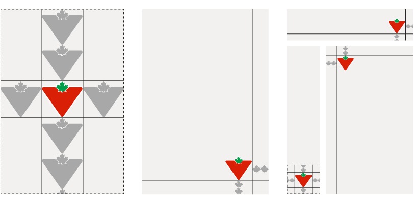
When placing the Brandmark, use the leaf or the Brandmark itself as a unit of measure.
Scale and minimum size
Avoid making the Brandmark too small. In order to achieve the highest impact, use the correct size/format based on the application for which it is being used. Not sure which version to use? Email the Brand Design Systems Team at BrandSteward@cantire.com.
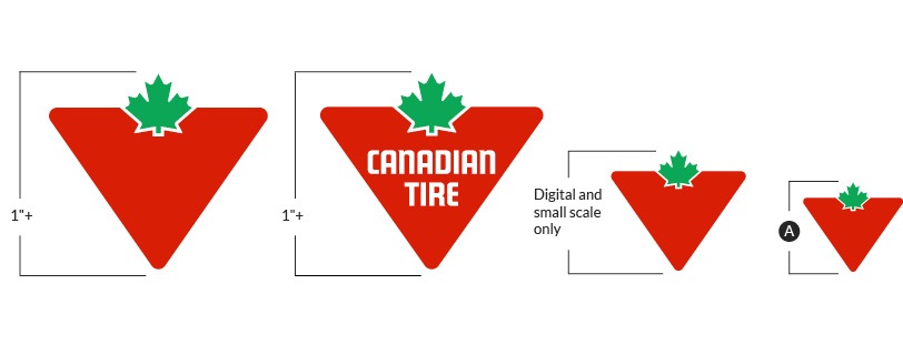
A – The minimum size for the social media icon has been predetermined
Micro Brandmark versions
The primary Brandmark's micro version has been optically set for digital and smaller scale applications. The micro version should never replace the primary Brandmark and should only be used when legibility due to scale is an issue.
Brandmarks – black & white
In rare instances where colour is not available, black and white versions of the Brandmark have been created. These may be used in newspapers, rubber stamps or embroidery. You should generally still be able to use the full colour Brandmark.

Primary Brandmark

Secondary Brandmark
Brandmarks – full reversed
This Brandmark version may only be used reversed out of CT Red and was created to provide flexibility to give a modern and confident feel to the Brandmark when reversed.

Primary Brandmark

Secondary Brandmark
Brandmark violations
Here are a few rules to ensure our Brandmark remains consistent across all branded materials. If you're unsure whether or not something violates these brand standards, please consult the Canadian Tire Brand team.

NEVER rotate, warp or skew

NEVER change colours

NEVER stretch or flatten

NEVER change Wordmark typeface

NEVER add effects

NEVER scale Brandmark elements

NEVER adjust corners

NEVER place on a busy background