• Moved Iconography overview and category content to a distinct page to provide a comprehensive introduction
Iconography foundations
Iconography foundations overview

Canadian Tire uses iconography across all channels to communicate with our customers. Icons are small, image only illustrations meant to act as a visual shorthand to convey a feature, benefit, or function with limited use of descriptive labels. Icons can also be used in-line with supporting text. They should be used to aid rapid transfer of information to support customer interactions.
All Canadian Tire icons must conform to the following list of foundational parameters, to ensure that they are cohesive and on-brand:
· Style
· Size (grid & common shapes)
· Stroke/fill specs
· Corner radius & end caps
· Colour use & accessibility
· Labels
· Shape containers
· Hierarchy
Style

Primary style:
Outline

Secondary style:
Glyph
Canadian Tire's primary iconography style is created with a single-colour outline. This line style of icon is used across all channels and is the default style when creating new icons. In some applications, where reproduction and quality of the icons would be hindered by our Primary style, our Secondary Glyph style can be used to further simplify an icon. The Glyph style is reserved for Product Feature Icons.
All Primary and Secondary icon styles are built using the same foundational elements. They must all appear consistent in size with pixel-perfect designs for integration purposes.
Size
Due to the wide range of types and applications across Canadian Tire, icons are designed to be responsive. Traditionally, responsive icons react and change depending on screen size. These icons have varying complexities and aim to find the balance of simplicity in relation to screen size. Canadian Tire's icon library will follow this same approach for all channels.
Icon sizes & grids
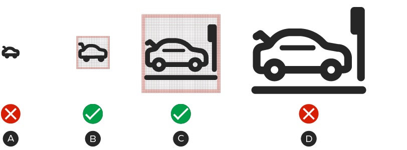
A – 16×16px
B – 20×20px
C – 48×48px
D – 96×96px
To make icons truly Omni-Channel, various sizes and levels of detail are considered to accommodate different applications and channels. Icons are designed on 20×20 and 48×48 pixel grids that adhere to predefined live areas and padding. For in-channel applications that require smaller or larger sizes, teams may adjust the icons to meet their needs. These versions can be created by scaling the 20×20px icon smaller or the 48×48px icon larger. See the Scaling section for more information on the how to scale the two sizes of icons.
Note: The BDS Team will not be responsible for maintaining icon designs outside of the 20×20px and 48×48px sizes.
Grid padding & live area
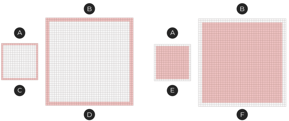
A – 20×20px grid
B – 48×48px grid
C – Padding: 1px
D – Padding: 2px
E – Live area: 18×18px
F – Live area: 44×44px
Icons are built on an underlying grid with a set live area and padding. The live area is where the bulk of the icon should live. This space is unlikely to be hidden or cut off.
The padding area allows for consistency in size and space around the icon designs. If required, portions of the designs may extend into the padding in order to achieve visual balance, but cannot extend beyond the grid.
Scaling
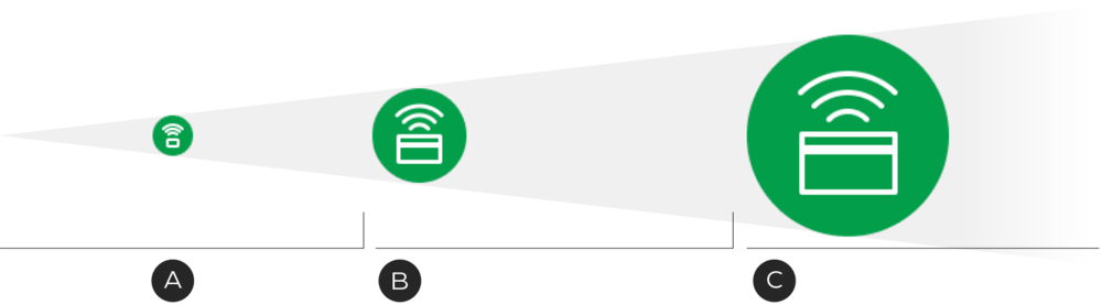
A – 20×20px icon scales between 0–47px / 0–1 inch
B – 48×48px icon scales between 48–149px / 1–2 inches
C – 150×150px* icon scales between 150px + / 2+ inches
*The 150×150px icon is designed for large scale print applications.
All icons are designed at two foundantional sizes, but on occasion, these sizes may not suit the needs of the composition/channel. Icons can be scaled to better suit the needs of your composition but must follow some basic rules in order to keep consistency across all channels. When possible, all channels should aim to use the foundational sizes.
Scaling down
If you scale down the 20×20px icon, scale the stroke along with it to maintain the stroke's visibility.
Scaling up
Scaling up an icon is slightly more complicated, as we cannot rely on proportional stoke scaling as consistently as when we scale down. For this reason, icons that need to appear larger than 2 inches have a 4px stroke width, which is better for larger display sizes.
As you scale, ensure you are selecting the correct size icon as a starting point. Scaling up an icon beyond its recommended size will result in chunky designs which will communicate less effectively with customers.
Strokes & fills

A – 20×20px icons—stroke width: 2px
B – 48×48px icons—stroke width: 3px
C – 48×48px icons—small detail stroke width: 2px
The primary line style utilizes strokes in the creation of the icon. The stroke weight is designed to be proportional to the size of the icon so that when scaling occurs, icons appear at a similar weight. Icons built on the 20×20px grid should maintain a 2px stroke weight. Icons built on the 48×48px grid should use a 3px stroke weight. Small details on the 48×48px icons can be created using the 2px stroke weight, but should only be used when a 3px stroke cannot work.

If a Primary style icon requires an area with a fill, it should not be more than 30% of the icon.
When the reproducibility of an icon is limited by a constraint such as size or paper type, our Secondary Glyph style of icon can be used. These icons follow all the same foundational elements as our Primary Outline style with the exception that it is made of mostly fills. We most commonly see this style used for Product Feature icons. This type of icon can be designed as filled Icons, but must utilize the correct stroke width for the icon's size.
Whenever possible, please use icons in the Primary icon style. To request an icon outside of the Product Feature Icon category in the Glyph style, please contact BrandSteward@cantire.com
Corner radius & end caps

A – Stokes should have rounded end caps.
B – Outer corners should be rounded, but the inner corners should remain square.
All icons, regardless of size, should be drawn with rounded corners and end points. Corner radii are 2px by default. Interior corners should be square, not rounded.
Colour use & accessibility
A – Contrast ratio - 3.5:1—Pass
B – Contrast ratio - 1.13:1—Fail
C – Contrast ratio - 3.5:1—Pass
D – Contrast ratio - 15.13:1—Pass
E – Contrast ratio - 1.13:1—Fail
Both the Primary and Secondary icons must only utilize a single colour and be created in both CT Soft Black and white. Icons and their shape containers can have colours applied to them so long as they meet WCAG 2.0 accessibility standards. Use a digital tool to check your colour choices and ensure they meet WCAG 2.0 level-AA contrast ratios.
Colour use for the Canadian Tire iconography helps to differentiate programs or types of icons. For example, Customer Experience Icons must appear in a CT Green shape container. Before applying a colour, please ensure the colour is not already in use or that your icon belongs to the corresponding set . If you are unsure about a colour, please contact BrandSteward@cantire.com for additional guidance.
Labels
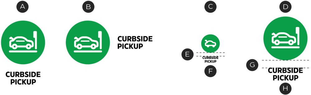
A – Vertical label
B – Horizontal label
C – 20×20px icon size
D – 48×48px icon size
E – 6px margin
F – CT Eastman Grotesque, Bold, 5.5pt
G – 12px margin
H – CT Eastman Grotesque, Bold, 12pt
All icons within the Canadian Tire library contain an optional label which can be turned on or off, depending on where the icon is being used. Labels can contain the name of the icon or instructional information (in the case of Process Icons, see the Process Icons page). They can appear below or to the right of an icon with a minimum clear space around the icon. They should be typeset in CT Eastman Grotesque, Bold. Icon labels can be set in uppercase when it is contains the icon/program name, but should be sentence case when containing descriptive text.
Note: Labels in the digital space must defer to ODP and Accessibility Standards.
Shape containers

Container padding is equal to the icon grid padding ×2
A – 20×20px size
B – Grid padding: 1px
C – Container margins: 2px
D – 48×48px size
E – Grid padding: 2px
F – Container margins: 4px
Icons can be placed within a container as a way to draw additional attention to an icon or set of icons, the default being circles. Container sizes are set based on the size of the icon and should maintain the corresponding margins. Container margins are determined by icon padding ×2. For example, a 20px icon has a padding of 1px therefore the container margin equals 2px.
Note: Due to Accessibility rules, clickable digital icon containers must be a minimum of 44×44px .
Hierarchy

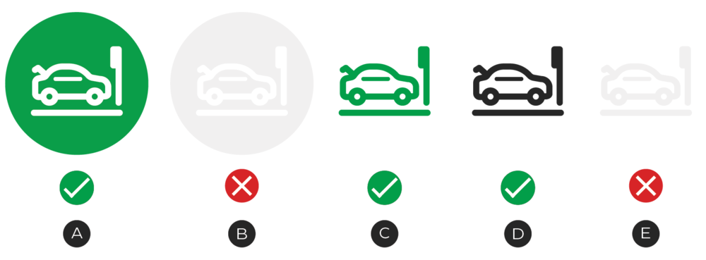
In this example, the icon with the higher-priority message—Order Pickup—uses a container, lending it more impact.
Within our system of icons, some sets will require the support of other icons to communicate features, benefits or a process. When this occurs, icons can be separated into two levels. These levels will help to define a hierarchy of information within the icon system and the composition.
To create hierarchy, place Level 1 (higher importance) icons into containers and keep level 2 (lower importance) icons in their basic state.
Iconography dos and don'ts

Do design simple, pixel-perfect icons.

Don't create new icon styles.
Do reuse commonly used shapes across icons.
Don't apply multiple colours.
Do consider all icons to be Omni-Channel when designing them, so that they're future-proof.
Don't use oversimplified icons for larger applications or highly detailed icons for small applications.
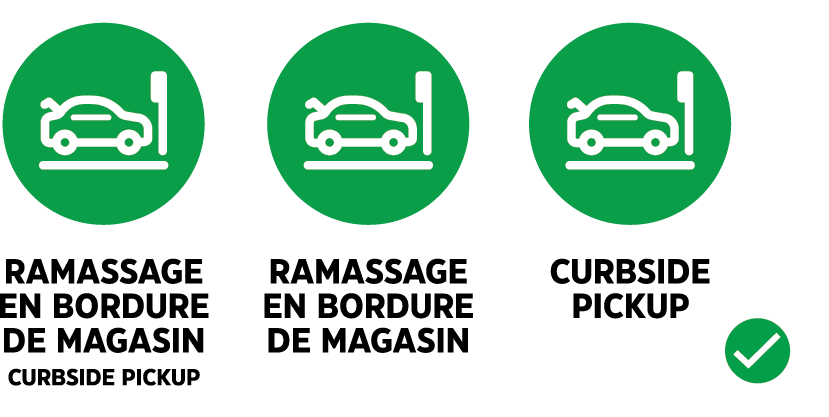
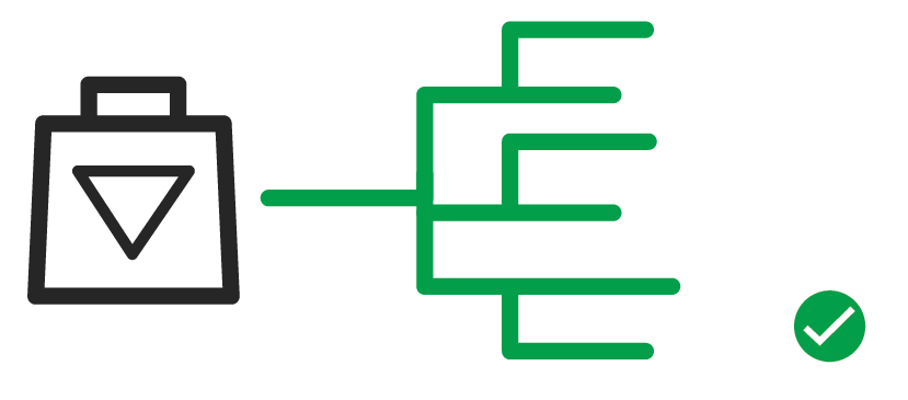
Do create English, French and bilingual labels for all icons.

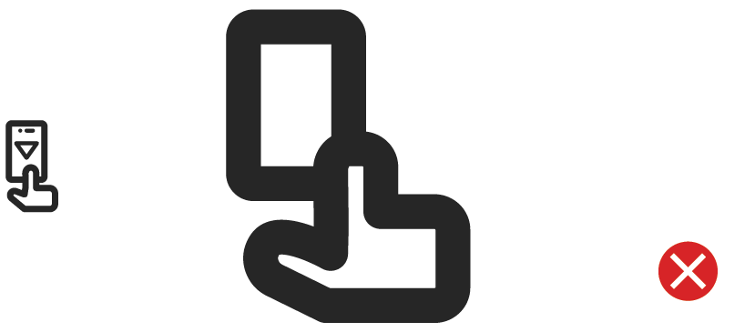
Don't customize an exisiting icon or label without prior approvals.