Brandmark, Triangle, lockup & event date/duration placement
The Special Print books are designed on a grid system to provide a set of guidelines to build a consistent look for all specialty print materials across both print and digital platforms. This grid helps to determine the size and placement of all the elements in the Special Print books.
Brandmark placement
The Canadian Tire Brandmark must always appear in the top left of all Special Print books. When placing the Brandmark, ensure that it is following rules set out in the Brandmark foundational guidelines.
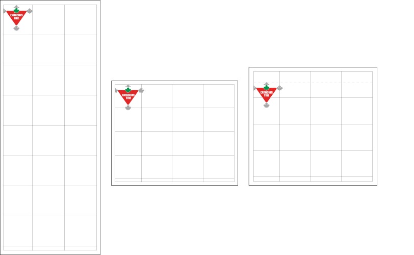
Similar to the Flyer, the Special Print books allow for the Brandmark to be placed 1/2 leaf measure from the left side margin of the book. The top of the Brandmark must be 1/2 leaf measure from the top of the page, with the exception of the Special Print books with a Pop-up zone. When the Pop-up zone is present, the Brandmark should measure a 1/2 leaf from the bottom of that zone.
Brandmark size
The Brandmark size is determined based on the size of the publication and its grid.
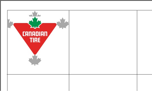

Narrow Broad
The Brandmark in the Narrow Broad format is designed as to be 1 grid unit in width, including the 1/2 leaf measure on the left and the full leaf measure on the right.
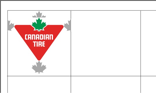

Square Tab
The Brandmark should measure 1 grid unit in width with the half leaf measures on the left and right side included.
Brandmark vs Brand Signature

Some Special Print books strategically support a higher level seasonal message. These books often utilize a Brand Signature in place of the Brandmark. When utilizing a Brand Signature, the size and placement must match the guidelines above for a consistently sized and placed CT Brandmark on all SP Books. One of the supplied Signature Brandmarks must be used. Do not change the proportion of the text (e.g., "Canada's Store") to the Brandmark.
Triangle placement
The Triangle Element can be used on Special Print book front covers as a way to further represent the Canadian Tire Brand. All instances of its use must follow the foundational guidelines which can be found on the Triangle Element page.
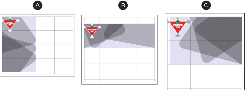
A – Incoming from the left
B – Incoming from the top
C – Incoming from the right
When using this Element on the Special Print books, the Triangle or Slash Element can come in from the left, top or right side. Regardless of side, the Triangle/Slash should not take up more than half of the height/width of the feature image zone and should respect the clearspace around the logo/Brand Signature.

A – Sample layer triangle with 65% opacity
B – Sample layer triangle with 55% opacity
C – Sample layer triangle with 45% opacity
When using the Triangle/Slash as a layer, the opacity can be adjusted between 45-65% to ensure the legibility of a headline/lockup, without obscuring the feature image.
Lockup placement
A lockup must exist on the front cover of ever Special Print book. Depending on the format, it can either sit in the lockup zone on top of the feature image zone or within the Pop-up zone.
Standard format
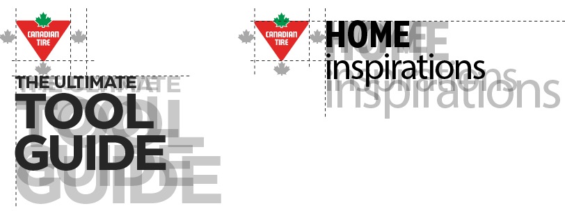
The CT logo requires a minimum of 1 leaf of clear space from any lockup. Lockups may sit below or beside the logo. Lockups have variable heights and widths, but must not be larger than 3 grid units in height or width. When placing a lockup beside the Canadian Tire logo, no copy should appear above the top of the red Triangle.

When the lockup is placed vertically below the CT logo or a Brand Signature, it must sit a minimum distance of 1 leaf from the bottom. As long as the 1 leaf minimum is maintained, the lockup can sit anywhere vertically within the lockup zone. If a Brand Signature is in use and separated from the Brandmark, the lockup must not come within three leafs of the Brand Signature. The lockup cannot exceed the width of 2 grid units.

When the lockup is placed horizontally beside the CT logo or Brand Signature, it must maintain a minimum distance of 1 maple leaf. The lockup cannot exceed 2 grid units tall, or 2 grid units wide and must align with the top of the red Triangle in the CT logo.
Pop-up zone lockup
When a pop-up zone is present, the lockup appears within it and is not repeated in the positions outlined above. For more information on the pop-up zone and it's content, see the pop-up zone page.
Event date & duration placement
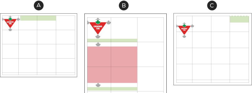
A – Event date & duration at top of page aligned to leaf in the CT Brandmark
B – Event date & duration positioned with vertical lockup zone
C – Event date & duration within pop-Up zone
The event duration & date zone contains information relating to the promotions sale dates and the length of sale. It can be located in the top right of the feature area, aligned with the top of the leaf in the CT logo, positioned as a part of the lockup or within the pop-up zone.
Top aligned
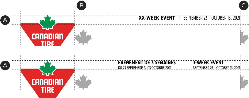
A – Event date & duration is aligned to the top of the leaf in the Brandmark and does not extend below the top of the red of the Triangle.
B – Event date & duration must be a minimum of 1 leaf from the Brandmark.
C – 1/2 leaf distance between the right edge of the feature image zone and the event date & duration zone.
When the event date and duration zone appears at the top of the page, it must be aligned to the leaf of the CT Brandmark.
Lockup aligned
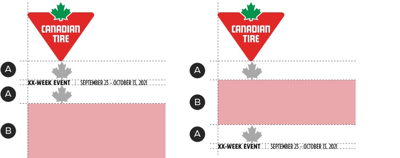
A – Minimum 1 leaf clear sapce
B - Lockup zone
When the event date and duration zone appears aligned with the lockup, it must be left aligned to with the lockup zone and maintain a 1 leaf distance, whether placed above or below the lockup zone.
Pop-up zone
For more information on how to set up the event date & duration zone when in a pop-up zone, see the Pop-up zone page.
Event date & duration typography
Regardless of zone placement, the event date & duration typography follow the same formatting.

A – CT Eastman Condensed Bold, 12/14pt
B – Centered 0.75pt black line, 1/2 leaf spacing between copy
C – CT Eastman Condensed Regular, 12/14pt

A – CT Eastman Condensed Bold, 12/14pt
B – 0.75pt black line, 1/2 leaf spacing from copy. Single line should apply to both languages.
C – CT Eastman Condensed Regular, 8.5/10pt
