Tier 2C: Tire Sale
Identity
The Tire Sale program targets key seasonal tire changeover periods—spring and fall—as well as a niche and strategically important customers with trucks and performance vehicles. Due to the importance of these sales, Tire Sale events are classified as Tier 2C, with an associated event colour and pattern.

Tire Sale visual identity
Identity components

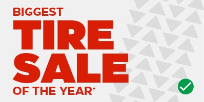
SALE lockup
Tier 2 contains the only event lockups that use the word SALE.

Pattern
A tire tread pattern made of CT triangles is used to create an ownable identity and a visual connection to automotive and tires.

CT Steel
The use of grey with red accents builds brand equilty in the tire category while separating it from other promo tier events.
Lockup construction
Tire Sale lockups may appear with or without event name copy and duration, either above or below the lockup, depending on what the situation requires.
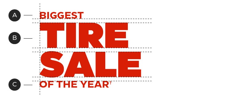
A – Event name and duration (optional)
B – Tier (type of sale)
C – Event name (optional)
The duration and event copy may change from sale to sale. Here's how to update them, if required:

A – Duration–CT Eastman Roman Medium
B – Event name–CT Eastman Roman Bold
C – Tier–CT Eastman Roman Heavy
D – Consistent leading
Always begin with the predesigned lockups, available in the downloads section of this page. Updates should be minimal, limited to wording only. If more substantial changes are required please contact BrandSteward@cantire.com
Orientation
Tire Sale event lockups each have a variety of orientations in order to best fit the needs of different channels. Always select the orientation that has the most presence in your layout.
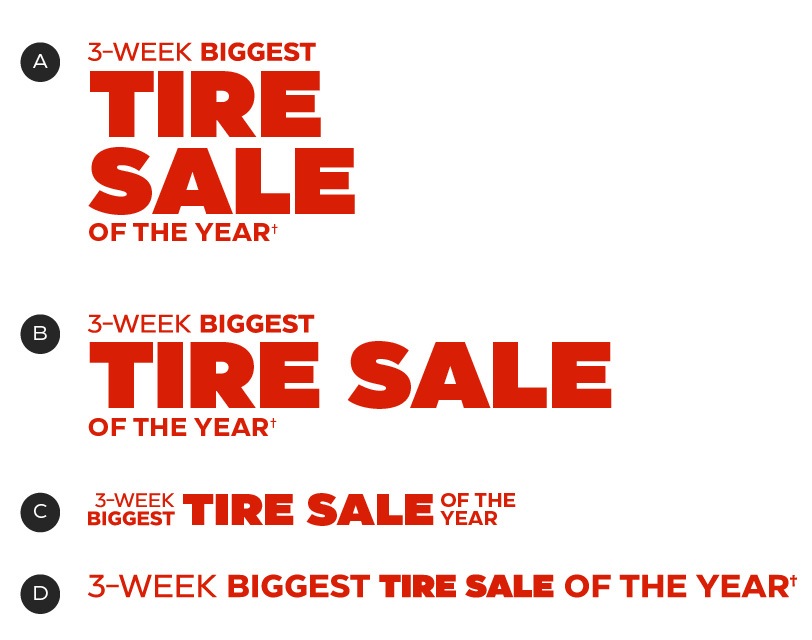
A – Vertical
B – Horizontal 1
C – Horizontal 2
D – Horizontal 3
Colour
The Tire Sale program uses either CT Red or CT White for lockups with the support of a CT Steel and CT Mid Grey background pattern.
Primary colour palette
Most compositions should be created using a combination of the following three colours:


Secondary colour palette
The secondary colours come into play with the secondary pattern colour combinations (see below).


Lockup colour options
The lockup may be set in either CT White or CT Red, depending on the background colour of your layout.


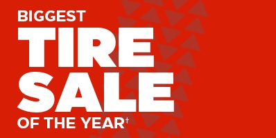
Preferred colour scheme: CT Red over a CT Steel background.
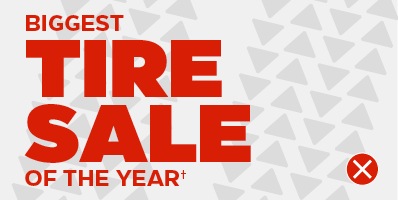
Alternate colour scheme: White over a CT Red background. To only be used in external channels sush as paid media in order to connect with the Canadian Tire brand.
Pattern
The Tire Sale program employs a tire tread pattern to create a sense of motion and build an ownable identity for these events. This pattern must only be used as a supporting element and be secondary to all messaging.
Pattern placement: dos and don'ts
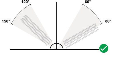
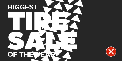
You may rotate the pattern between 150 and 120 (or 60 and 30) degrees, to best suit your layout.
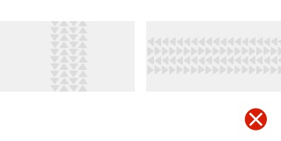
Don't set the pattern square to your layout (0 or 90 degrees).

The pattern must bleed off the layout, as though a tire has rolled over the entire page.
Although it can sit behind text, the pattern must not interfere with content.
The pattern should appear at a large scale.
Only one instance of the pattern should appear per layout.
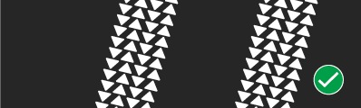
Exception: In narrow layouts, such as web banners, interior transit ads, or blade flags, you may place two patterns in a parallel arrangement—mirroring tire tracks.
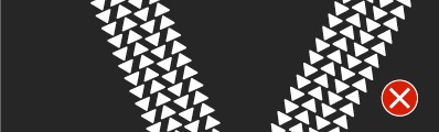
Do not place multiple tracks in a non-parallel arrangement.
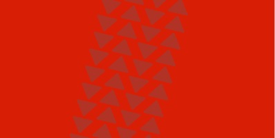
Pattern colour options
The pattern should primarily appear in CT Mid Grey over a background in CT Steel; but a number of other options are available if the need arises.

Primary colour combination
Pattern: CT Mid Gery
Background: CT Steel

Secondary colour combination
Pattern: CT White
Background: CT Soft Black
Secondary colour combination
Pattern: CT Dark Red
Background: CT Red

Secondary colour combination
Pattern: CT Steel
Background: CT White
Patterns are always monochromatic—never mix two colours.

Always use monochromatic colour schemes in patterns
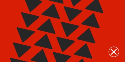
Never mix colours
Downloads
For the latest versions, please contact the Omni-Channel Team.