Pop-up zone
Pop-up zone summary
The pop-up zone is a special zone that appears on some Special Print books which are printed as inserts to the weekly Flyer. These books require additional height so that when they are inserted into the Flyer, the book is visible.
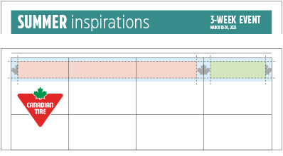
Pop-up zones contain a lockup zone and an event date & duration zone. When a pop-up zone is in use, the lockup and event date & duration zone are shifted up from on top of the feature image zone and into the pop-up zone.
Placement
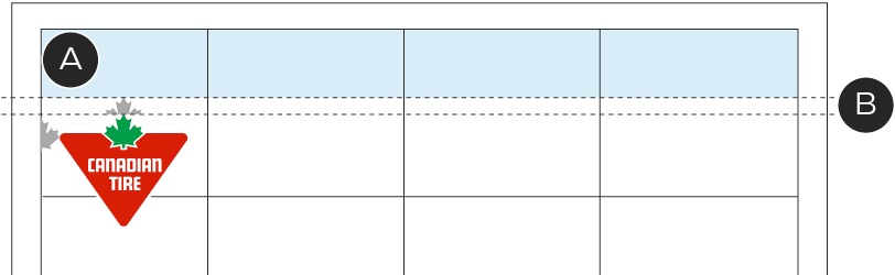
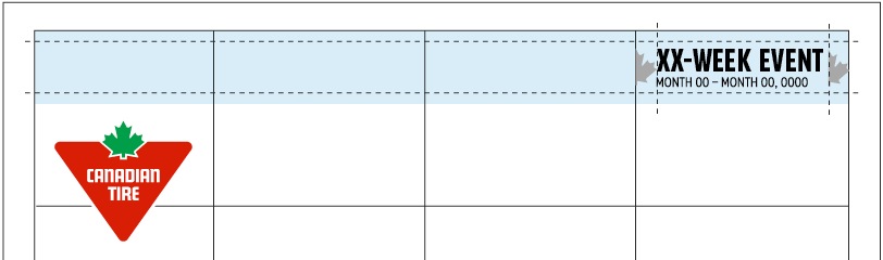
A – The pop-up zone must be positioned within the grid in the top row.
B – The Brandmark must appear a 1/2 leaf from the bottom of the pop-up zone.
The pop-up zone appears within the grid and at the top of the front cover. It must always have a 1/2 leaf gap between the bottom of the zone and the Brandmark.
Construction
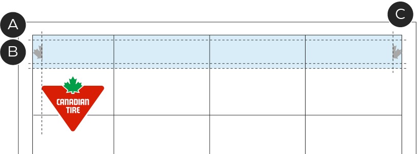
A – Height varies based on the paper size of the Special Print book and Weekly Flyer. The height must not appear less than 4p2 (inner margins measuring to 2p8).
B - 0p9 top and bottom margins
C – 1/2 leaf left and right margins
Within the pop-up zone, the lockup zone and event date & duration zones can appear. These zones must sit within the pop-up zone's inner margins.
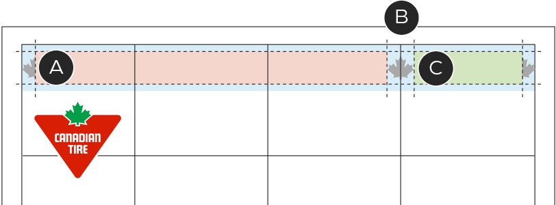
A – Lockup zone
B – 1 leaf clearspace between zones. The leaf must center on the vertical grid unit line.
C - Event date & duration zone
When placing the lockup and event date & duration zones, you must maintain a 1 leaf distance between the two zones. This leaf measurement must be centre-aligned to the vertical grid line between the third and fourth grid unit columns. The lockup should be left and vertically centre-aligned. The event date & duration zone must appear contained within the right-most grid column with a 1/2 leaf padding on either side of the zone.
Colour
The pop-up zone can take on a colour to help differentiate the zone from the feature image and product image zones below. The colour applied should be reflective of the weekly seasonal colour, campaign colour or Omni-identity colour.
Lockup typography
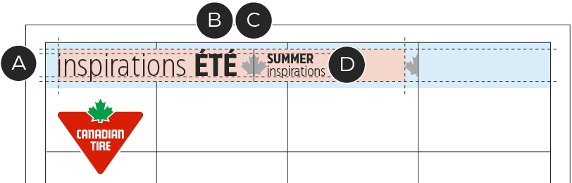
Due to the shape of the pop-up zone, only horizontal lockups may appear in this space. These horizontal treatments utilize a slight variation to the horizontal treatments outlines on the Lockup & headline callout typography page. Commonly, there is still space for the languages to be stacked in the horizontal treatment, but with the limited height of the pop-up zone, all messaging must appear side by side.
A – Lockup must be vertically centered within the lockup zone.
B – Be mindful of the lockups ascenders, descenders and accented characters. These elements may extend into the margin area but should not come within 0p4 of the pop-up zone's edge.
C - Bilingual Lockups must be separated by one leaf distance with a centered 0.75pt black vertical line.
D - English language should appear on two lines and can scale to the maximum height of the Cap height of the French language.
Event date & duration typography
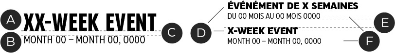
Due to the shape of the pop-up zone, the event date and duration zone is located in the right-most column and appears vertically stacked. Since the space is limited by the width of a single grid unit, the typography of the zone is altered to better fit the space.
Unilingual
A – CT Eastman Compressed Bold, 26/31pt
B – CT Eastman Compressed Regular, 11/13pt.
C – 0p6 space between text
Bilingual
D – CT Eastman Grotesque Extra Bold, 10/12pt
E – 0p9 space between text
F – CT Eastman Compressed Regular, 8.5/12pt
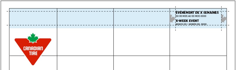
Copy within the event date & duration zone should be vertically centered and allow for the minimum 1/2 leaf measurement of space on either side.