Digital—A-spot
Overview
Our new A-spots work with the existing ODP structure, refreshing its look.
Tier 1–3 A-spots use a full-value background colour and a matching Triangle motif to create visual excitement.
Tier 4 (Flyer integration) A-spots generally use a triangle in an accent colour.
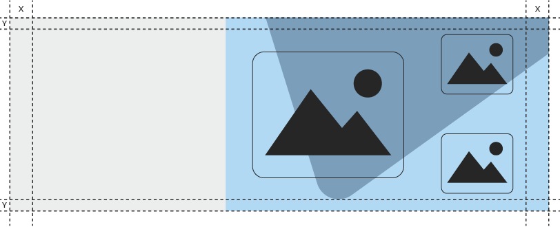
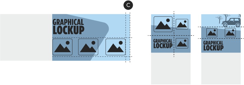
A-spot zone system
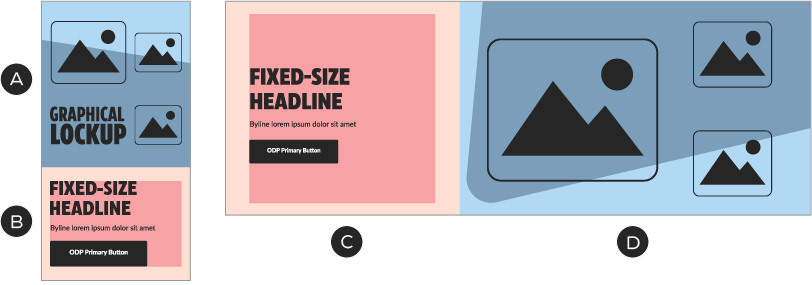
A, D – Image zone—product images, lockups, branded elements (i.e., portal, patterns). Fixed aspect ratio.
B, C – Copy zone—live text, button, CSS background colour
Copy zone
The copy zone contains the headline, subcopy and CTA button, as well as a background colour that is configured to match the image zone. Headlines are set in CT Eastman—the weights, widths and sizes of which are defined in the Typography section of this page. Body copy is set in Lato. Always follow the ODP guidelines for copy sizing and character counts.
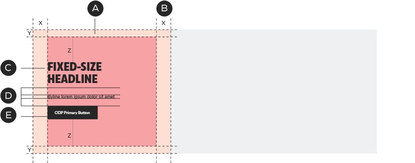
A – Background colour of copy zone defined in CSS
B – Margins and zone size defined by ODP
C – CT Eastman for headlines
D – Spacing defined by ODP
E – Lato for copy and buttons
Copy Zone: colour relationships
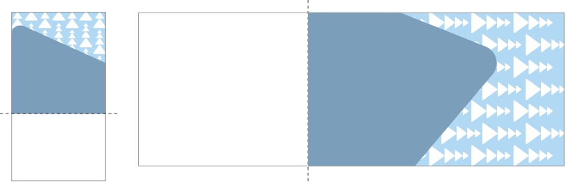
There are two basic layouts for the image zone and these affect the colour choice in the background of the copy zone. The background colour for the copy zone must match the portion of the image zone that touches its margins.
If the triangle or portal points towards the copy zone, the background colour of the copy zone must match that of the image zone.
If the triangle or portal points away from the copy zone, the background colour of the copy zone must match the colour of the triangle.
Image zone
The image zone is occupied by a single raster image at a fixed ratio. The image scales proportionally with browser width changes. There are separate images for desktop and mobile breakpoints. Always follow ODP guidelines for A-spot image specifications.
Foreground images and lockups are subject to the same margins as the copy zone. Unlike the copy zone, there is no inner margin.
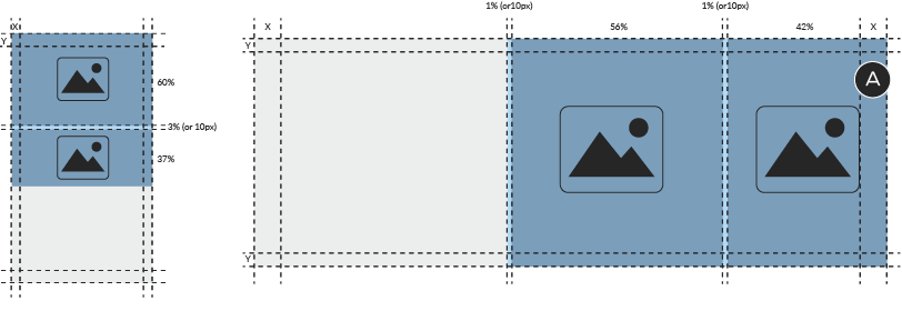
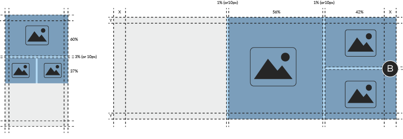
Image zone composition: Tiers 1–3
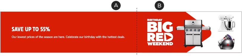
In Tiers 1–3, the portal points away from the copy zone. The copy zone’s background colour matches the portal’s, which visually unites the copy and lockup. Tiers 1–3 support multiple types of image arrangements, including the use of lifestyle images, which sit behind the portal.
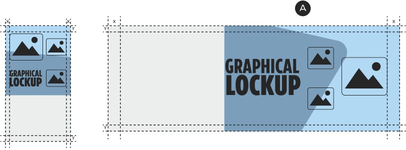
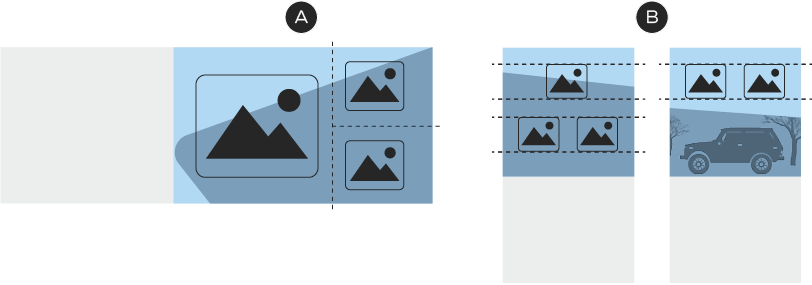
Layout option 1: one large and two small images. Note how the portal points away from the copy zone in all Tier 1–3 layouts (A).
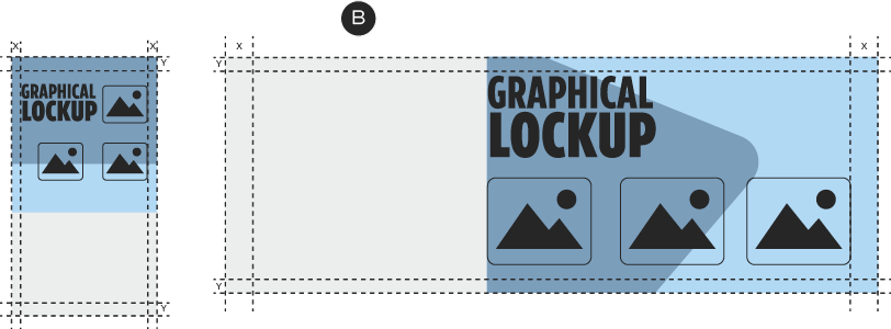
Layout option 2: three equally-sized images. The background colour of the copy zone should match the portal in all Tier 1–3 layouts (B).
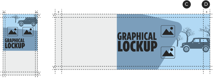
Layout option 3: two isolated images, one lifestyle. Lifestyle images always sit behind the portal in Tiers 1–3 (C) and may break the margins (D).
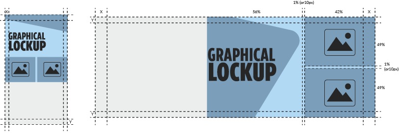
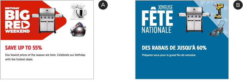
Image zone composition: Tier 4
In Tier 4, the portal points towards the copy zone. The copy zone’s background colour matches the background colour of the image zone. As with Tier 1–3 A-spots, layouts for Tier 4 support a variety of image arrangements, including the use of lifestyle images—which should be cropped inside the portal, rather than being placed behind it.
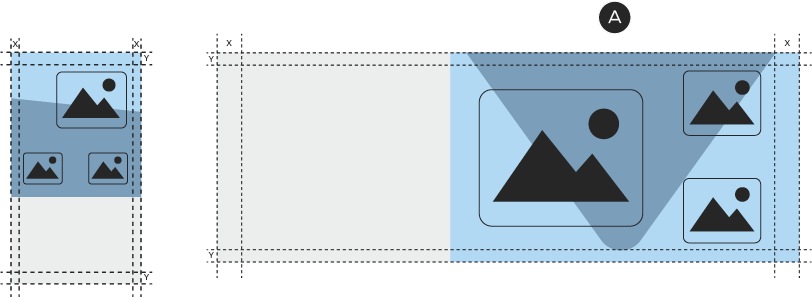
Layout option 1: one large and two small images. Note how the portal points toward the copy zone in Tier 4 layouts (A).

Layout option 2: three small images. The background colour of the copy zone should match the background colour of the image zone in all Tier 4 layouts (B).
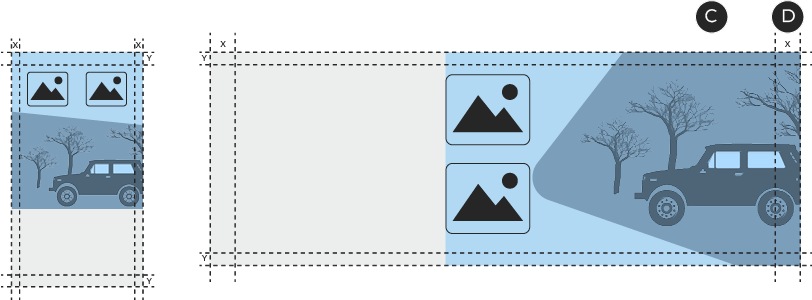
Layout option 3: two isolated images, one lifestyle. Lifestyle images always sit inside the portal in Tier 4 (C) and may break the margins (D).
Image zone composition: multiple lifestyle images
In instances where multiple lifestyle shots are desired, use one of the following layouts. Images should be separated by 10px of white space, including to the left of the innermost image (on desktop). In Tier 1–3 communications, the portal always points towards the lifestyle images. In this case, omit the 10px of space at the far left of the desktop image.
Layout option 1: two images. Lifestyle images may bleed into the margin (A). Do not place white space to the right of the outer images.
Layout option 2: three images. The 10px bars (B) look best when they match the background colour of the website adjacent to the A-spot; e.g., #FFFFFF, #F8F8F8.
Layout option 3: two images with promo lockup. When the portal points towards the images, as in Tiers 1–3, omit the 10px of space at the far left of the desktop image.
Image zone composition: product alignment
While layout within the image area is relatively flexible, there are some basic rules to follow when arranging the elements:
A – Treat the layout like a grid, with each product and the lockup contained within its own unit.
B – Techniques like shared base/centre lines and optical sizing will make layouts feel more organized.
C – In general, foreground images should remain within the same margins as the copy zone.
Typography
Per the visual tone of voice guidelines, different widths and cases of CT Eastman may be applied to A-spot headlines, depending on the nature of the communication. Body copy and buttons always follow ODP guidelines. Here's how to style A-spot headlines:
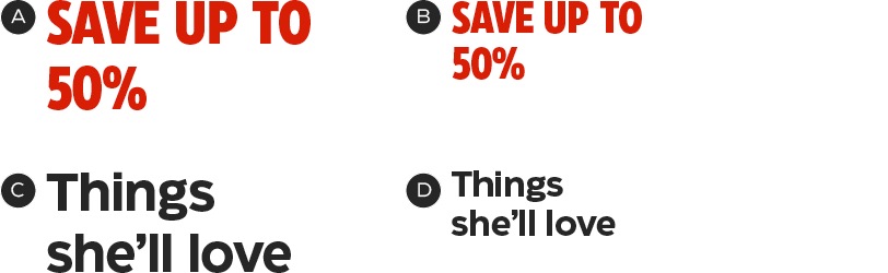
A – Authoritative tone, desktop—CT Eastman Condensed Extrabold, 56/60px. Save stories are always red.
B – Authoritative tone, tablet/mobile—CT Eastman Condensed Extrabold, 40/42px.
C – Human tone, desktop—CT Eastman Roman Bold, 48/56px.
D – Human tone, tablet/mobile—CT Eastman Roman Bold, 32/36px.
Triangle Graphic Element
There are a variety of positions available for the Triangle, which allow for flexibility and variety in layouts. Always start with one of these positions; horizontal or vertical adjustments may be necessary to accommodate different products or lockups.

Tiers 1–3 (Triangle points away from copy zone)

Tier 4 (Triangle points towards copy zone)
For simplicity’s sake, mobile image zones do not use the Triangle. There are three options for angled slices to use in the background—their vertical position may be changed to suit the layout.
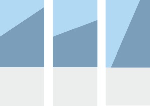
Tiers 1–3 (slice points away from copy zone)
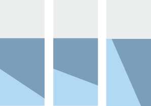
Tier 4 (slice points towards copy zone)
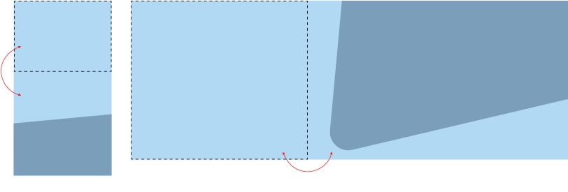
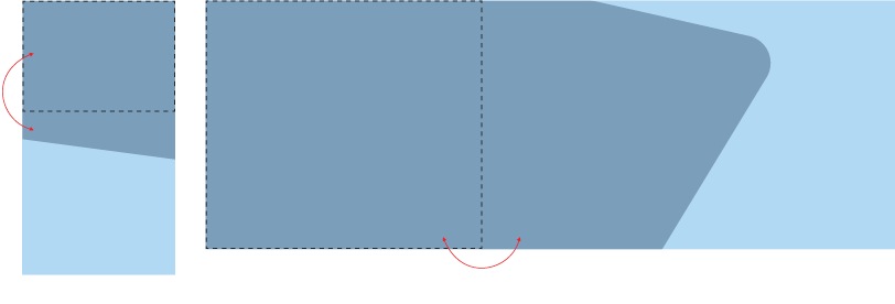
The Triangle Element in the templates has been calibrated so that it optically matches triangles that appear in other types of media. It’s important that the Element is only ever moved—but never resized. This will keep it consistent across brand communications, never looking too soft or too pointy.

Always use the template to create A-spots—and never change the size of the Triangle Element—so that the curve shape is always the same.
Patterns
Patterns are used in Tiers 1 & 2 to add excitement and mark a special event. They should never compete with the product images.

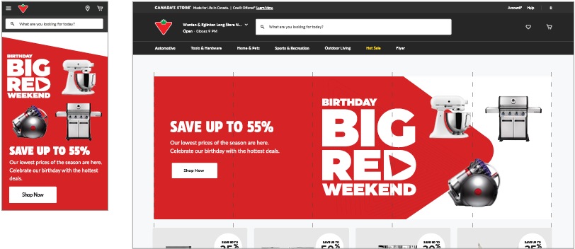
Tier 1A—Big Red Weekend: the BRW pattern must be contained within the background Triangle. It must fade out completely before it reaches the left edge of the image zone (desktop) or bottom edge (mobile), so that it doesn't appear to be cut off.
Tiers 2A—2B—Super Sale & Fête nationale; Mega Sale: follow the pattern guidelines for these tiers and ensure that it never competes with the foreground images. In mobile, the pattern should be scaled down to match the new proportions—it may also be rotated, if it benefits the design.
Promo Banner Integration
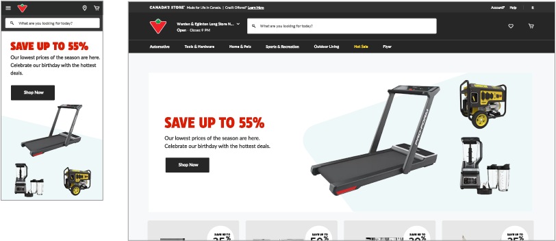
Designing Promo Banners works the same way as with A-spots, using colour to create a relationship between the copy and image zones. Always follow the ODP guidelines for copy lengths and image size specifications.
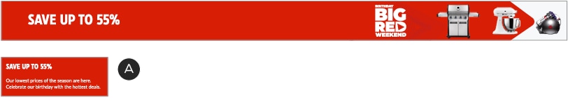
Desktop:
A – Background colour of copy zone matches Triangle colour in image zone.
B – Patterns in image zone end before reaching the left margin, so that they don’t appear to be cut off.
Mobile:
A – In mobile layouts, white may be used in the background of the copy zone to create a visible margin for the image zone.
B – Colour may also be used in mobile copy zones to create the illusion of continuity.
Ultra-slim:
A – The mobile versions of ultra-slim units do not include images. Use a colour from the desktop version for consistency.