Universal email modules: Banners
Universal modules may be used in both email types—their construction does not change between the types of emails. Note that some graphics on this page have had outlines added for visibility—email modules do not typically contain outlines, unless specifically indicated in the guidelines.
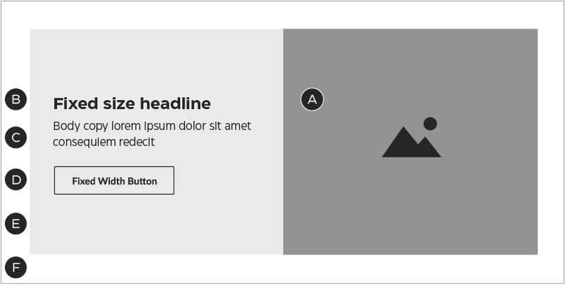
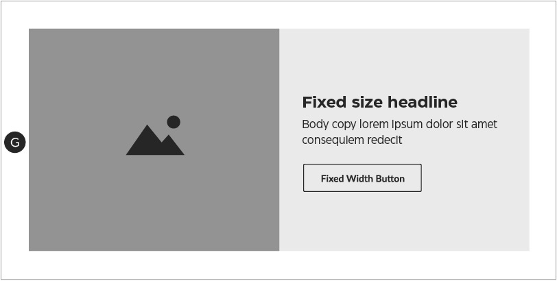
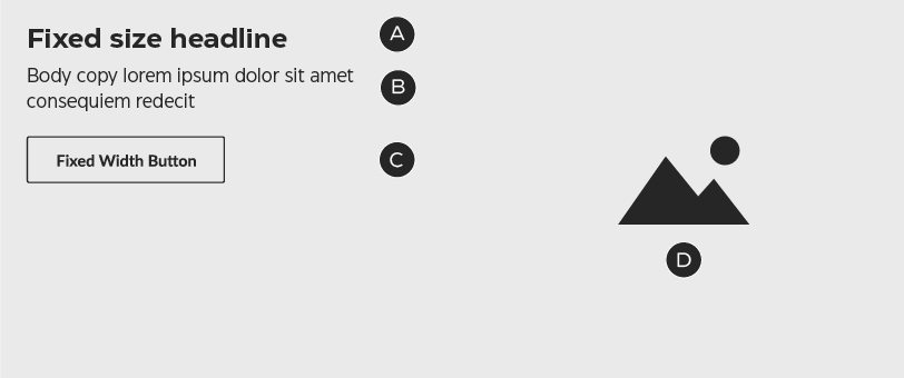
Banner 1: cropped image
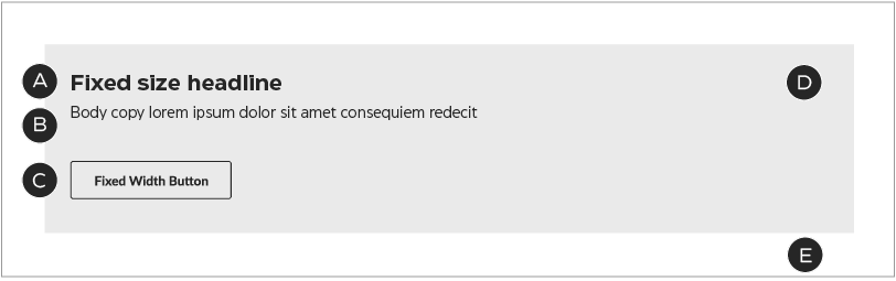
Banner 1: mandatory & optional components
Banner 1 places a cropped photograph or graphic next to a block of copy over a field of colour. On desktop, this module may be laid out with the image to either the left or right of the copy.
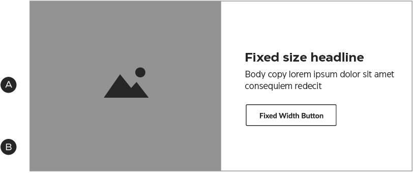
A – Image
B – Optional image left/image right configuration
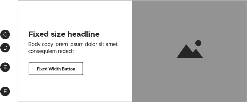
C – Headline
D – Optional body copy
E – Secondary-style Fixed Width or Tertiary button
F – Background colour
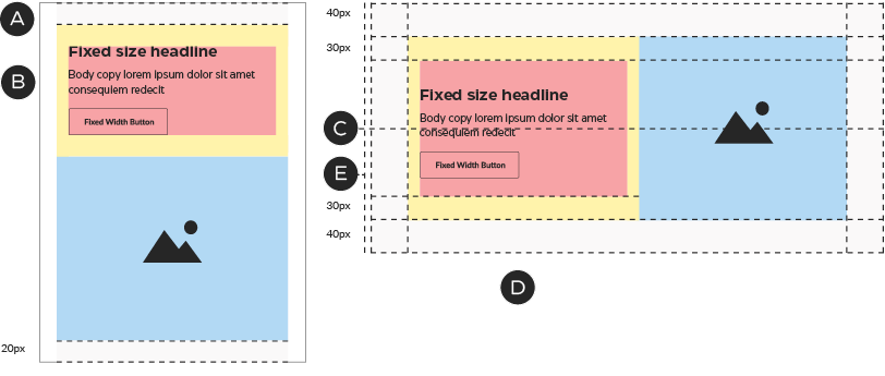
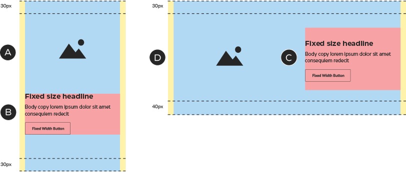
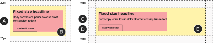
Banner 1: construction
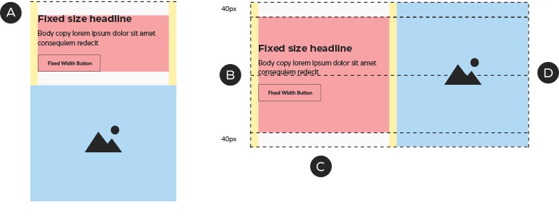
A – The zones stack in mobile and the copy zone shrinks to fit the height of the content
B – In desktop, the copy block sits 5px higher than centre
C – Each copy zone is 280×250px, flush-left
D – The total height is fixed at 320px
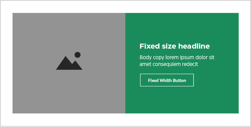
Banner 1: colour
The background colour of the text area may be any Foundational brand colour or a promo colour. In promo emails, the text area may also contain a matching pattern.


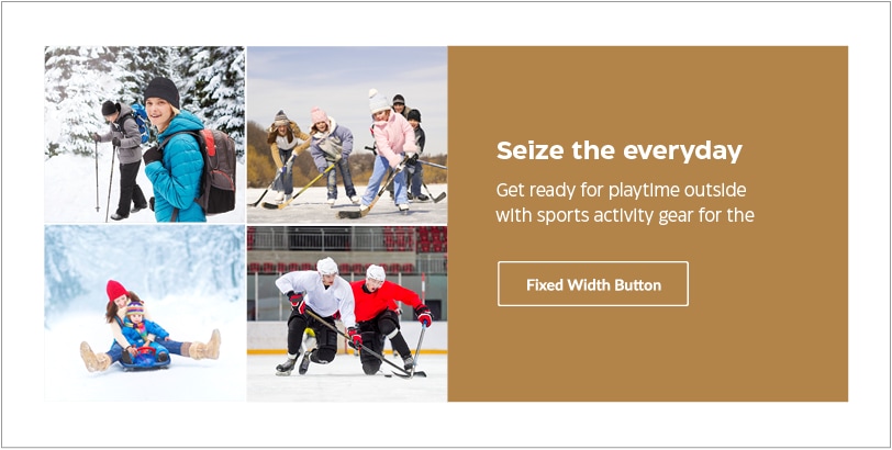
Variation example: creating mid-page NPP units using the Banner 1 module

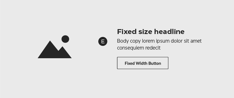
Banner 2: cropped image with border
Banner 2: mandatory & optional components
Banner 2 uses the same basic format as Banner 1, placing a cropped photograph or graphic next to a block of copy over a field of colour—with the addition of a thick border in either white or a colour that matches the module directly above or below it. On desktop, this module may be laid out with the image to either the left or right of the copy.
A – Image
B – Headline
C – Optional body copy
D – Secondary-style Fixed Width or Tertiary button
E – Background colour
F – Border colour
G – Optional image left/image right configuration
Banner 2: construction
A – In mobile, the columns stack and the outer padding is reduced to 20px.
B – The copy zone shrinks to fit the content, maintaining its margins.
C – In desktop, the copy block sits 5px higher than centre.
D – The copy zone is 240×210px, flush left. In this module, the copy zone takes on a 30px top and 40px bottom margin.
E – The total height is fixed at 360px.
Banner 2: colour
The background colour of the text area may be any Foundational brand colour or a promo colour that suits the NPP creative. For promo messages, the text area may also contain a matching pattern.
The default border colour is white—but you may also choose a colour that matches the module directly above or below the banner.
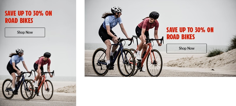
Variation example: image grid
This execution uses the available space to showcase more than one visual, even though it’s still technically built with a single image.
Banner 3: full-bleed image
Banner 3: mandatory & optional components
Banner 3 places a full-bleed photograph or graphic directly behind the copy. The copy may be placed on either side of the module in desktop, in any vertical position.
A – Headline
B – Optional body copy
C – Secondary-style Fixed Width or Tertiary button
D – Image
E – Copy may sit to the left or right, in any vertical position
Banner 3: construction
A – The mobile unit has a flexible height.
B – In mobile, the text zone remains 280px wide and touches both left and right margins. It may also be placed in any vertical position.
C – In desktop, the copy zone is 280px wide, flush left. It must sit against the 20px left or right margin, but may be placed in any vertical position (provided it stays within the top & bottom margins).
D – The total height is fixed at 320px.
Banner 3: colour
The background colour of the text area may be any Foundational brand colour or a promo colour that suits the NPP creative. For promo messages, the text area may also contain a matching pattern.
Banner 3: composition
Be sure to optimize images for both mobile and desktop breakpoints.
Banner 4: text-only
Banner 4: mandatory & optional components
Banner 4 is designed using only text and colour, with a thick border in either white or a colour that matches the module directly above or below it.
A – Headline
B – Optional body copy
C – Secondary-style Fixed Width or Tertiary button
D – Background colour
E – Border colour
Banner 4: construction
A – In mobile, the outer padding is reduced to 20px and the copy zone is 480px wide, flush left.
B – The mobile copy zone’s right margin is reduced to 20px.
C – In desktop, the copy zone is 800px wide, flush left.
D – This module’s height flexes to fit the height of the copy zone.
E – In this module, the copy zone takes on the following margins: top: 30px; right: 140px; bottom: 40px; left: 20px.
Banner 4: colour
The background colour of the text area may be any Foundational brand colour or a promo colour that suits the NPP creative. For promo messages, the text area may also contain a matching pattern.