Brand colours
Brand colour palette
Colour plays an important role in the Canadian Tire brand. Our red and white brand colours have become iconic and symbolic amongst Canadians and continue to represent the deep connection to our roots and heritage.
Primary

CT RED
Primary brand colour
PMS 485
CMYK 0 / 100 / 100 / 0
RGB 216 / 30 / 5
HEX #D81E05
TCX 18-1561

CT WHITE
Primary brand colour
CMYK 0 / 0 / 0 / 0
RGB 255 / 255 / 255
HEX #FFFFFF
Our primary brand colours are red and white. They are used to provide simplicity and consistency throughout all of Canadian Tire's brand communications.
Although green is a part of our Brandmark we use it sparingly. This is why we've classified it under the secondary palette and use it as an accent.
Secondary

CT SOFT BLACK
PMS Black C
CMYK 70 / 65 / 65 / 75
RGB 38 / 38 / 38
HEX #262626

CT GREEN
PMS 355
CMYK 100 / 0 / 100 / 0
RGB 0 / 158 / 73
HEX #009E49
TCX 15-5534

CT DARK RED
PMS 1805
CMYK 22 / 91 / 90 / 13
RGB 176 / 55 / 46
HEX #B0372E

CT STEEL
PMS Cool Gray 4 (20% tint)
CMYK 0 / 0 / 0 / 6
RGB 240 / 240 / 240
HEX #F0F0F0

CT MID GREY
PMS Process Black (13% tint)
CMYK 0 / 0 / 0 / 13
RGB 220 / 220 / 220
HEX #DCDCDC
Brand colour palette: usage guide
The colour palette is applied differently across 3 key platforms:
Marketing & comms
In marketing and comms applications, CT Red and CT White are the primary colours. while CT Soft Black, CT Green and CT Steel are used sparingly.
CT RED
Primary brand colour

CT WHITE
Primary brand colour

CT SOFT BLACK
Typography, accent

CT GREEN
Neutral backdrop

CT DARK RED
Accent

CT STEEL
Neutral backdrop

CT MID GREY
Neutral backdrop
Digital
Within digital applications (website), CT White is used predominantly as a neutral background along with CT Steel. CT Soft Black is used for typography and accent elements. CT Red is saved for the Canadian Tire Brandmark, key pricing and special call-outs. CT Green is also used as an accent colour and for functional iconography.
CT WHITE
Neutral backdrop

CT SOFT BLACK
Typography, accent

CT RED
Logo, prices, call-outs

CT GREEN
Accent, iconography
CT DARK RED
Accent
CT STEEL
Neutral Backdrop
CT MID GREY
Neutral backdrop
In-store
The in-store experience uses CT White, CT Steel and CT Soft Black to create a modern and fresh look, while it also provides a blank canvas for CT Red in the Brandmark and key messaging to shine. CT Green is again used for functional and utility signage.
CT WHITE
Backdrop, accent

CT STEEL
Backdrop, accent
CT SOFT BLACK
Backdrop, accent
CT GREEN
Functional/utility signage
CT RED
Logo, prices, call-outs

CT DARK RED
Accent
CT MID GREY
Neutral backdrop
Colour and accessibility–digital
When it comes to the use of colour, websites and web content (ex. display ads and emails) must have distinguishable content. This means colours must accommodate people with limited colour vision or colour blindness. With colour deficiency affecting one in 10 males in Canada and one in 200 females worldwide, ignoring colour contrast standards means losing a significant portion of potential customers.
As a general rule, always ensure content has at least 50% difference in contrast. Check your colour combinations using an online tool to ensure it passes requirements.

Acceptable contrast


Unacceptable contrast

Approved primary colour combinations
Here are a few pre-determined combinations:
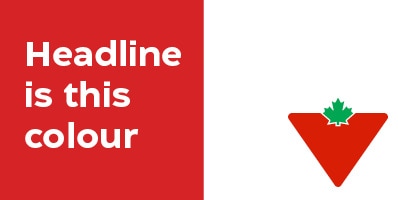
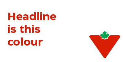
Option 1: White text over CT Red
Option 2: CT Red text over white
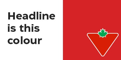
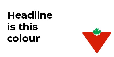
Option 3: CT Soft Black text over white
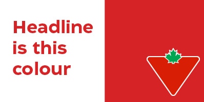
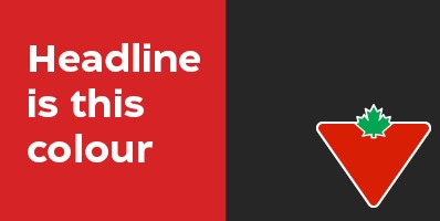
Option 4: White text over CT Red flood
Option 5: CT Red text over white flood
Option 6: CT Soft Black text over white flood
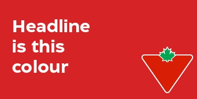
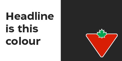
Brandmark use on CT Soft Black or dark backgrounds
While we encourage designers to use the iconic CT Red, there are times when the brandmark will need to sit on CT Soft Black or a darker background. When this happens, continue to use the approved Brandmark variations. Remember, any placement of the Canadian Tire Brandmark on a CT Soft Black or darker background must be approved by the Canadian Tire Brand Team.
Here are the approved colour combinations using CT Soft Black:
Option 1: White text over CT Red
Option 2: CT Red text over white
Option 3: CT Soft Black text over white

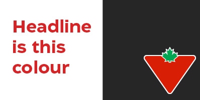
Option 4: White text over CT Soft Black flood