Addition of Small version micro brand signatures lockups download links
Brand Signature
Brand Signature lockup
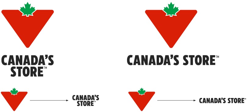
The new Canada’s Store lockup is modernized and made more impactful with the use of CT Eastman. It also uses bolder typography, is more condensed to save space in lower-funnel applications and creates a better balance alongside the Canadian Tire Brandmark.


Primary Brand Signature lockup
This version of the Brand Signature lockup combines the primary Canadian Tire Brandmark with the Canada’s Store typography. This is the is the preferred lockup for consumer facing use in 2022 and beyond.


Secondary Brand Signature lockup
This Brand Signature uses the secondary Canadian Tire Brandmark for applications where brand awareness may be low, eg. in corporate communications or assets for international audiences.
The primary Brand Signature lockup should be used whenever possible for the majority of print, television and digital applications unless otherwise specified by the Canadian Tire Brand Team.
Outline
The white keyline is an integral part of the Brandmark and must always be present. On white backgrounds, it will become invisible—this is ok.
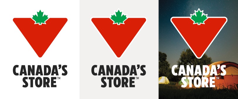
Always include the white keyline around the Brandmark in Brand Signature lockups. It will naturally become invisible over white backgrounds.
Configurations
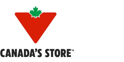

Vertical one line


Vertical two line centred


Vertical two line left aligned


Horizontal one line


Horizontal two line


These configurations have been designed to provide maximum flexibility in our communications. Choose the configuration that works best in the context of your layout (see usage examples below).
Note: do not recreate the Brand Signature marks. All variations have been built and are available for download—see the links at the bottom of this page.
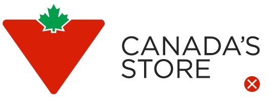

Don't recreate the Brand Signature lockups or set them in a different typeface.
Small Format Brand Signature

In instances where the Brand Signature is being used when limited space is available, a secondary small size format is available in a single horizontal and vertical configuration. Whenever possible, the standard size Brand Signature should be used.


Horizontal configuration


Vertical configuration
When evaluating which size of Brand Signature to apply, consider the following scaling guide. The size selection should be based on the size of the Canadian Tire Brandmark.

A – 0-0.24" - Avoid using a Brand Signature at less than 1⁄4" (18px)
B – 0.25-0.5" - When the Brandmark appears between 0.25-0.5" (18-36px) in size, utilize the Micro Brand Signature.
C – 0.51-0.99" - When the Brandmark appears between 0.5-1" (36-72px) in height, use the X2 Small Format Brand Signature.
D – >1" - When the Brandmark appears larger than 1" (72px) in size, utilize the standard Brand Signature.
Small Format Do's and Don'ts


Do use the assets as supplied.


Don't create new configurations.

Do consider using the Isolated Wordmark in place of the Small Format when applicable. See Isolated Workmark section below.


Don't scale the Small Format in excess of 1".
Colour
The Brand Signature may be used with one of three colour combinations—these may be applied to either the primary or secondary signature lockups:
Do not alter the approved colours or create your own combinations:
Colour dos and don'ts:


Do use the white type version over dark backgrounds.


Do use the black type version over light backgrounds.


Don't use a lockup where there's insufficient contrast for legibility.


Don't use the knockout version of the lockup over anything that isn't a solid block of CT Red.
Spacing and alignment
No matter the lockup, we always use a half leaf measure between the CT Brandmark and Canada’s Store Wordmark. We also include a full one leaf clear space around the entire Brand Signature.
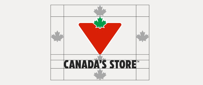
Vertical one line lockup
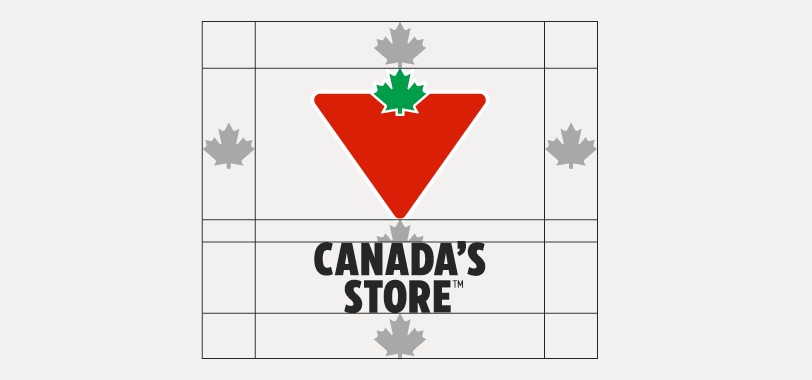
Vertical two line lockup
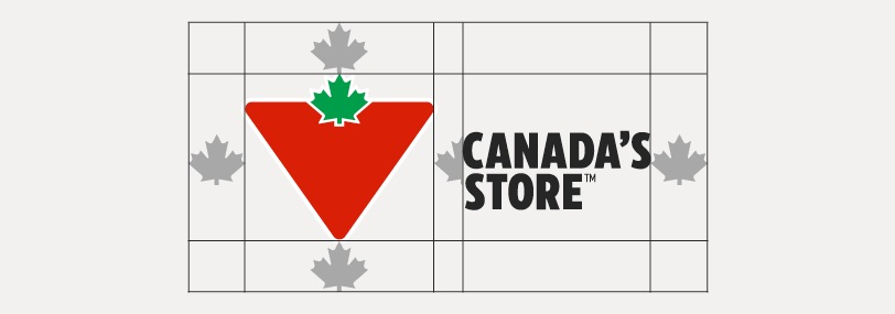
Horizontal one and two line lockups
TM / MC symbols
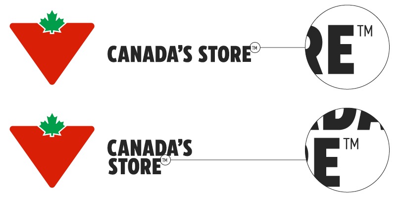
The height of the TM or MC symbol is the height of the top of the letter E.
French / bilingual lockups
French lockups
The French versions of the Brand Signature are constructed the same way as the English—type size, spacing and clear space are the same. Apply them in the same way you would the English versions.

Bilingual lockups
Bilingual versions of the Brand Signature are available for layouts that require them. Always use a bilingual lockup, rather than separate English/French lockups, in these applications.

Bilingual lockup dos and don'ts:


Do use the pre-designed bilingual lockup.


Don't change the size or spacing relationship between the languages.


Don't place the English before the French.


Don't use separate lockups instead of the bilingual version.
Isolated Wordmark
The Canada’s Store Wordmark can be used in isolation or by itself as long as it’s used within proximity to the CT Brandmark. By proximity we mean you must be able to see both the Wordmark and the CT Brandmark at the same time, but they don’t need to be locked together.
The size of the Canada’s Store lockup must not be any greater than the height of the leaf in the Canadian Tire Brandmark:


The Wordmark may be smaller than the maximum allowance.

Incorrect sizing. The Wordmark exceeds the height of the leaf.
Isolated Wordmark dos and don'ts:
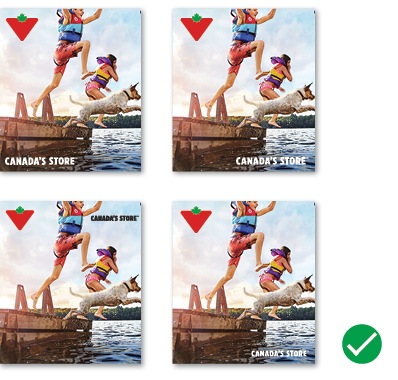

Do: separate the CT Brandmark and Canada’s Store Wordmark, while keeping them in the same layout


Don't: place the Canada’s Store Wordmark in a layout without the CT Brandmark


Do: use the Canada's Store Wordmark in isolation from an event lockup.


Don't: use the full Brand Signature when there is already a CT Brandmark connected to the event lockup.
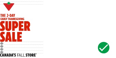

Do: place at least four maple leaves' worth of space between an event lockup and the Canada's Store Wordmark.


Don't: visually connect an event lockup with the Canada’s Store Wordmark. This creates confusion around the event.

