Canada's Fun Store
Overview
Canada’s Fun Store Brand Identity is designed with fun in mind. This includes a playful colour palette, expressive doodle illustrations and hand-drawn typography—all designed to help highlight and hero product in a fun way.
Identity components
Fun Store lockup
A unique take on the category Brand Signature incorporates a fun and youthful energy.

Identity colours
A combination of colours created to represent the energy and playfulness the products bring to our everyday life.
Unique elements
A series of playful background shapes and hand drawn doodle illustrations.
Canada's Fun Store lockup
Canada’s Fun Store lockup follows the same foundational rules as all other category Brand Signatures. For more information on the lockup's useage guidelines, please see the Brand Signature: Canada's Fun Store page.
Typography
The Canada's Fun Store identity utilizes our foundational brand typefaces in on their own or in combination to bring excitement and playfulness to Fun Store compositions.

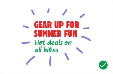
Our headline typography is set in CT Eastman Heavy and designed to be loud and typeset in the Authoritative approach in order to create a sense of excitement and urgency.
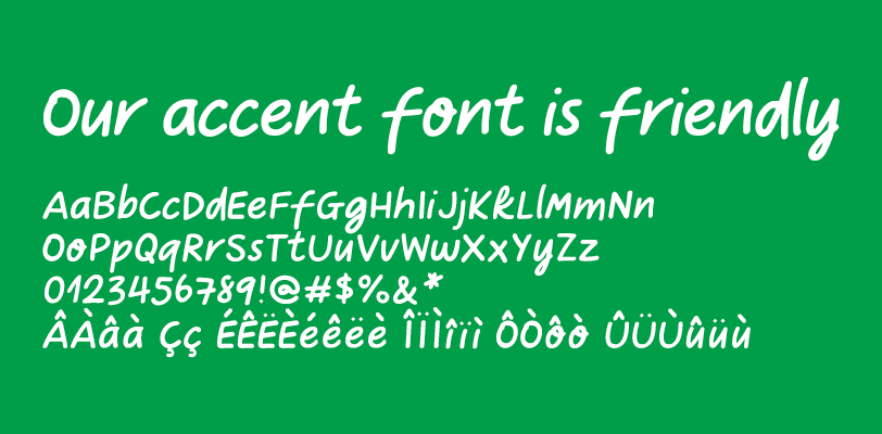
Our accent font, Take Note, is playful and friendly. This font is used as an accent to the headline font and should have a lot of personality.
Colour
The Canada’s Fun Store colour palette is created to represent the energy and playfulness the products bring to our everyday life. The colour palette leverages the CT Red and Green from the Masterbrand, while the purple leverages the primary purple from Party City’s brand identity.
Primary identity palette
The primary colours are used throughout the Canada’s Fun Store brand materials. They can be used with the secondary colour palette and are interchangeable with each other.


Secondary identity palette
The secondary colours are reserved for accent colours in the doodle illustration as well as background colour fields in the Flyer.

FUN LILAC
PMS 272@20%
C:9 M:9 Y:0 K:0
R:226 G:224 B:239
#E2E0EF

FUN GREEN
PMS 355@20%
C:20 M:0 Y:20 K:0
R:204 G:231 B:211
#CCE7D3
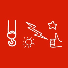
Unique elements
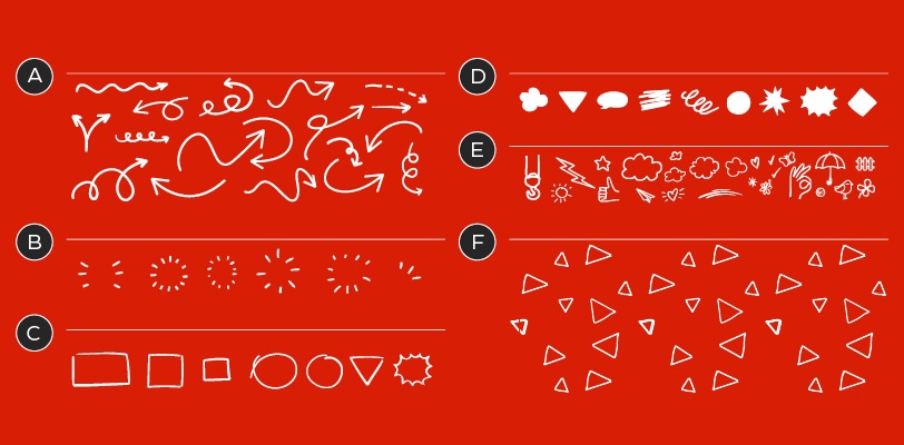
Canada's Fun Store doodle and illustration library:
A – Callout arrows
B – Product burst
C – Product frames
D – Background shapes
E – Illustration add-ons
F – Background pattern
The doodle illustration toolkit can be used with product features or headlines to bring life to the product. They may help with telling the story of the product or even to help give context to a product attribute.
Note: illustration line weights should always scale consistently. When mixing illustrations the line weights can be modified to help create consistency.
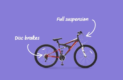
Call-out arrows
We use callout arrows to point out the key attributes and add personality to a product being featured. Arrows are optional and should only be used if it doesn’t conflict or add complexity to the layout.
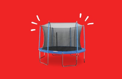
Bursts
Bursts are used to give personality to the product itself or to draw additional attention to a headline.
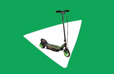
Background shapes
These playful background shapes can be used to call attention to a product or headline. The shapes are also used to disrupt the layout and add a little fun and playfulness.
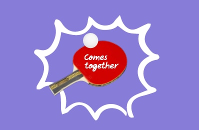
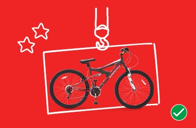
Frames
Similar to background shapes, frames call attention to a product or headline. The difference with frames is that they can contain product information like price points or callouts.
Background pattern
Sometimes we need to add a bit of life to a field of colour or large background in a layout. In these cases we can add a playful CT Triangle pattern to bring things to life and add a hint of excitement to the design.
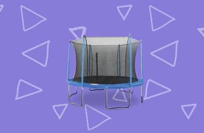
The background pattern can be used as a tone‐on‐tone pattern. This is a subtle use that works best behind product photograph.

The background pattern can also be used in full white over any of our colour in the Canada’s Fun Store colour palette. Only use this pattern if it does not add unnecessary complexity to the layout.
Badges
To highlight different toy SKUs, a series of Toy badges have been created to help call out specific products. These can be used in either red or green to highlight a variety of toy SKUs. The badges are available with three different copy versions to be relevant to a variety of use cases. All three versions of these badges are available in singular, plural and in English, French and bilingual. For more information on how to apply this element, see the Toys Badges page.
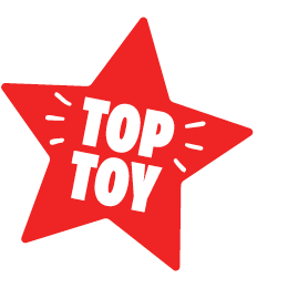
Tops Toys
Available as Featuring Top Toys and Top Toy.
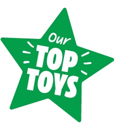
Our Top Toys
Available as Featuring Our Top Toys and Our Top Toy.
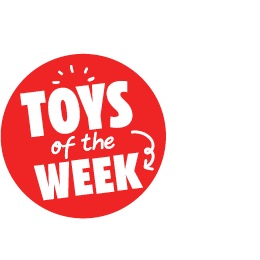
Toys of the Week
Available in singular and plural.
Motion
The intent of motion is to enhance the product being featured and not to distract. Where appropriate we use motion to add additional fun and personality to our doodle illustrations or Take Note brand font. When adding motion to our illustration add-ons try to keep it subtle as we want to keep the focus on the product first.
Motion should be used subtly.
Use motion to direct the eye.

Try to keep the speed to 1.5 seconds.
Motion and typography
Along with our doodles you can also add motion to our Take Note brand font.

Take Note typography can animate letter-by-letter.

or can reveal by paint stroke.
Dos and don'ts

Do size doodles to accent the product. Illustration most not exceed more than 60% of the product size.
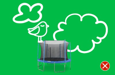
Don't scale the illustration and line work too big so that it overpowers the product.
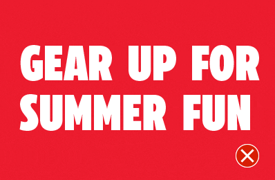
Do utilize the doodle library in combination with headlines.

Don't overuse the doodle library in a composition. Limit the doodles to emphasize no more than 1-2 elements.
Do scale illustration line weights consistently. When mixing illustrations the line weights can be modified to help create consistency.

Don't create new custom illustrations without consulting the BDS team for approval.

Do apply motion to direct the eye to a product or price.
Don't apply motion to headlines set in CT Eastman. They can appear but should not reveal in the same way as text set in Take Note.
Overview
Canada’s Fun Store Brand Identity is designed with fun in mind. This includes a playful colour palette, expressive doodle illustrations and hand-drawn typography—all designed to help highlight and hero product in a fun way.